Art Direction - Abby Guido | Categories - Design, Interactive, Research
Creative Timeframe - January to April, 2020 | Purpose - Educational Project
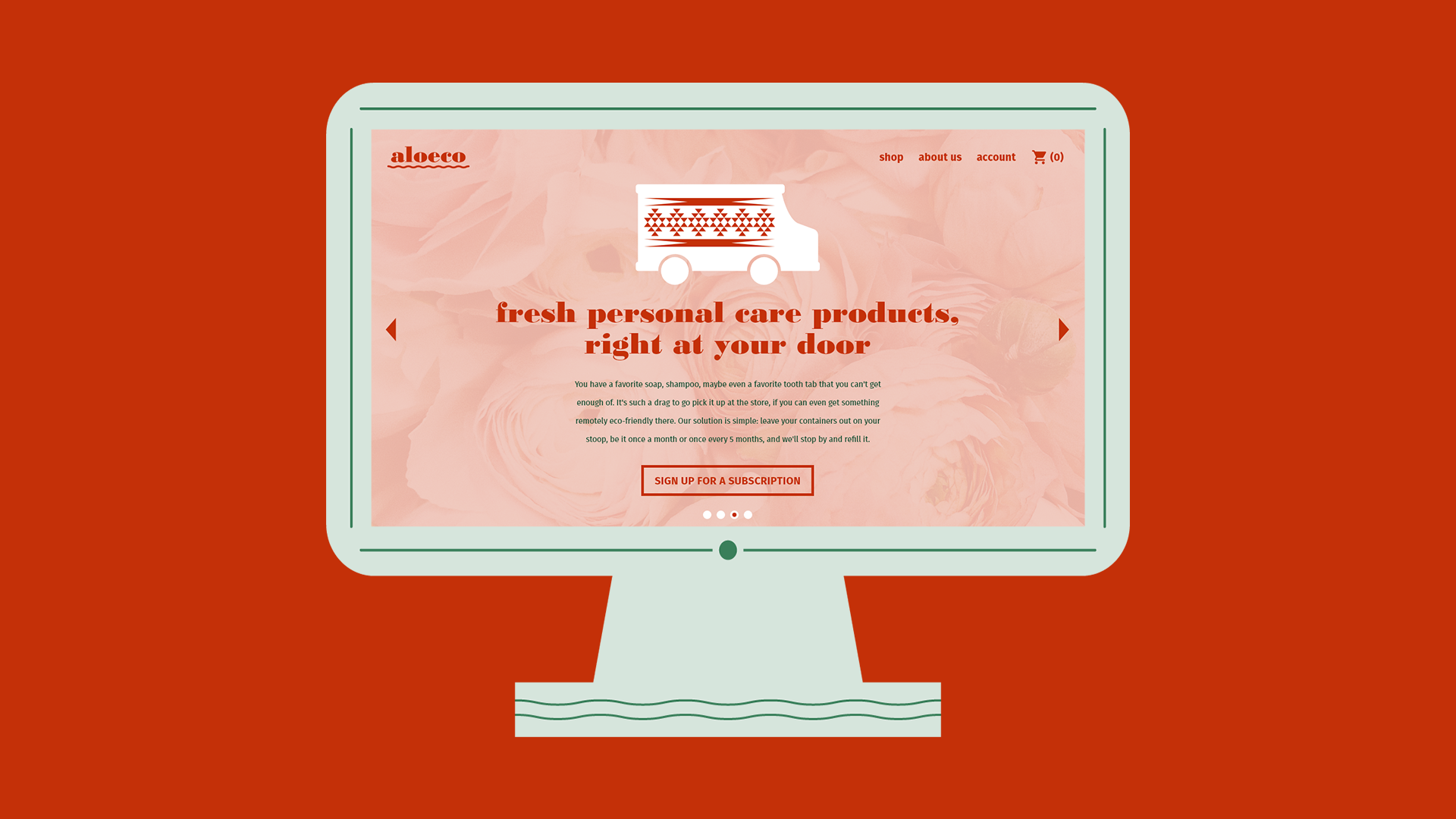
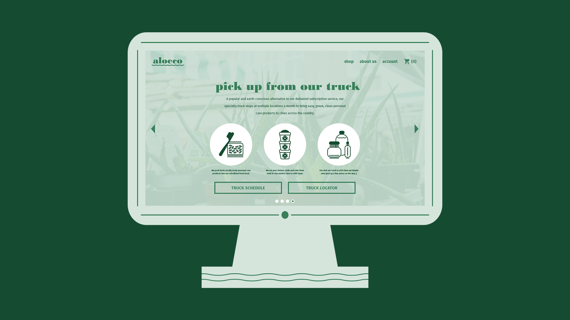
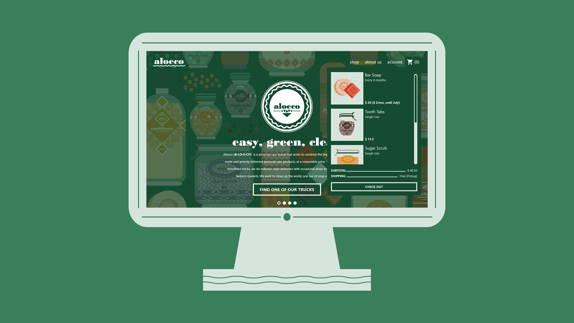
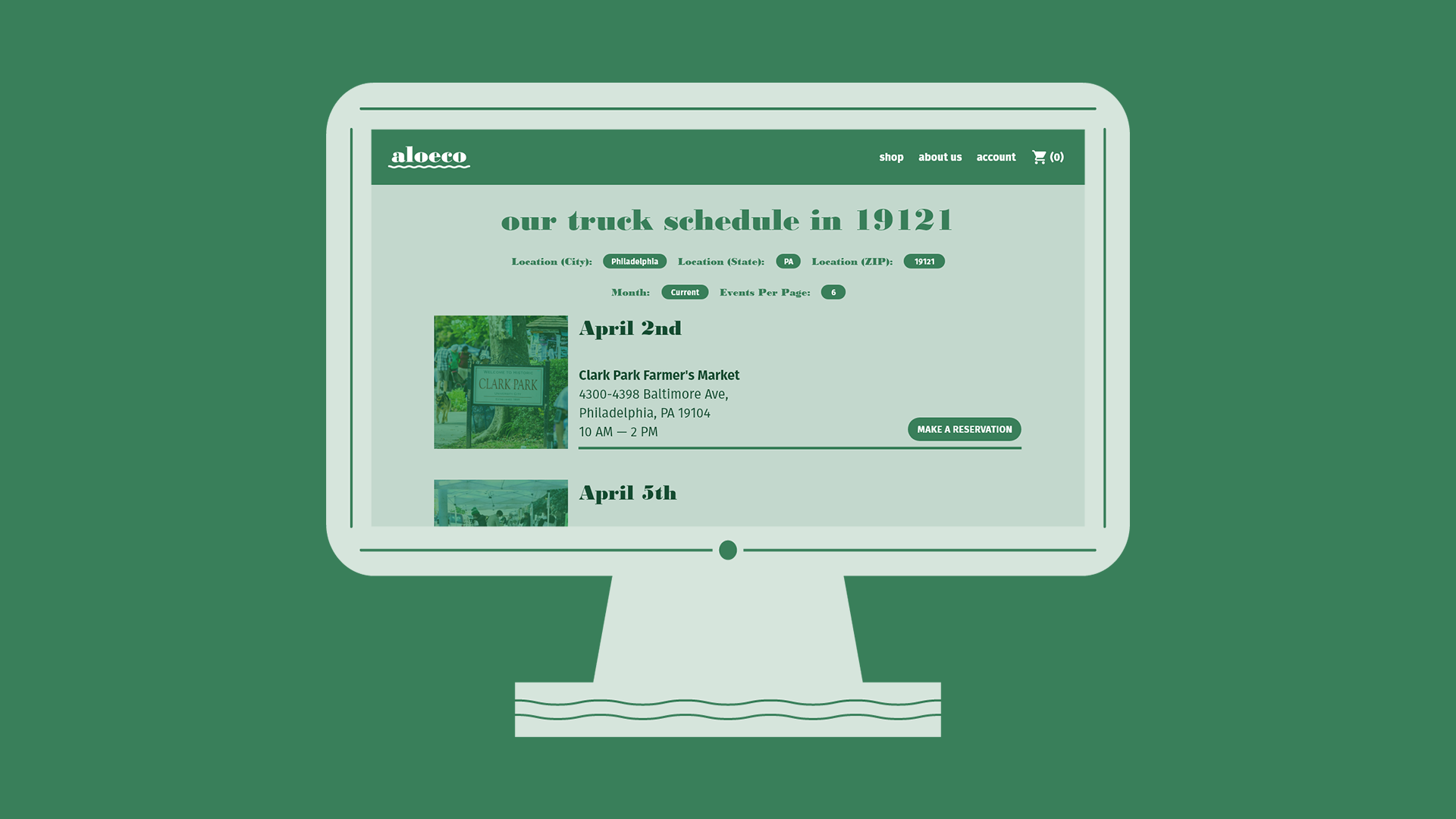
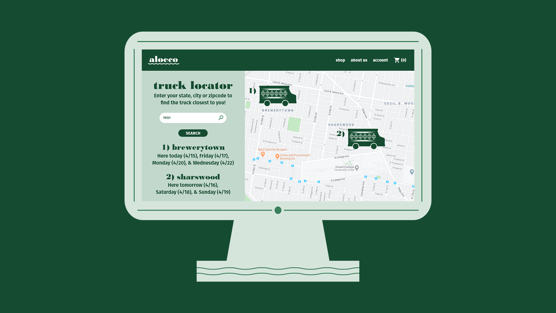
Aloeco (pronounced AH•LO•EE•CO) is a website and local delivery service of recyclable, reusable, or packaging-free personal care products. A small number of converted food trucks serve as the primary storefront and delivery system in effort to reduce the carbon footprint of long-distance delivery. A potential customer can visit the truck when it is parked for events like farmer’s markets and craft fairs, or have the truck deliver and refill containers left out on their doorstep. Aloeco makes switching to eco-friendly products easy and clean.
How it Began
The idea behind making a personal care brand comes from a recent interest of mine. Lately, I have been testing out new, eco-friendly hygiene products like bamboo toothbrushes, locally made soaps, and ethically made shampoo. In my quest to change my habits and educate myself on these products, I realized that there is a resistance to this kind of switch, for a number of reasons. Chiefly, eco-friendly products like these tend to run expensive, oftentimes at the cost of cleaning efficiency. People are used to personal care products that are cheap, do not require much habit-changing, and are ruthlessly effective at cleaning. For items like tooth tabs, shampoo bars, and package-less floss, consumers are resistant because they are used to doing it the way they always had.
Secondly, I noticed resistance from people who assume that personal care is an essentially feminine activity. While I recognize that I am not an average young man, I have always taken hygiene seriously, and want to see my male peers do the same. With the growing trend of acceptance and celebration of self-care, men who were previously resistant to the idea are starting to catch on to the idea of using quality products to stay clean. If presented with clear information and quality products, I believe a lot of people who dismiss personal care would be slowly persuaded to change their minds.
Finally, when I really started digging in and researching eco-friendly personal care, I realized something crucial; can it really be called eco-friendly when these items are shipped by huge polluters like vans, trucks, and planes? While Rome was not built in a day, changing habits like frequently purchasing items online can be cut back relatively quickly if the means to do so are present. If someone has access to eco-friendly products within easy riding distance in their town, there would be no need to have them shipped. The convenience of the internet could still be used to set aside some product to pick up after work, but otherwise such a vendor would be a new fixture to promote healthy habits.
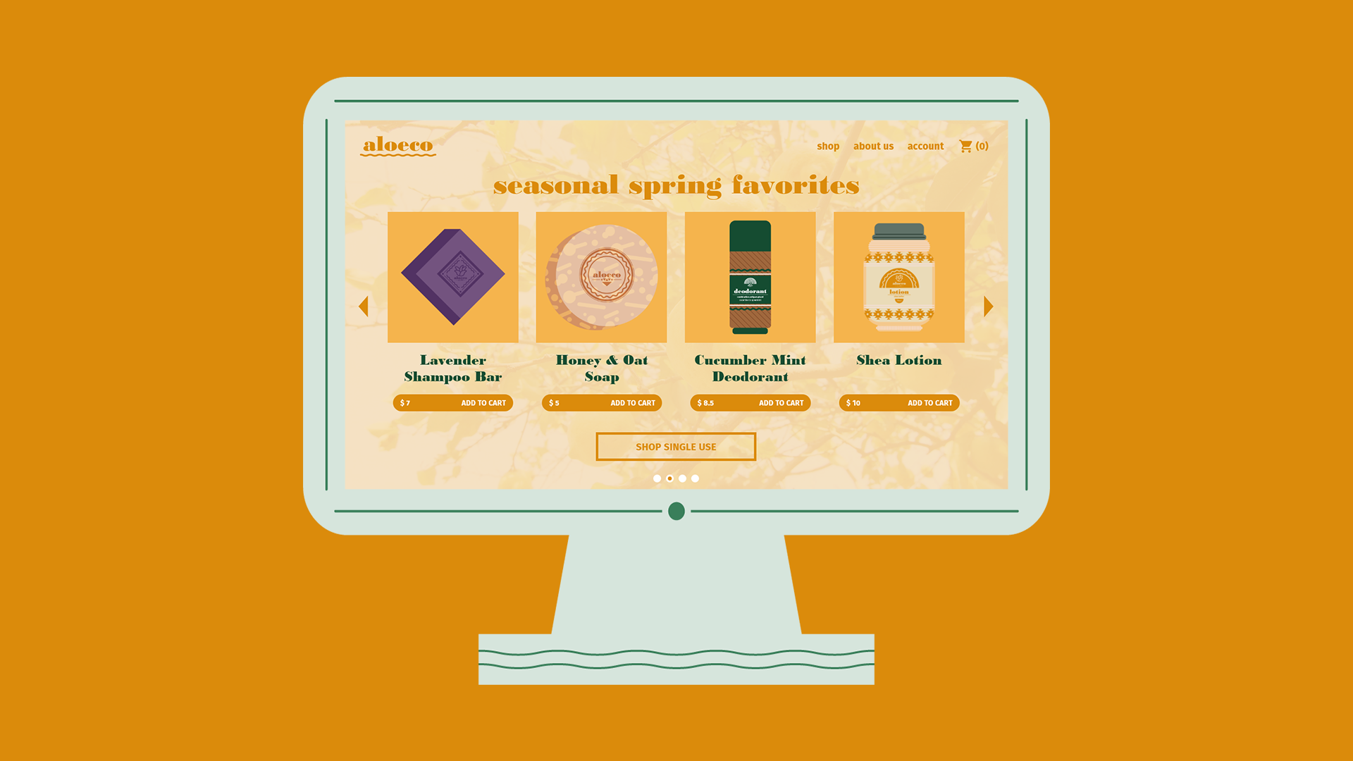
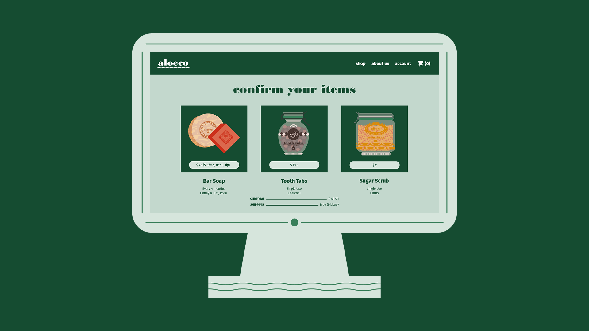
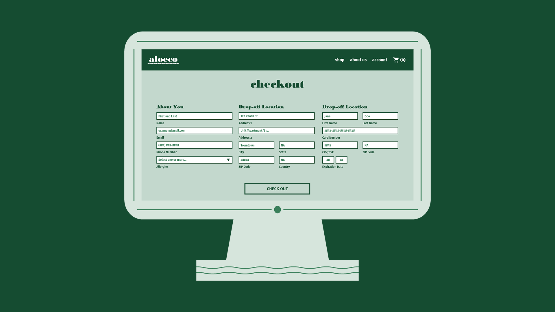
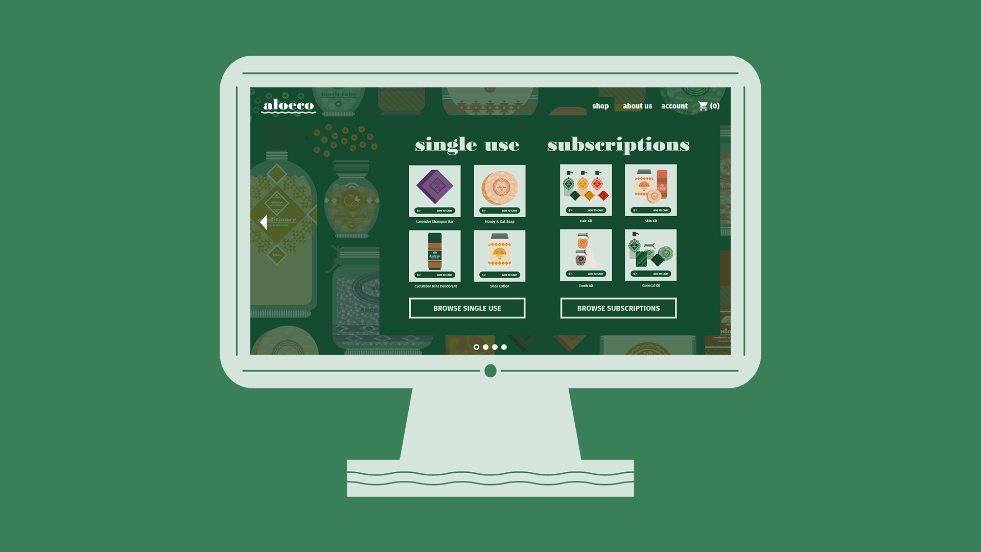
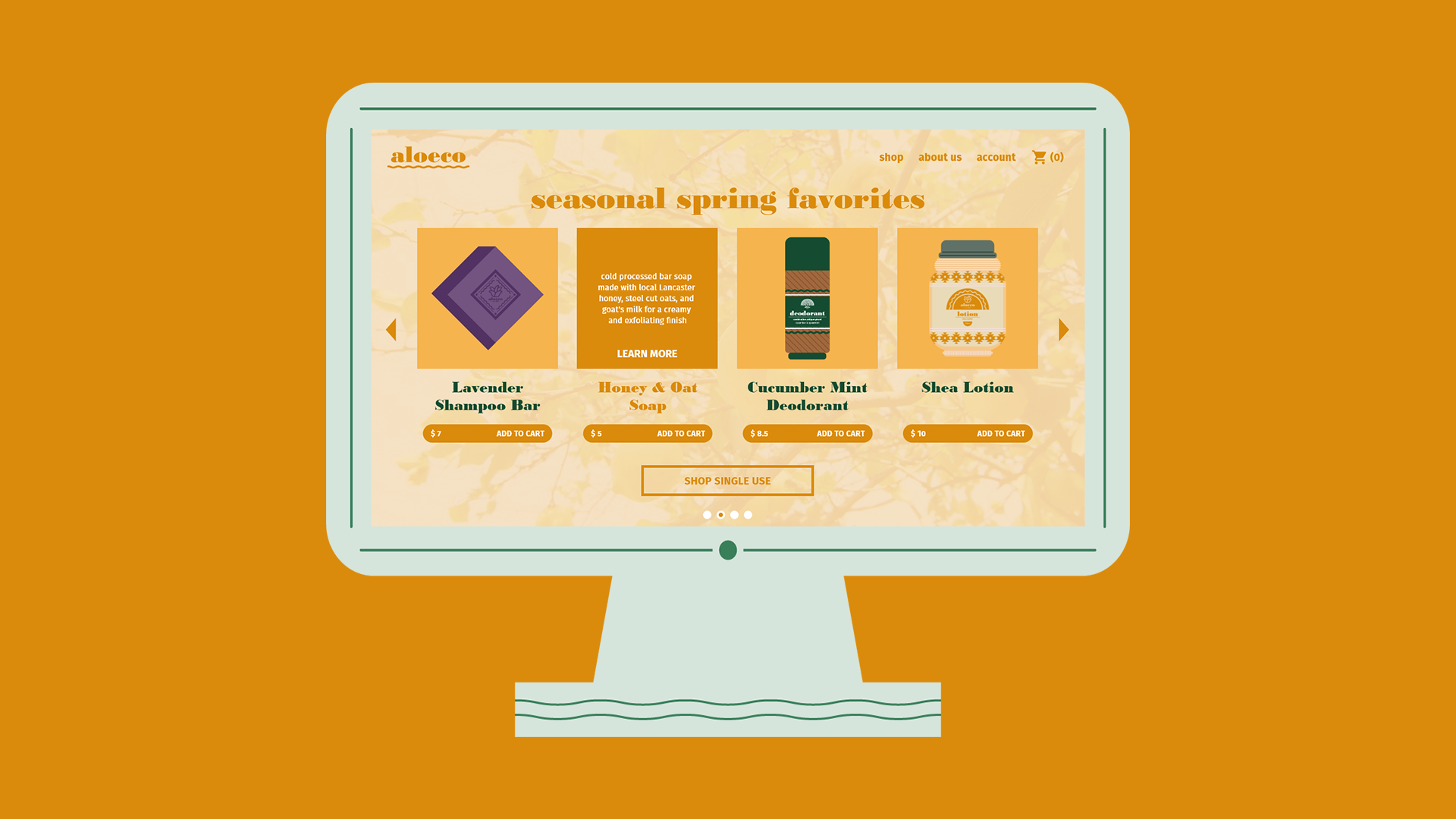
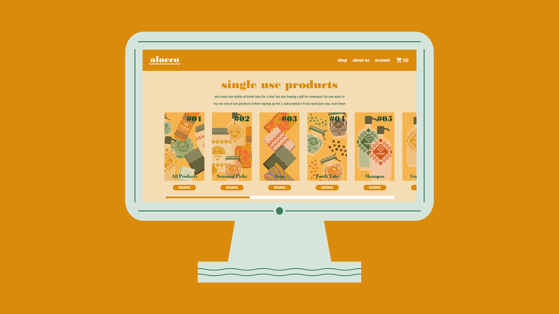
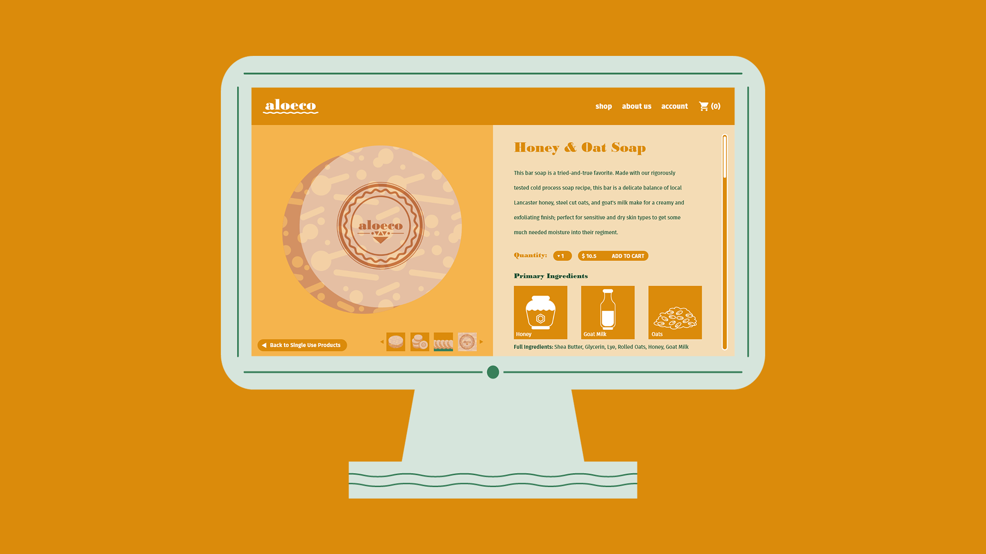
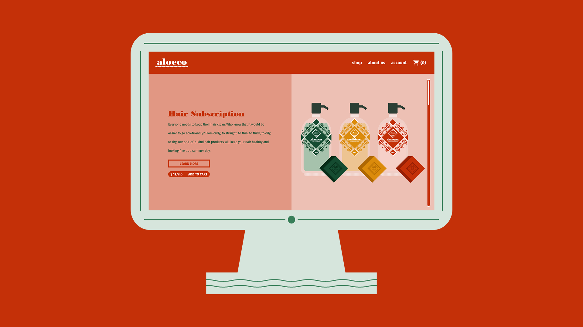
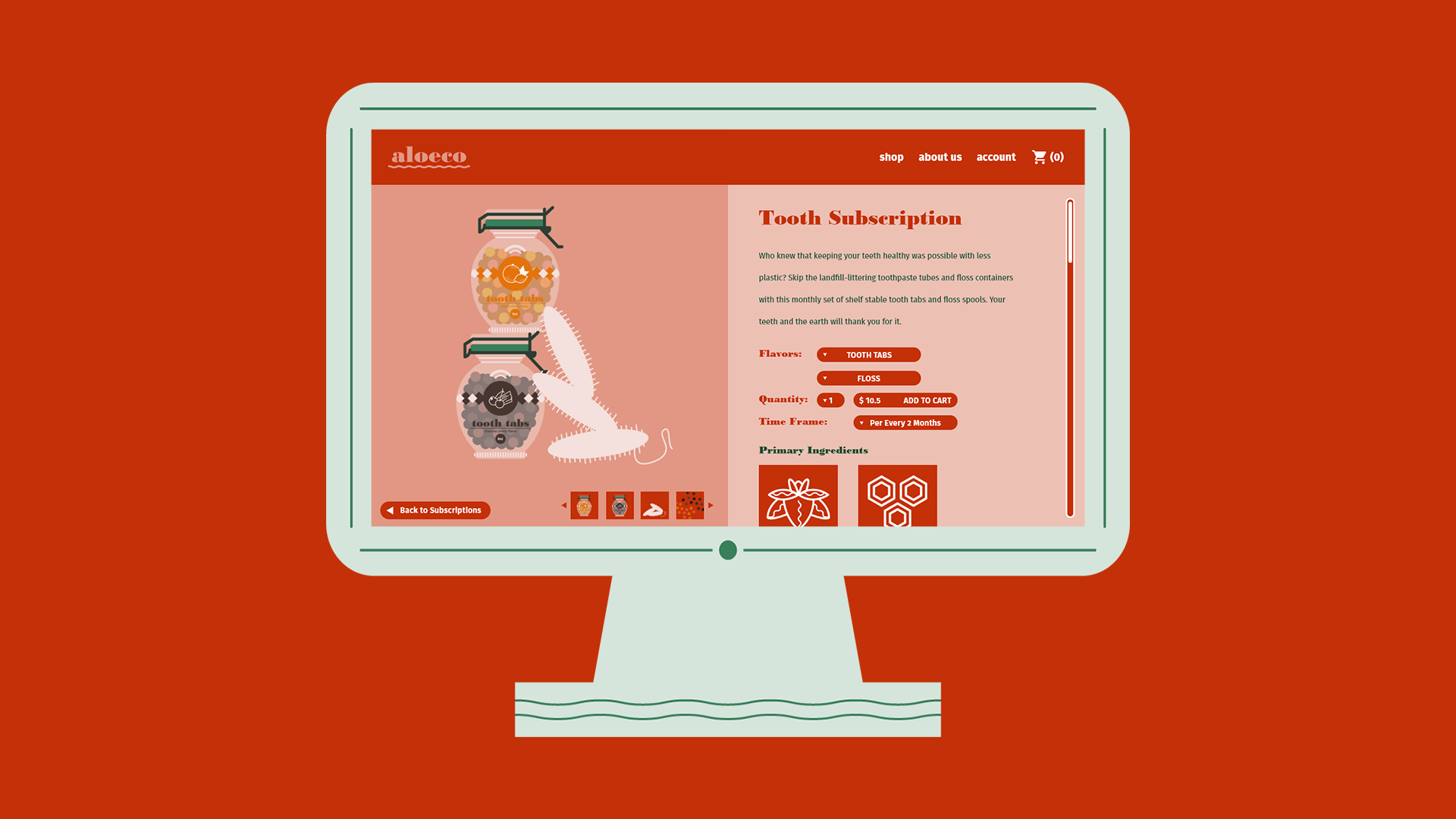
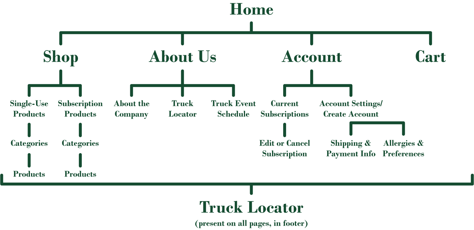
Website
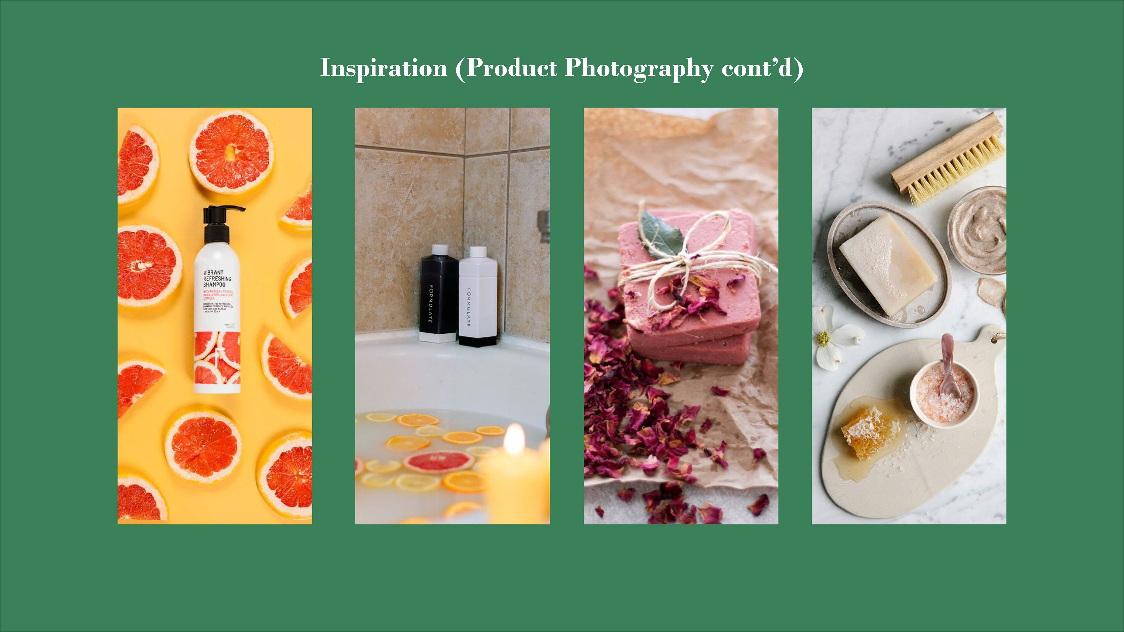
The first thing that will draw people in is a beautifully designed, easy-to-navigate website. After extensively reviewing other personal care brand websites, one of the things I realized was that a lot of them followed the strict, cookie-cutter template of a commerce website. There was little variety between pages beyond imagery for products, cluttered headers and footers, all set against a stark white background. Therefore, the first set of challenges for Aloeco’s website was to give it great variety, exciting visuals, and uncomplicated user interfaces.

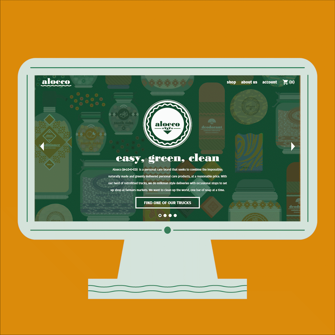
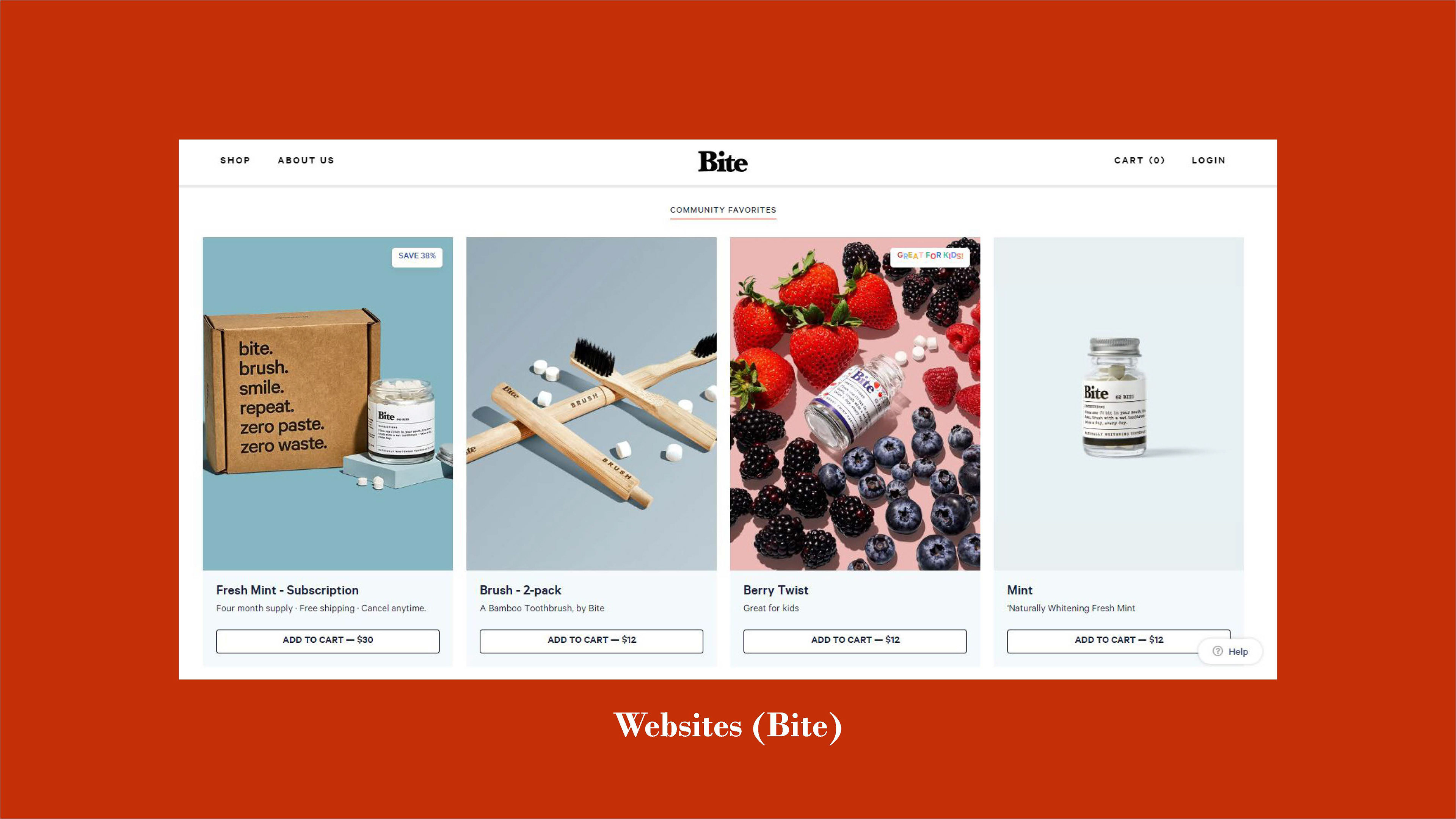
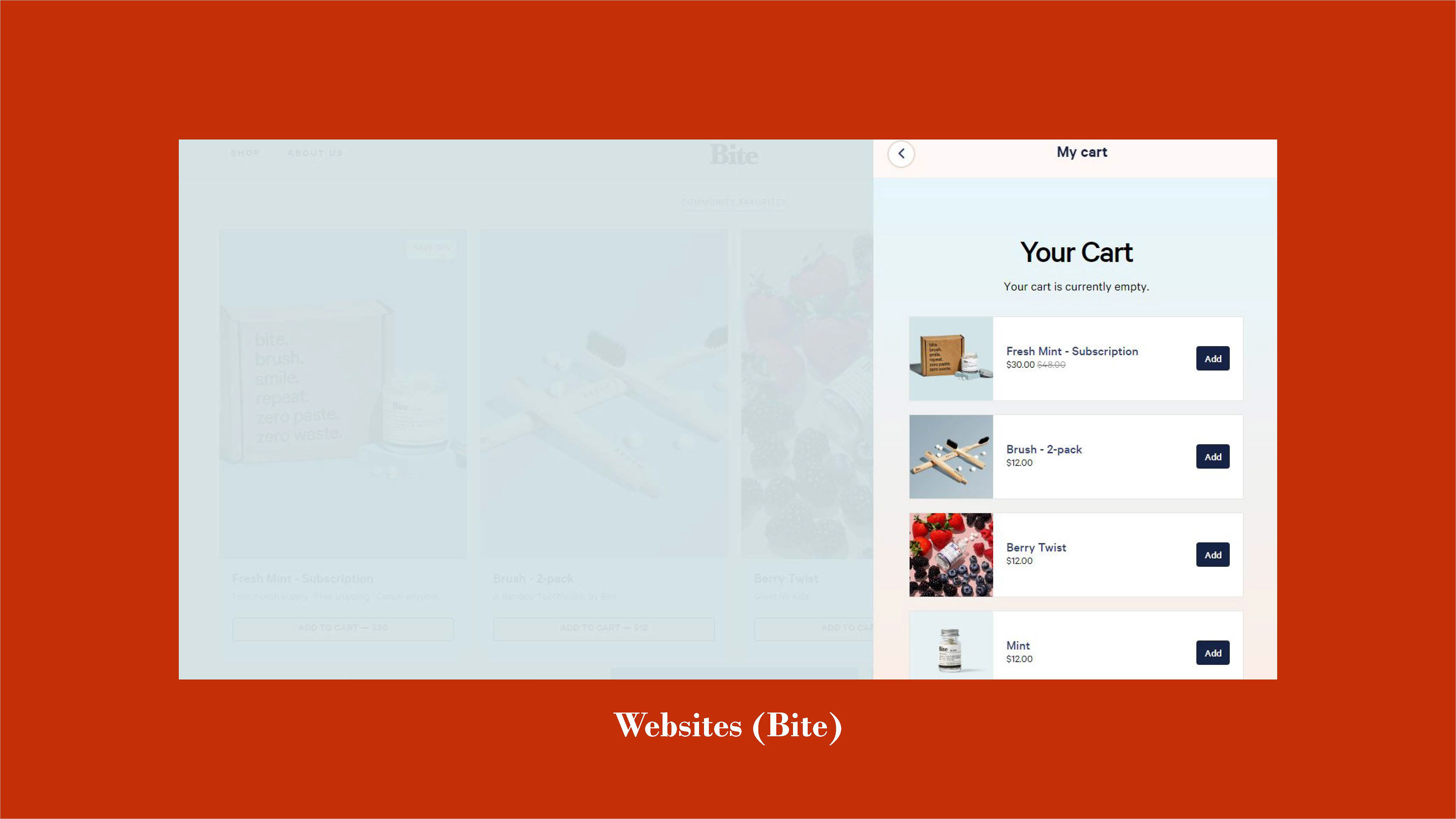
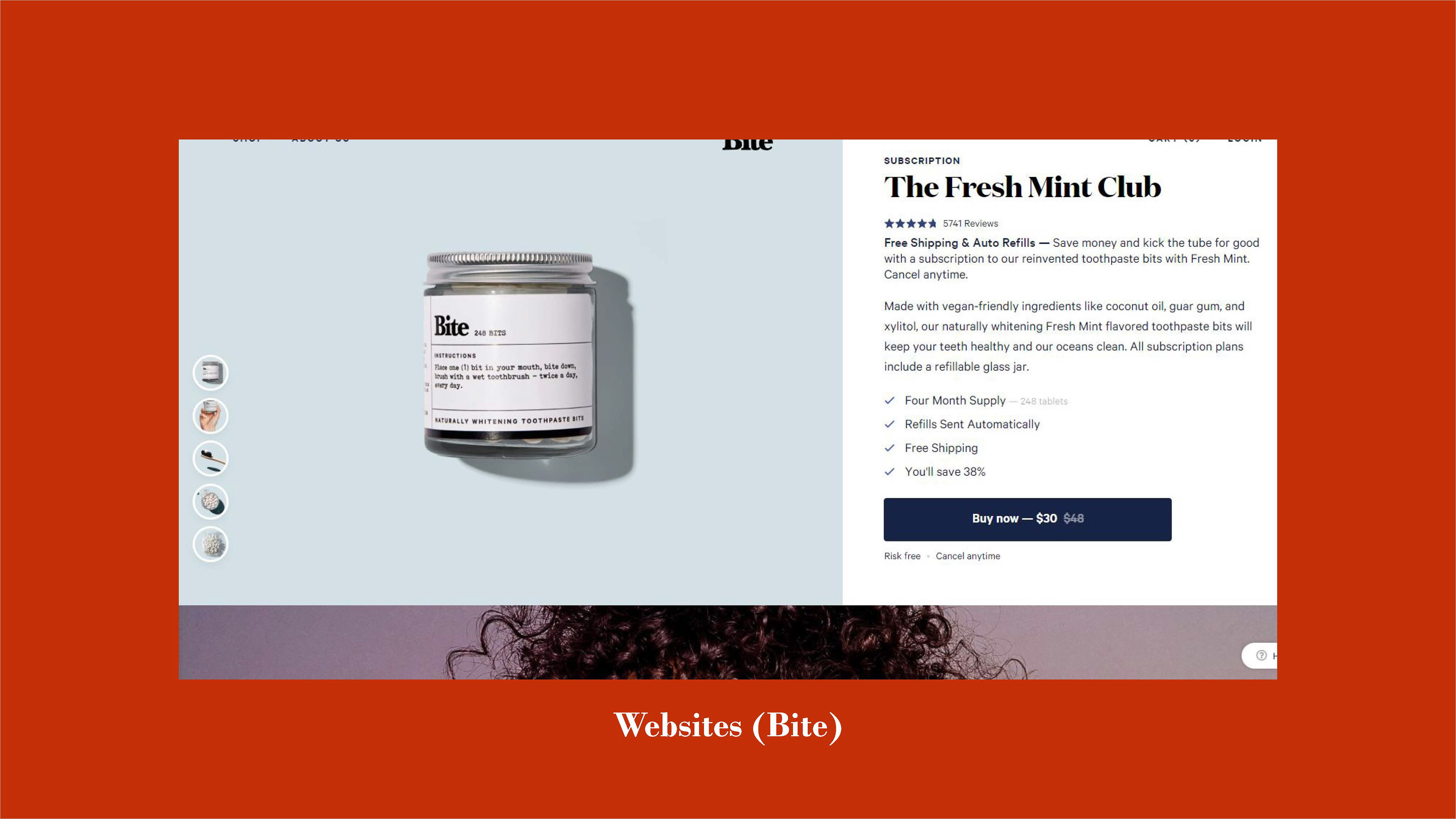
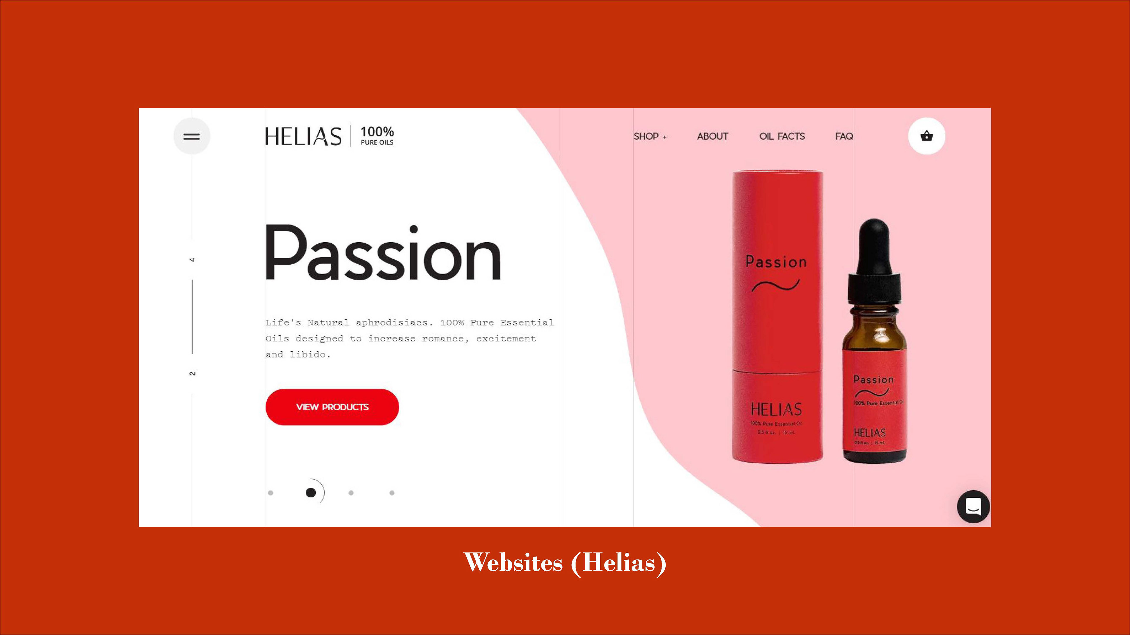
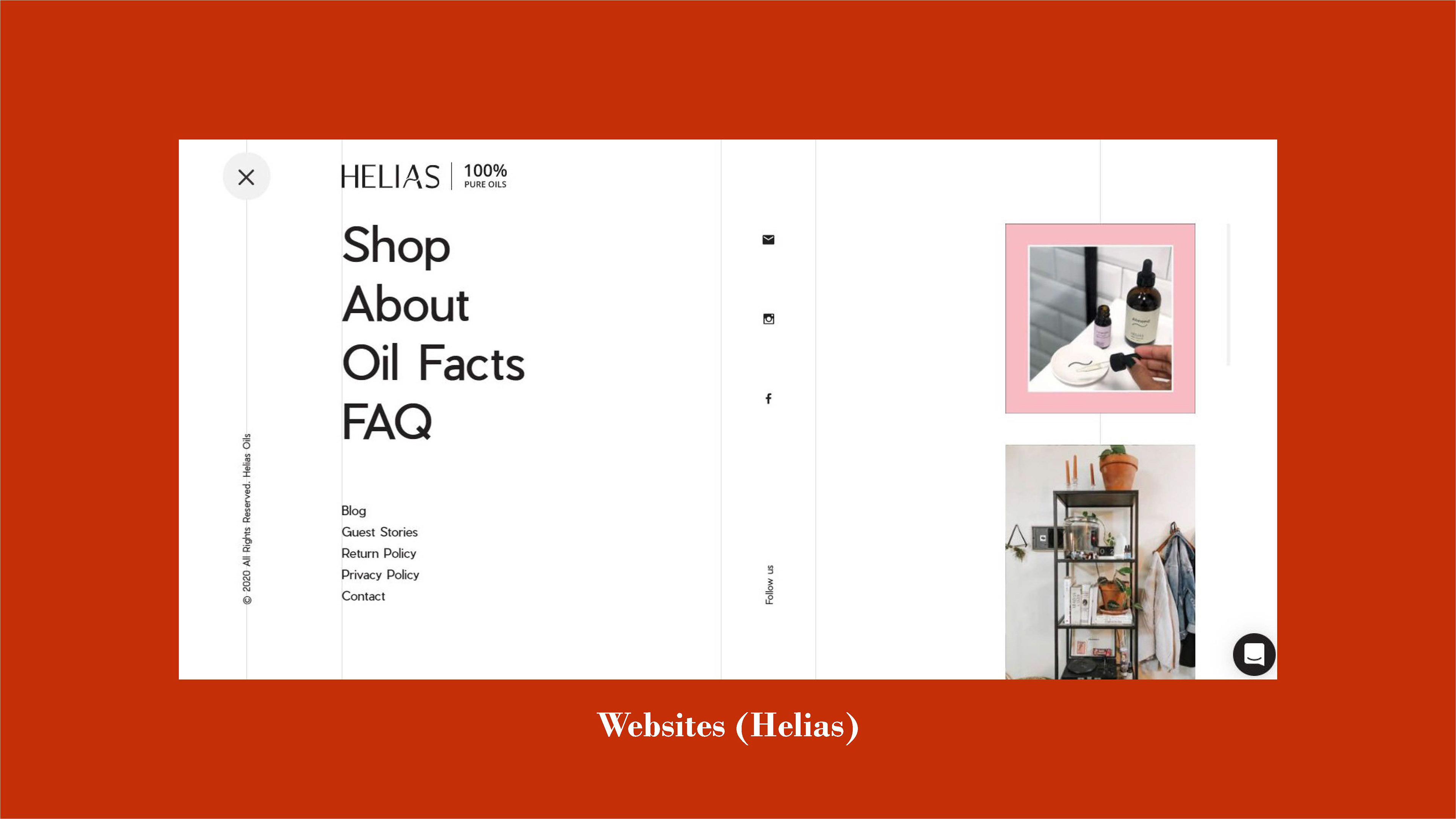
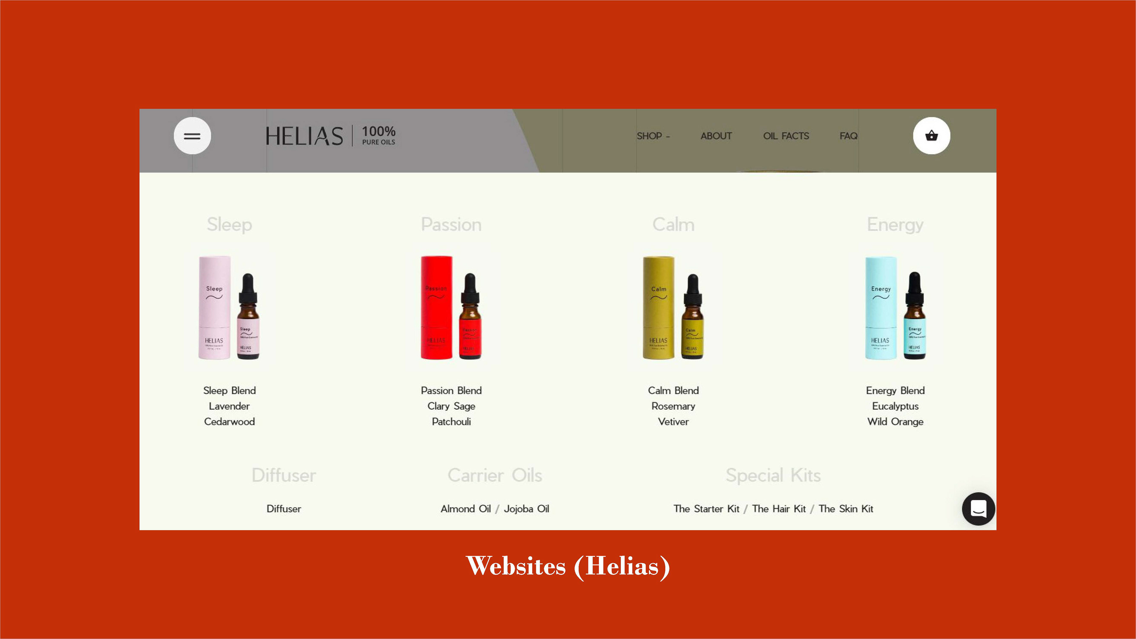
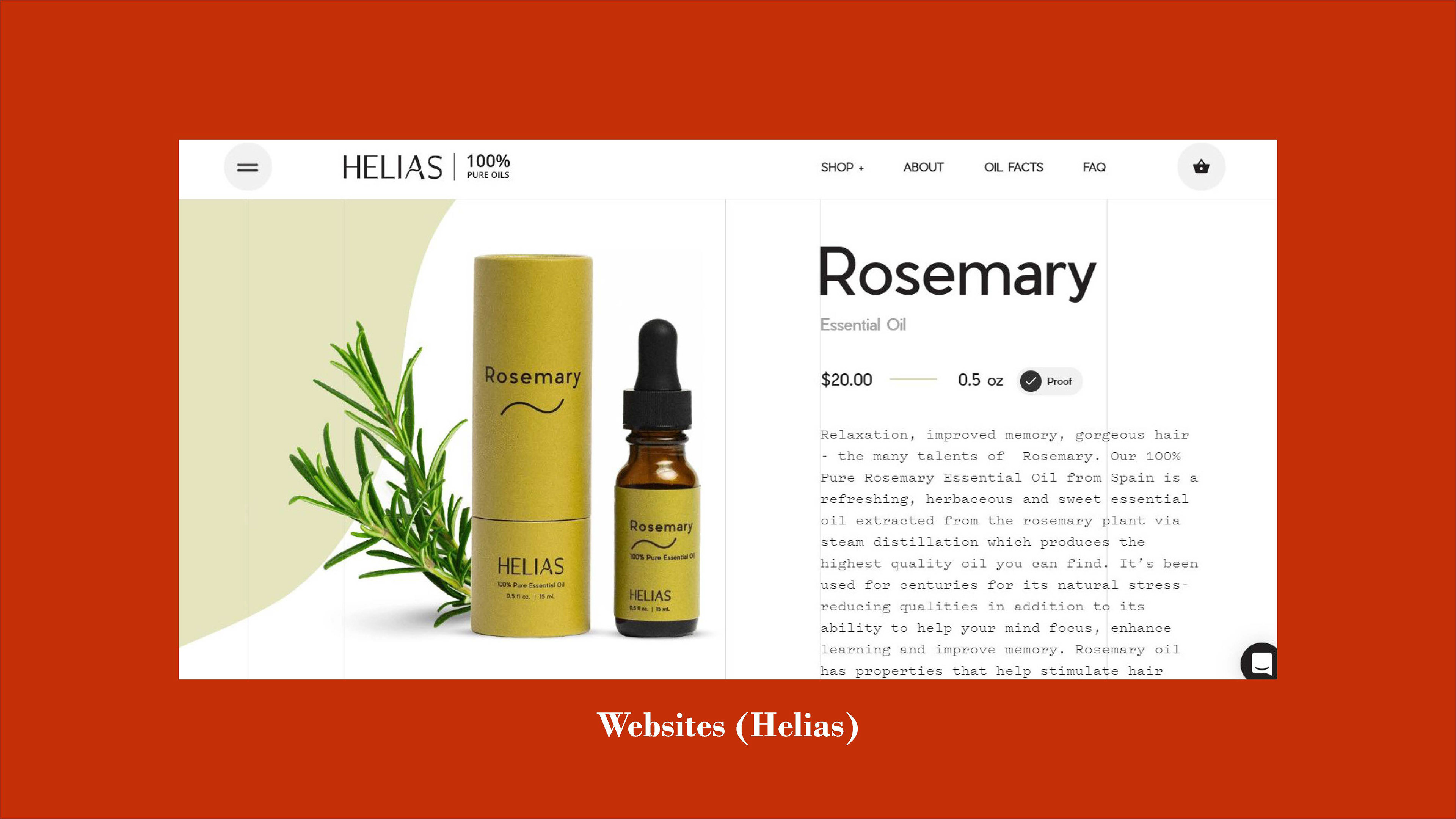
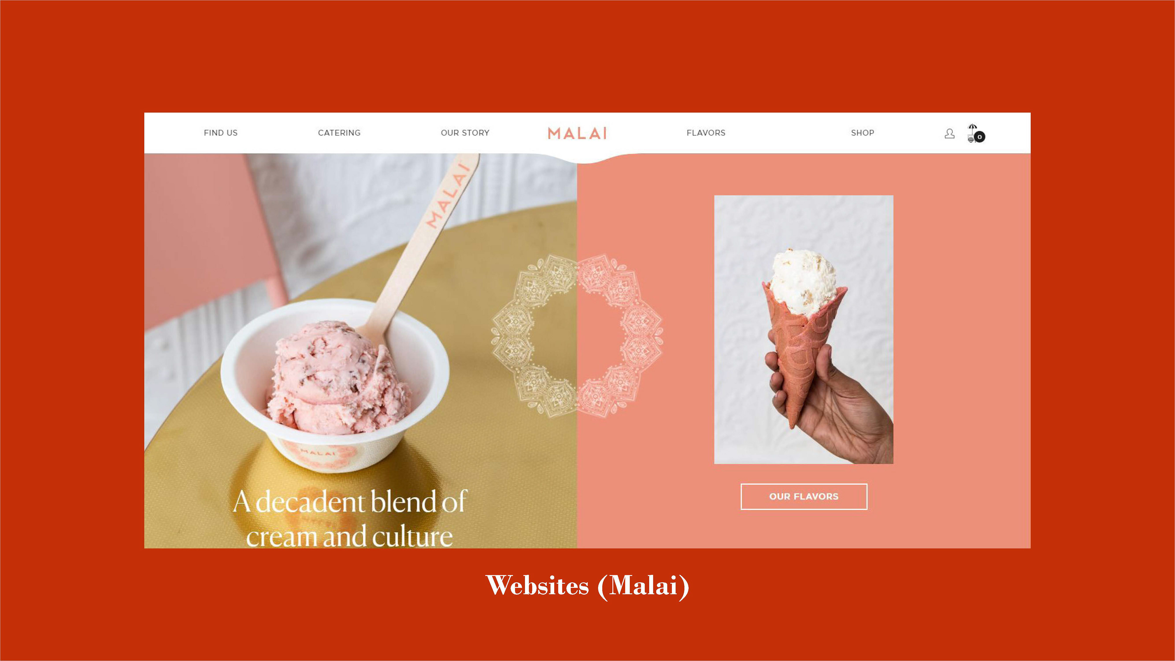
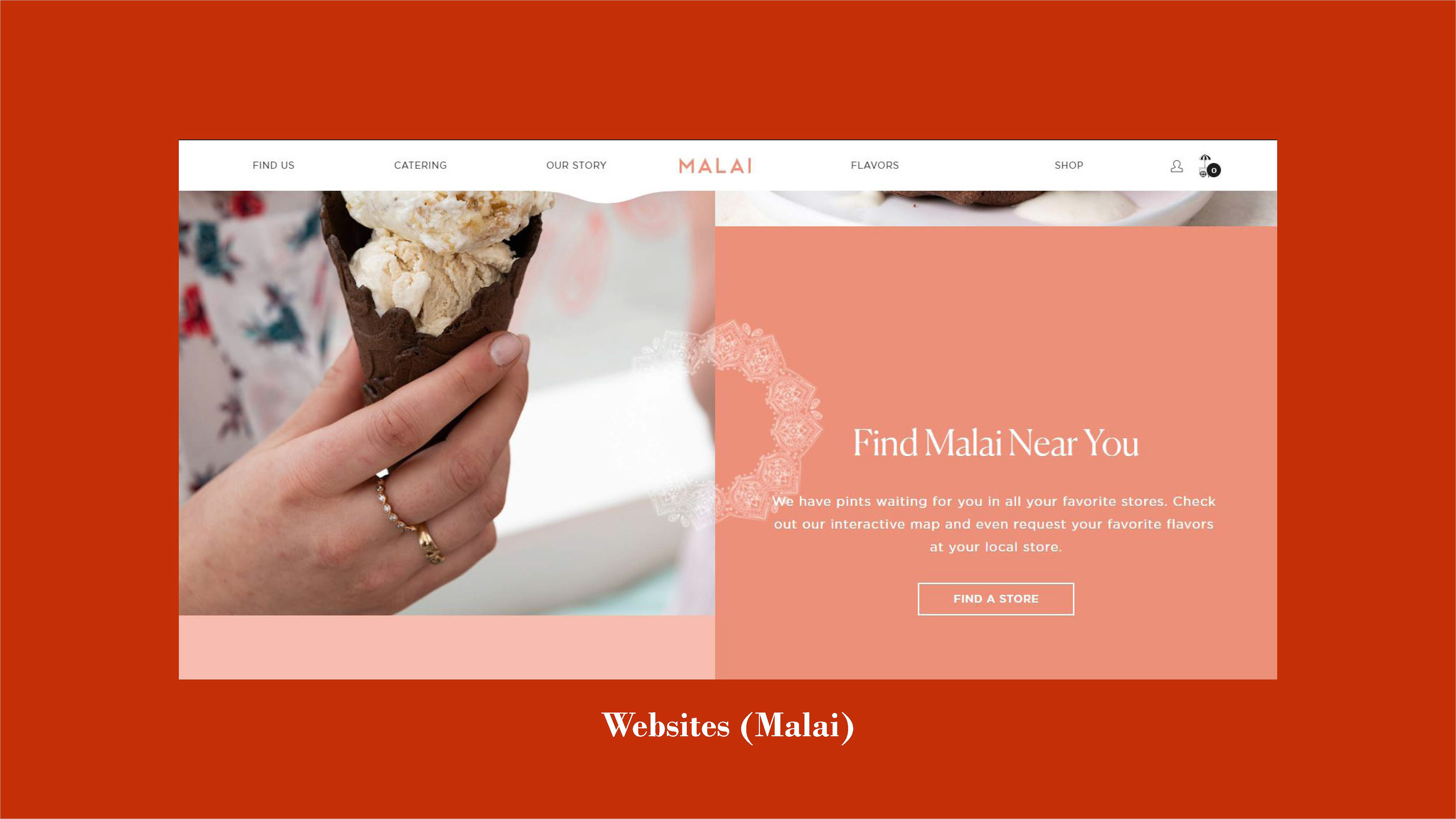
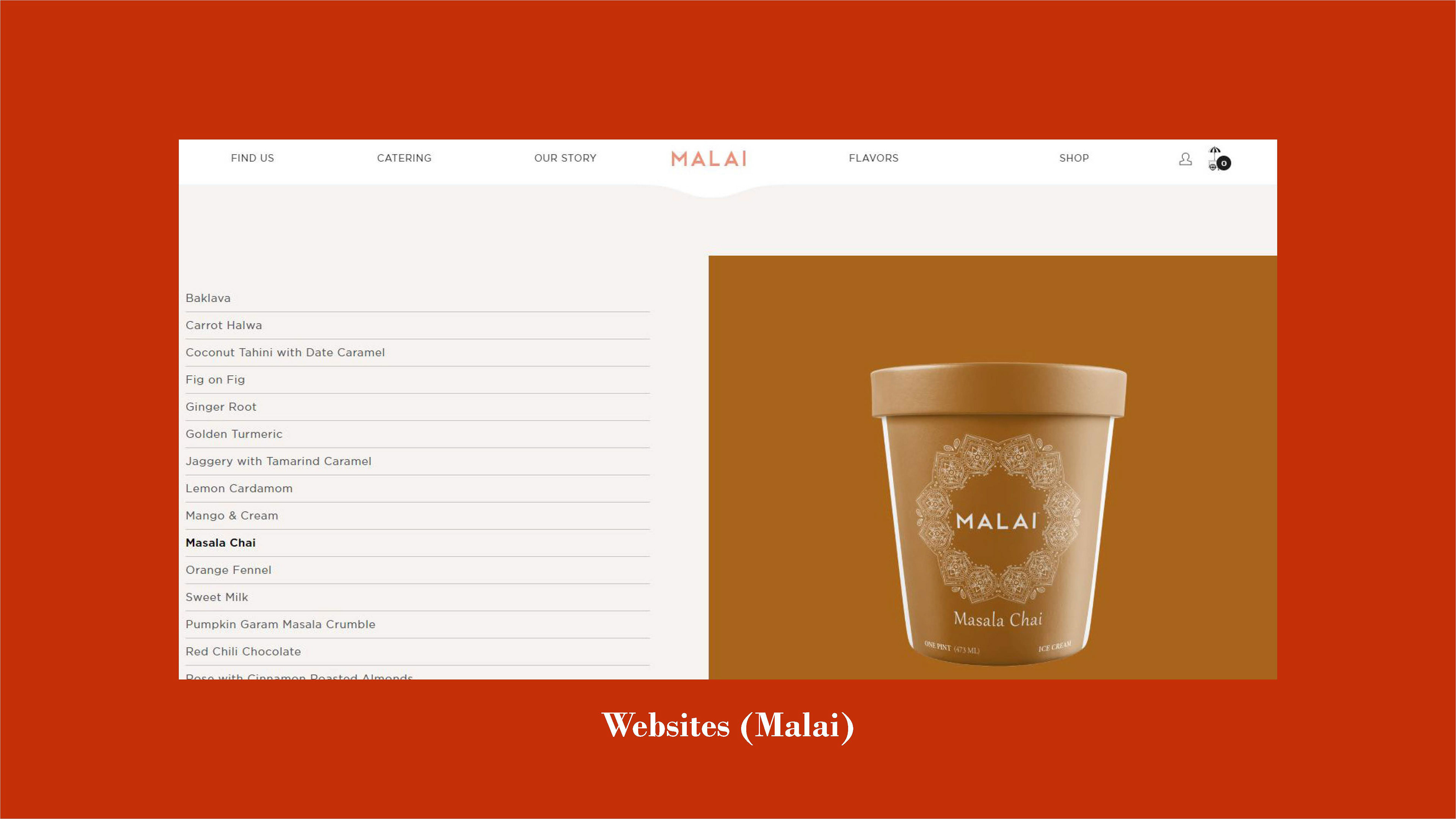
From there, there was another puzzle to ponder: movement. How does this website feel as a user moves through it, and navigates its pages? Much like their basic layouts, the commerce sites from my initial research limited themselves to up and down scrolling. However, other sites like Bite Toothpaste Bits, Helias Oils, and Malai Ice Cream implemented methods of animation and parallax that created deep visual intrigue; inspired, I followed suit, including several different types of motion where possible.
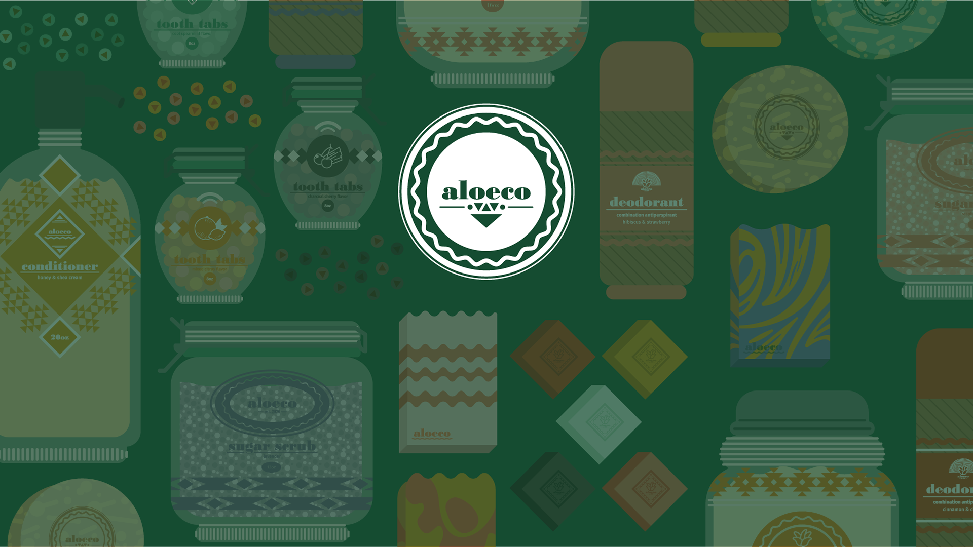
Brand Assets
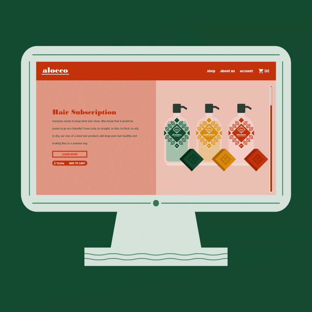
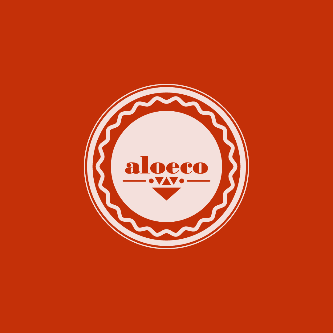
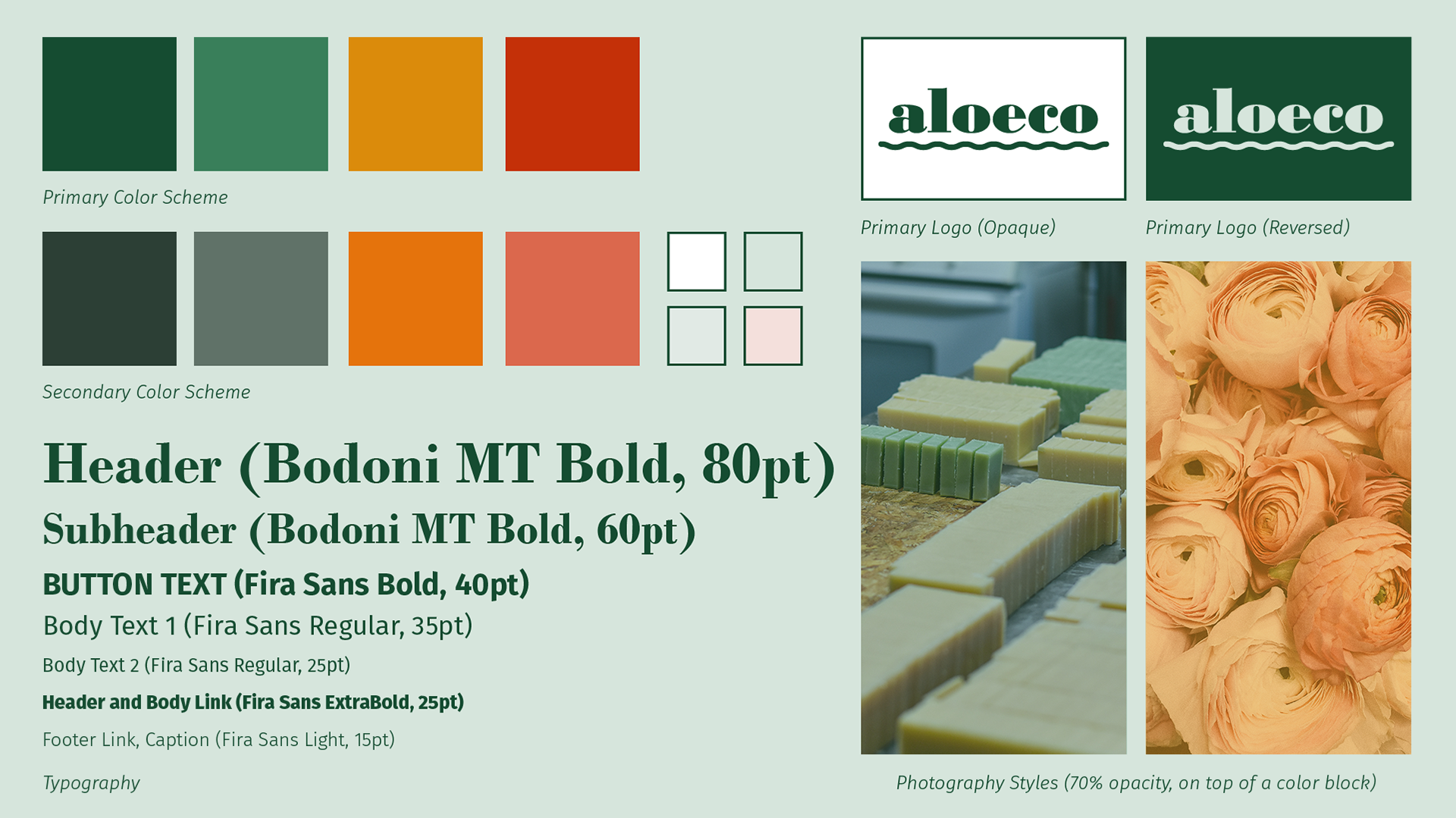
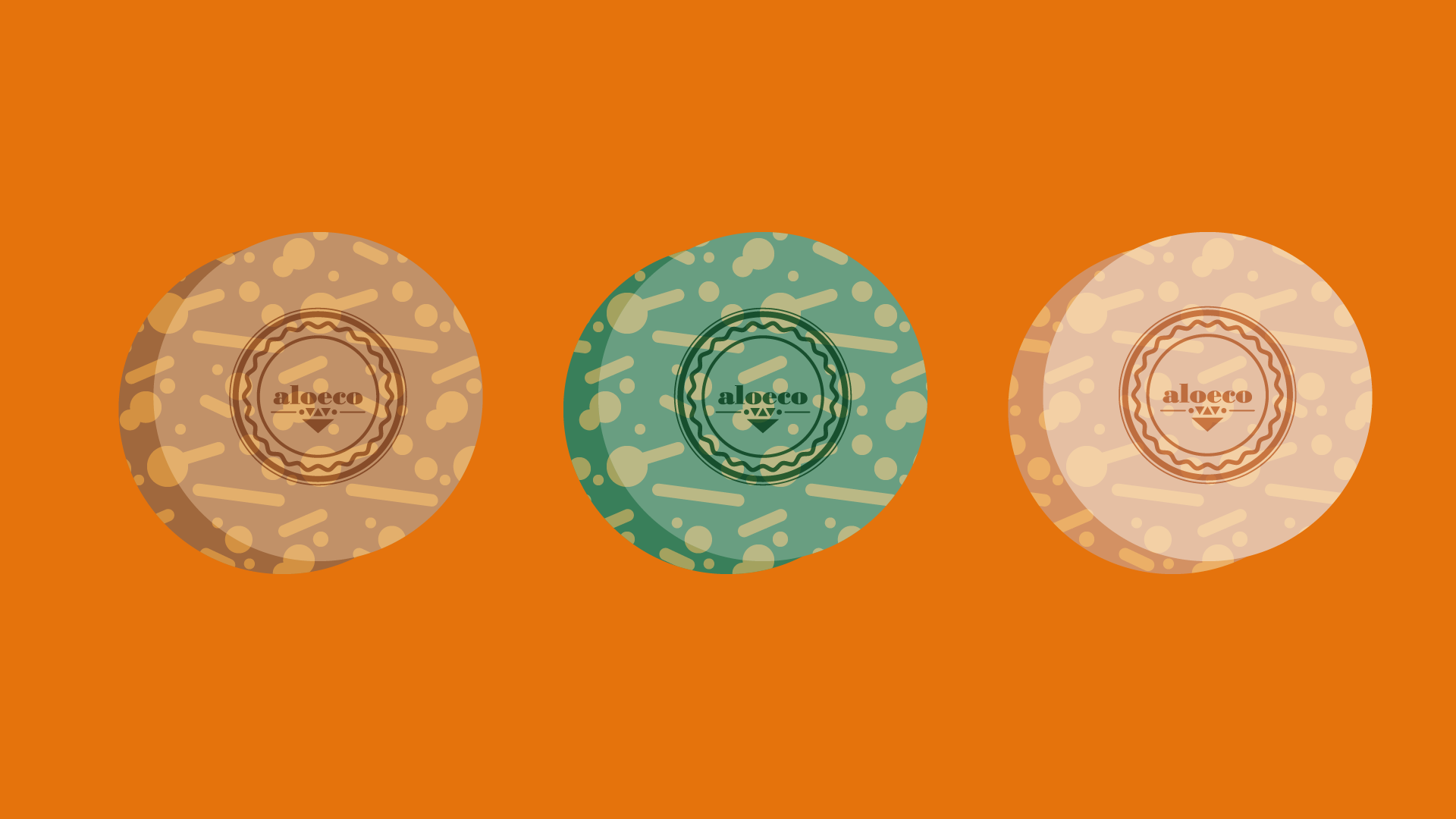
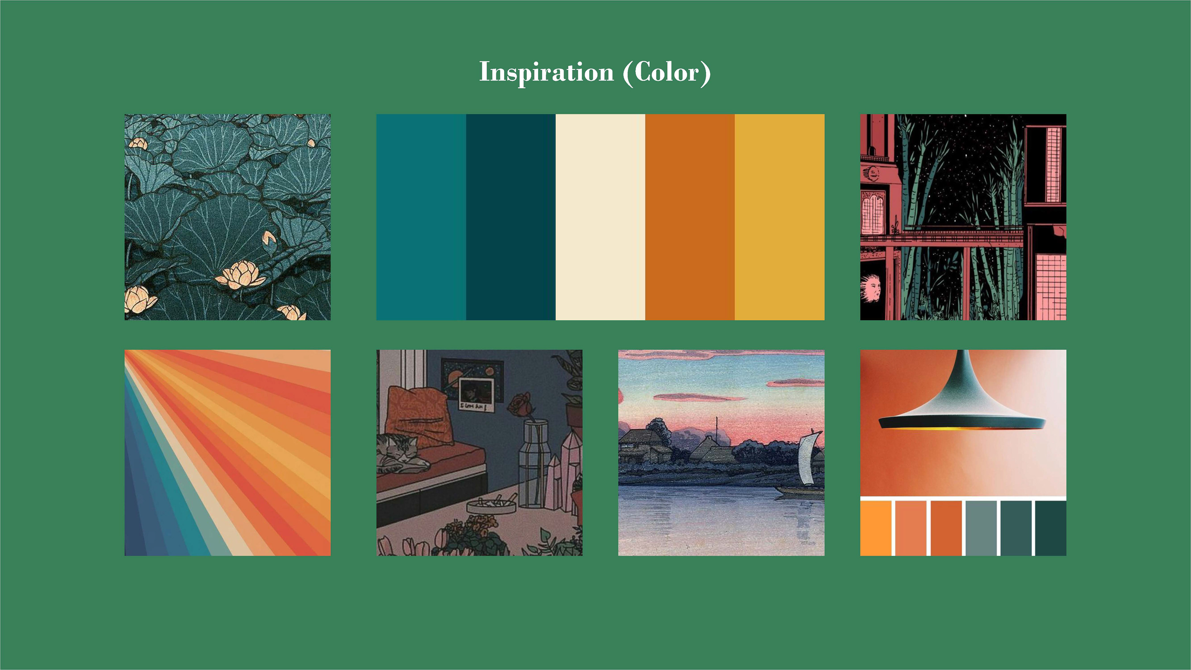
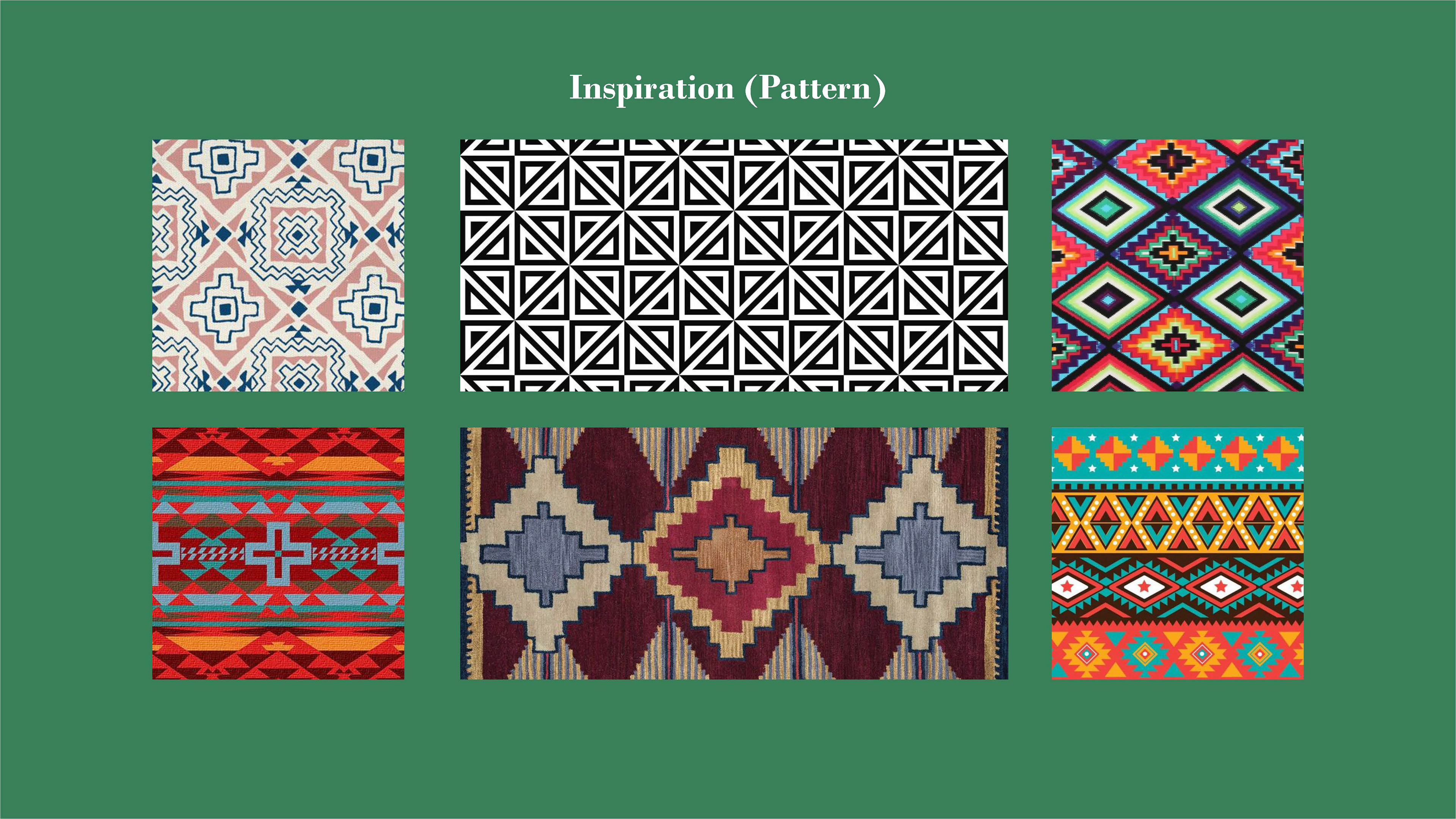
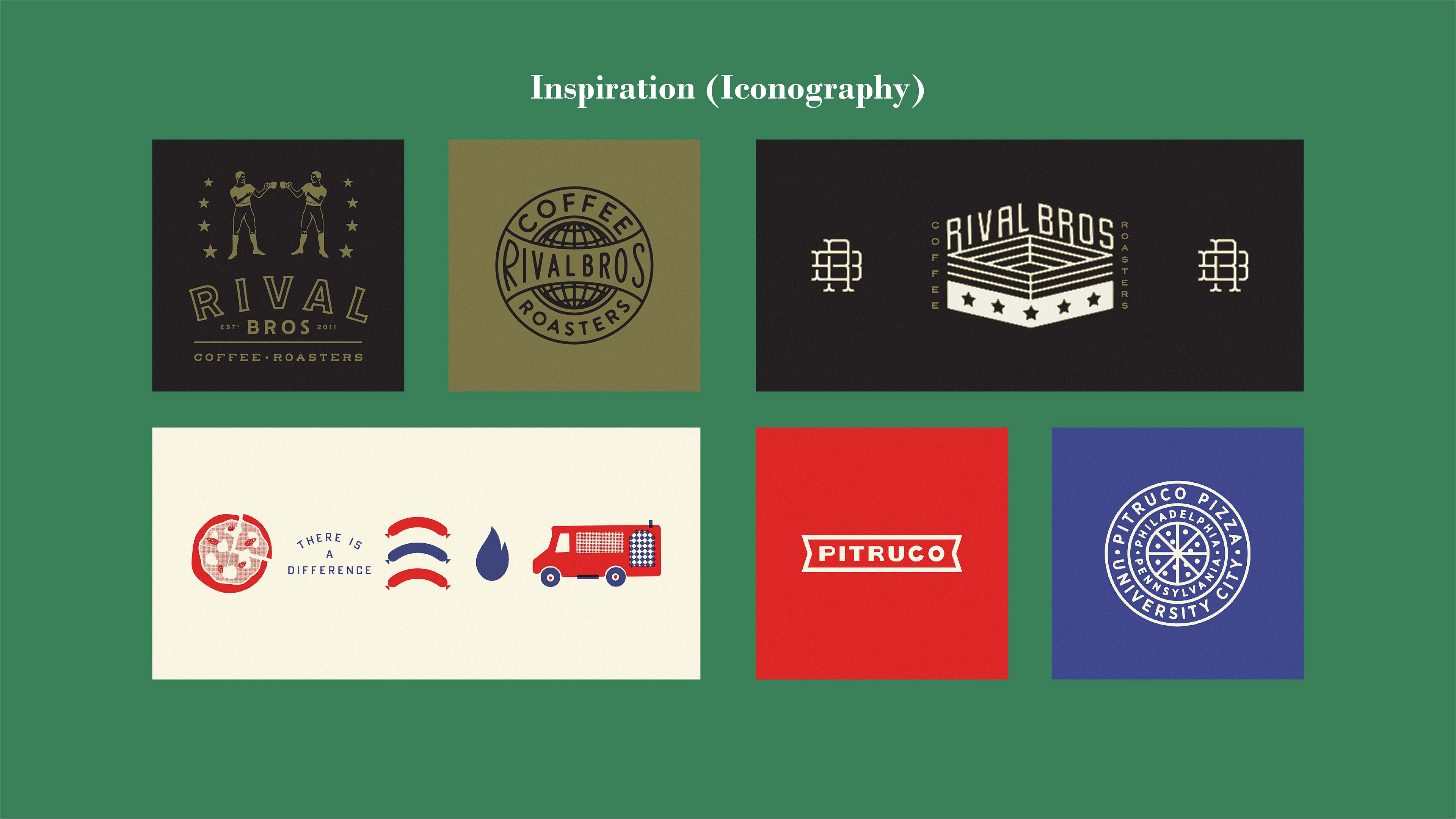
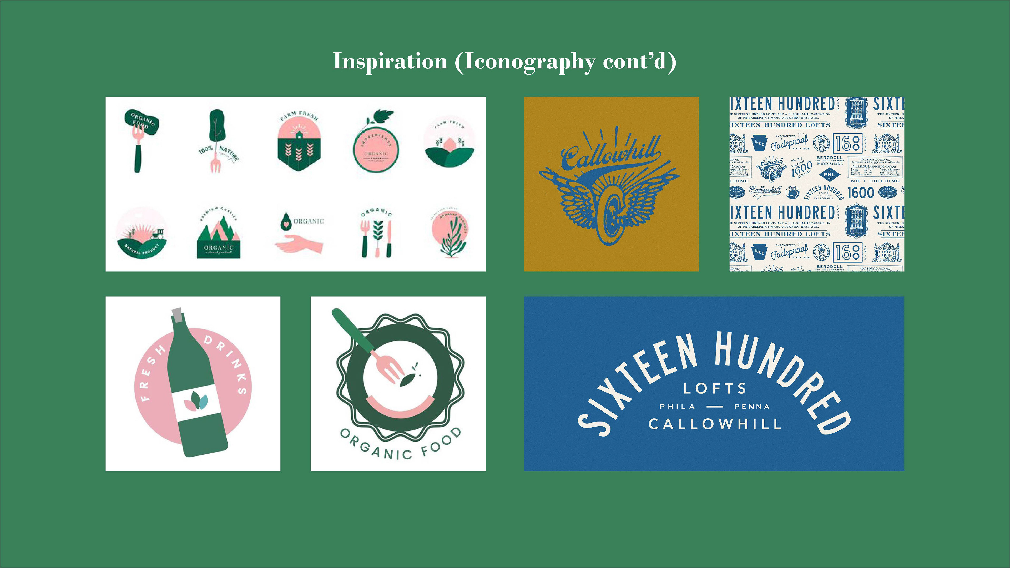
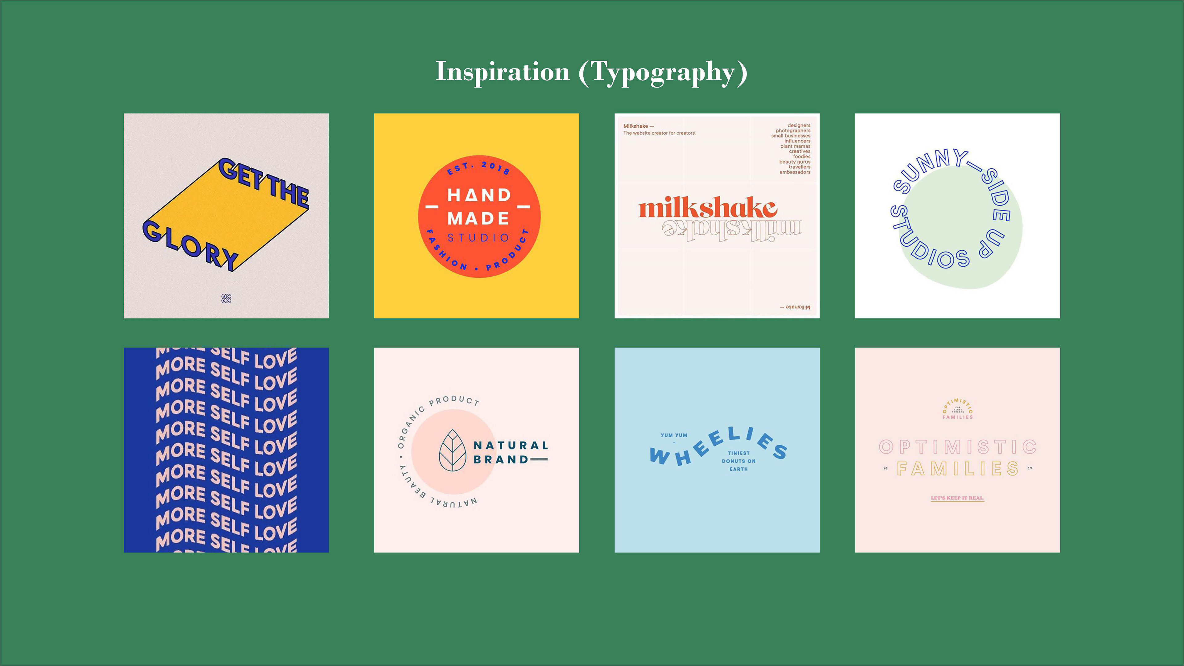
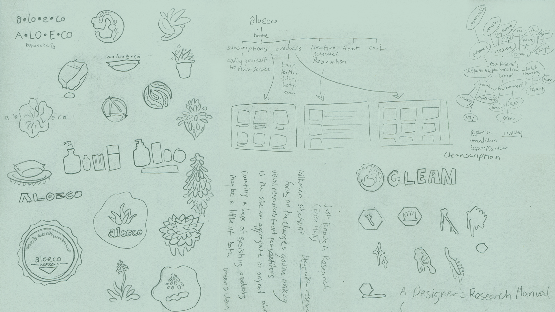
To give Aloeco a strong foundation, there had to be a balance struck between simplicity and excitement. Clean vector illustration conjunction with a juicy, attention-grabbing title font like Bodoni proved successful, but why stop at just one logo? With a brand like this, operating widely through several different applications like web and packaging, seeing the same logo slapped onto each label would get boring quickly. To combat this, I created several different wordmark logos, icons, and illustrations to be applied across the brand. This logo tapestry, as best explored by Philadelphia-based design studio Mellow Gold, shows a wide amount of marks that work as well together as they do alone.
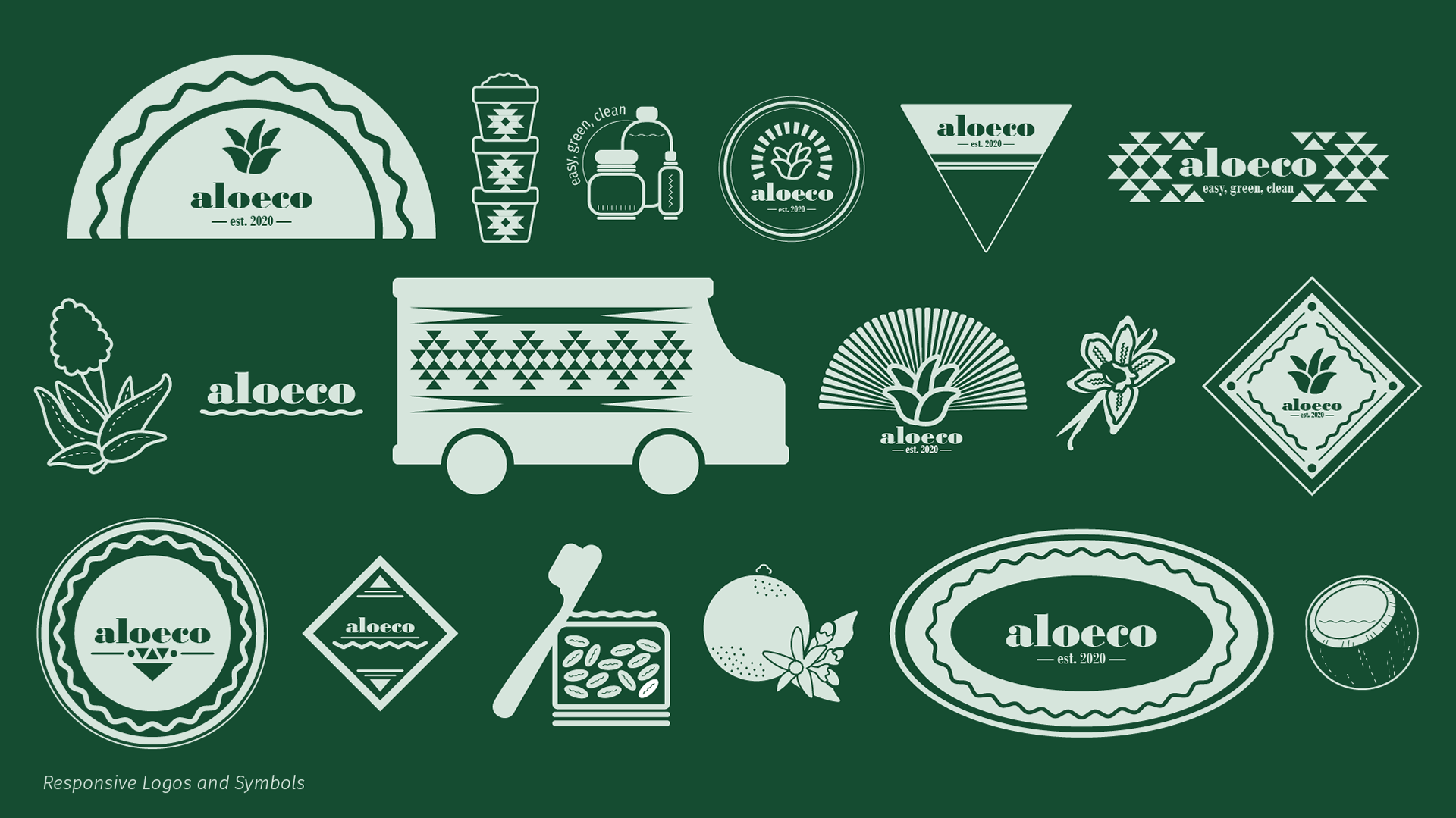


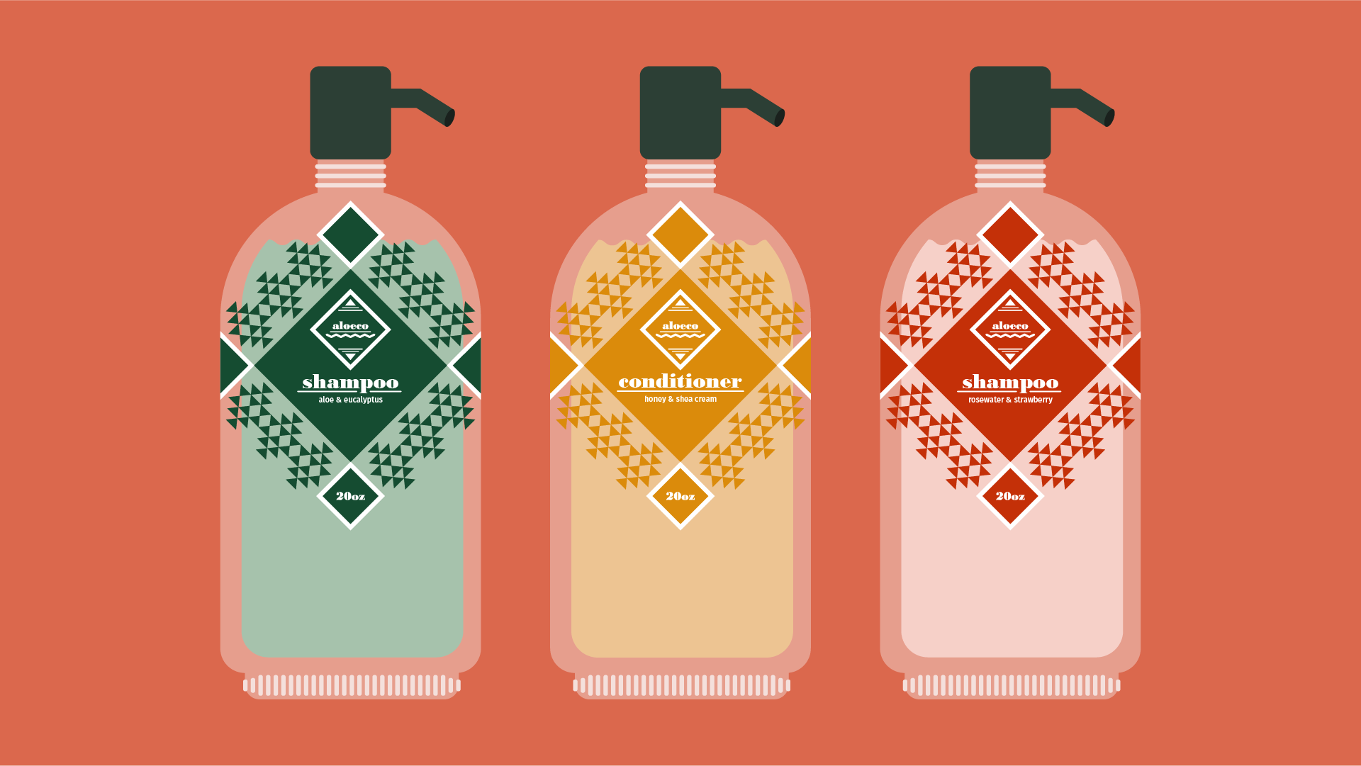
From there, the detail work of making sure these elements work together fell into place. For a significant amount of time, the colors of this project did not come naturally. I was stuck in my comfort zones of neon green, blue, and orange, which all turned out too loud and atonal to the approachable nature I was striving for. After many revisions, I came to incorporate more of a laidback, autumn-inspired color palette. These specific shades of green, yellow-orange, and dusty red provide the perfect balance between strong visual interest and contrast, the feelings of nature, and the energetic flavors of home-made personal care products.
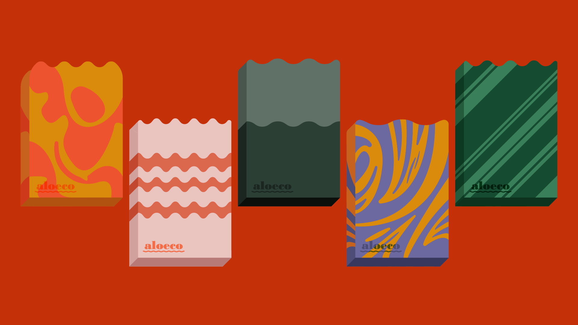
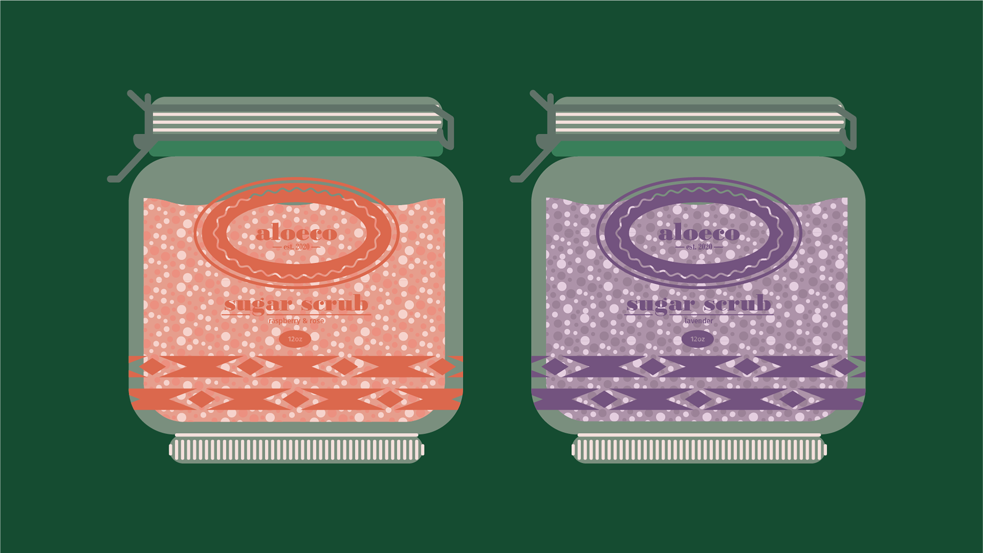
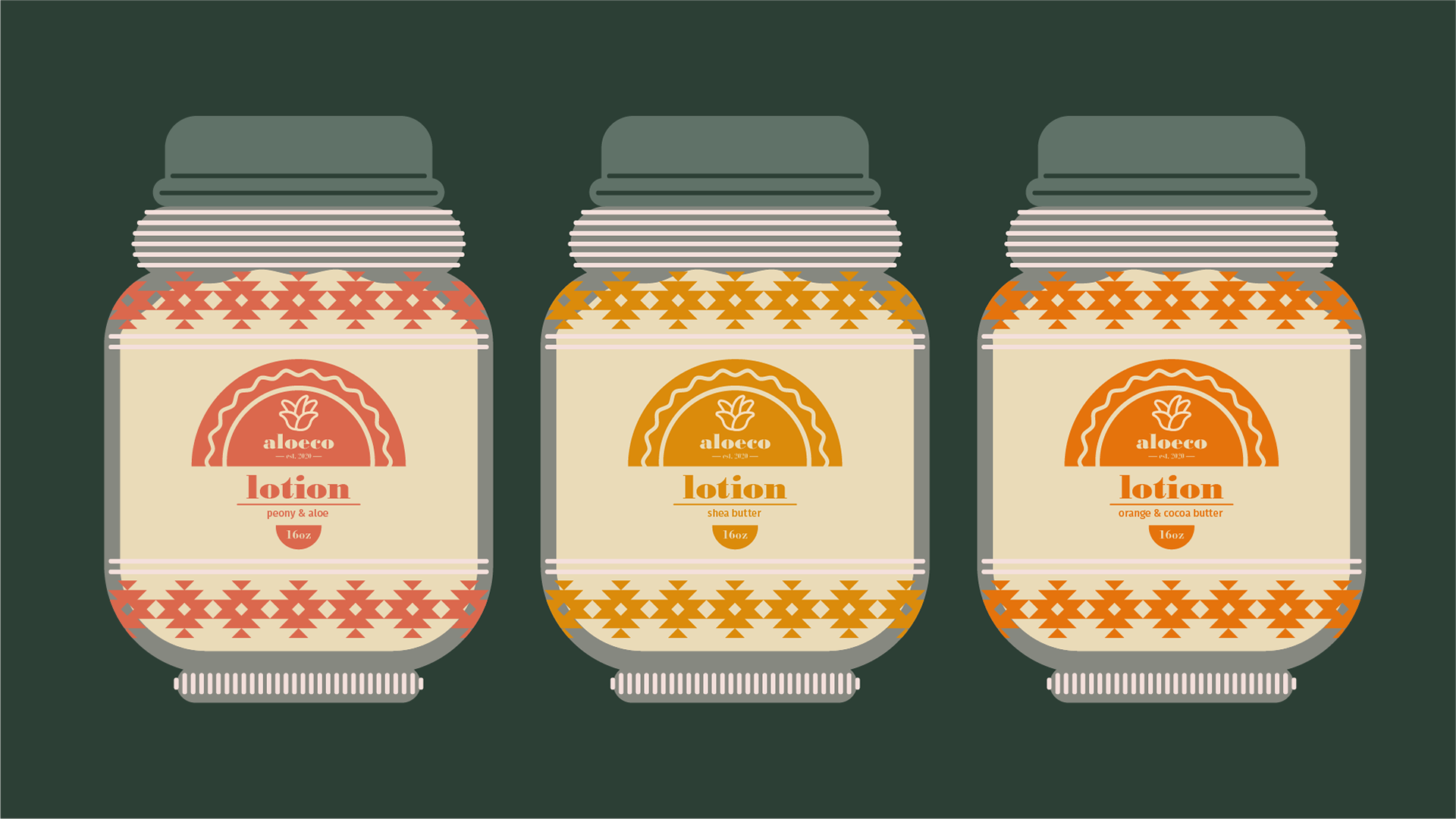
Products
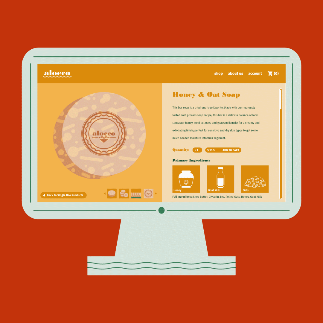
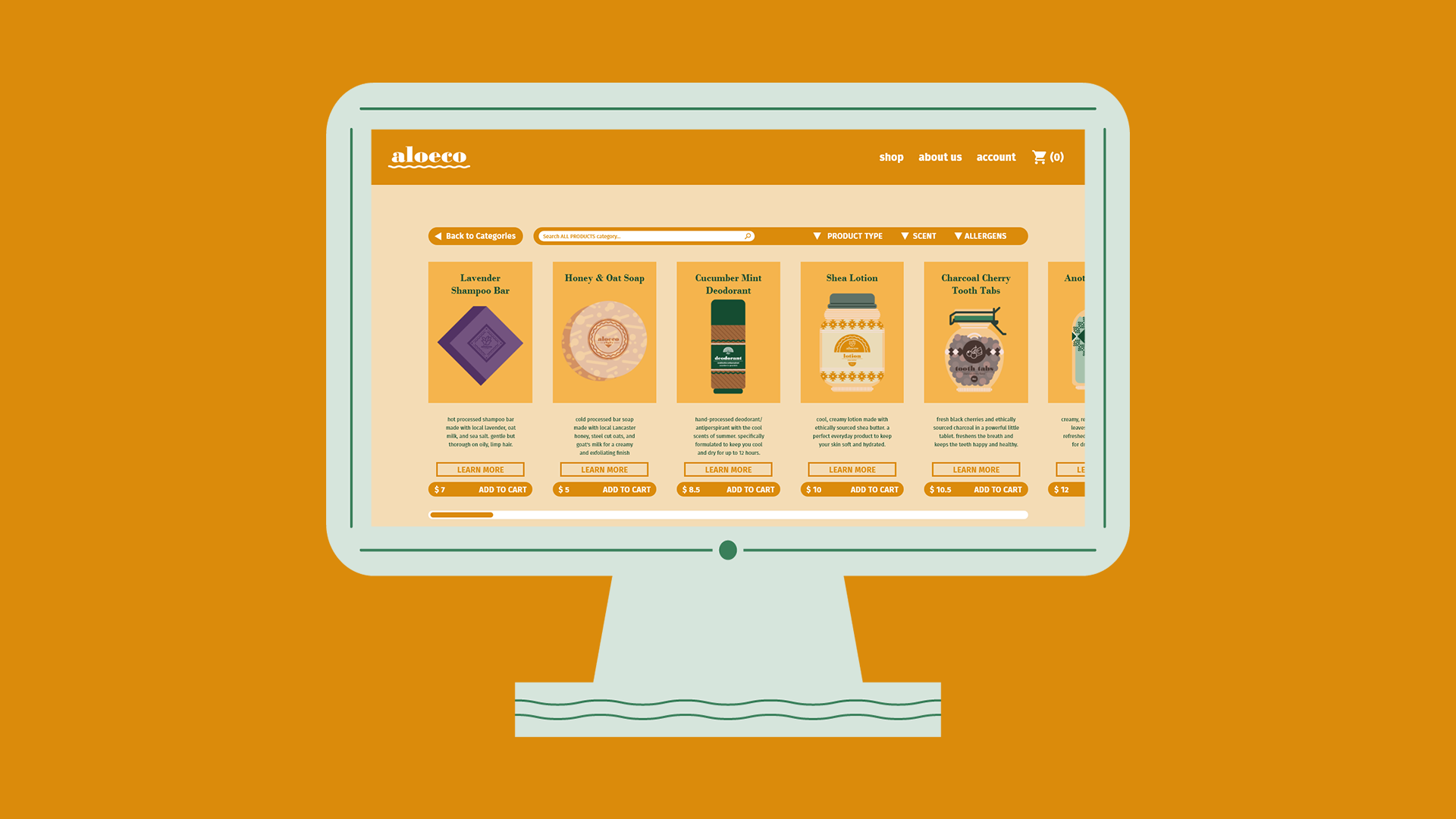
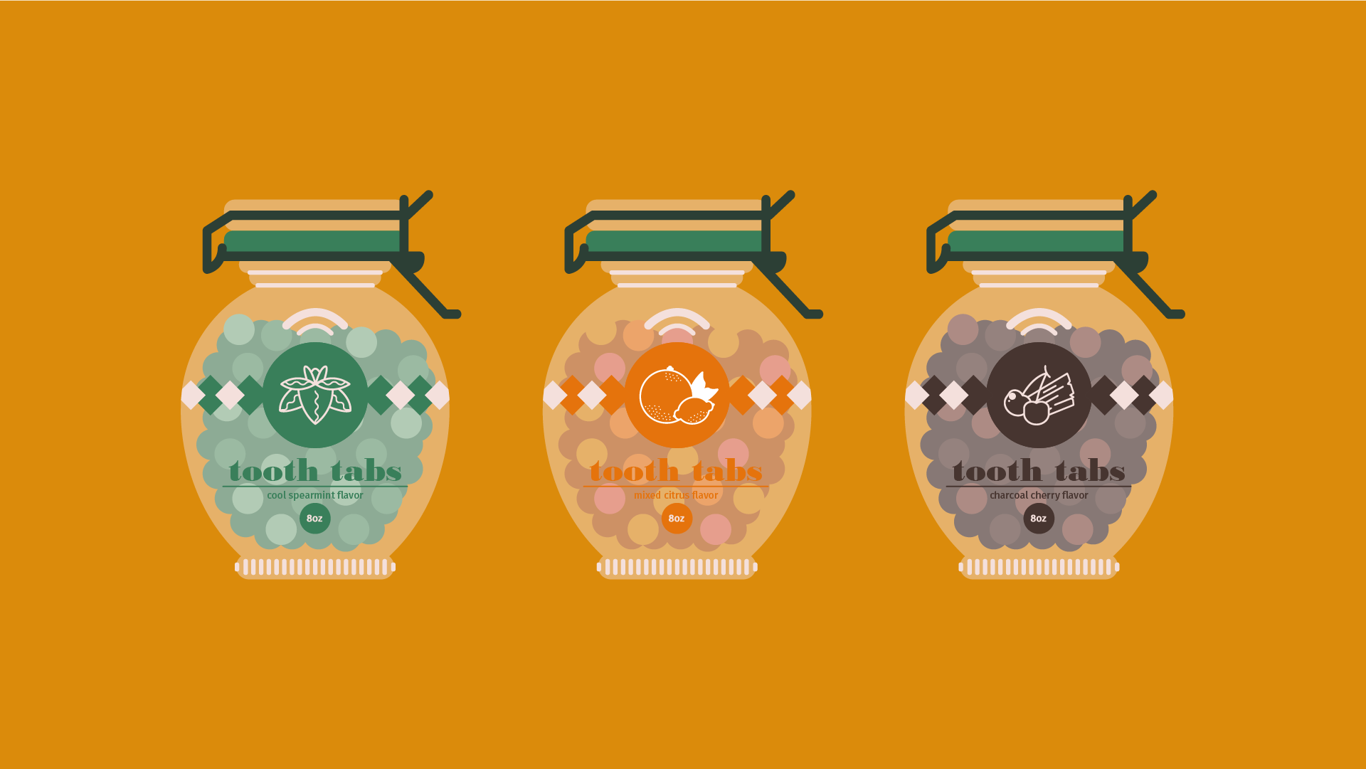
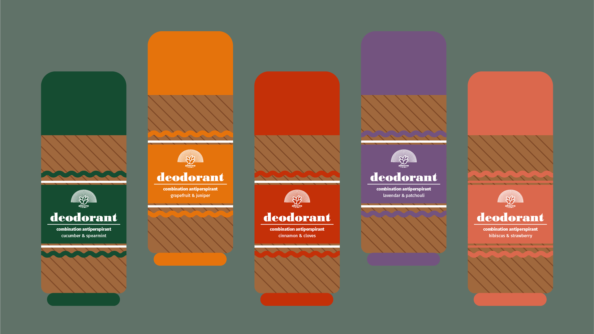
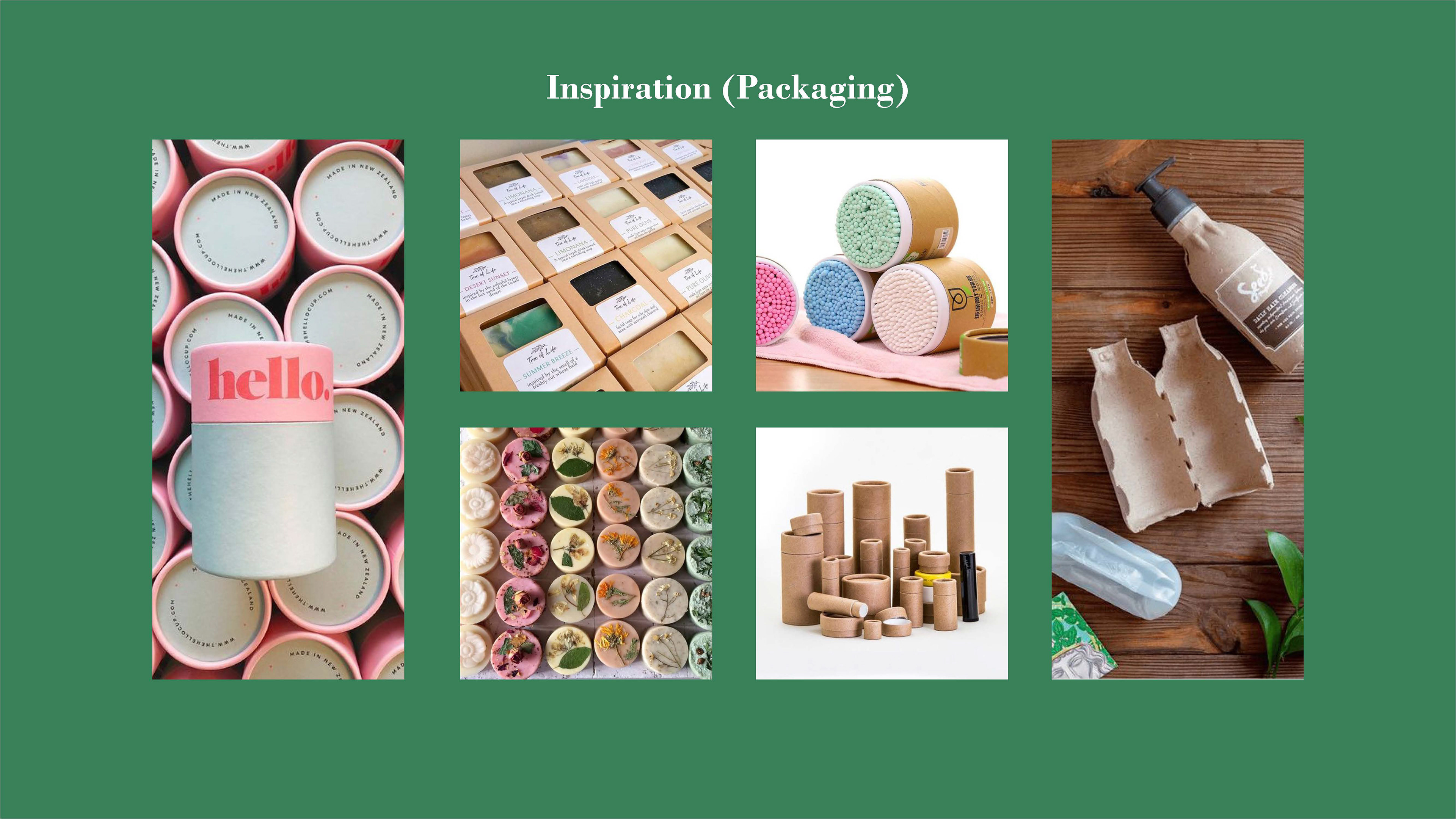
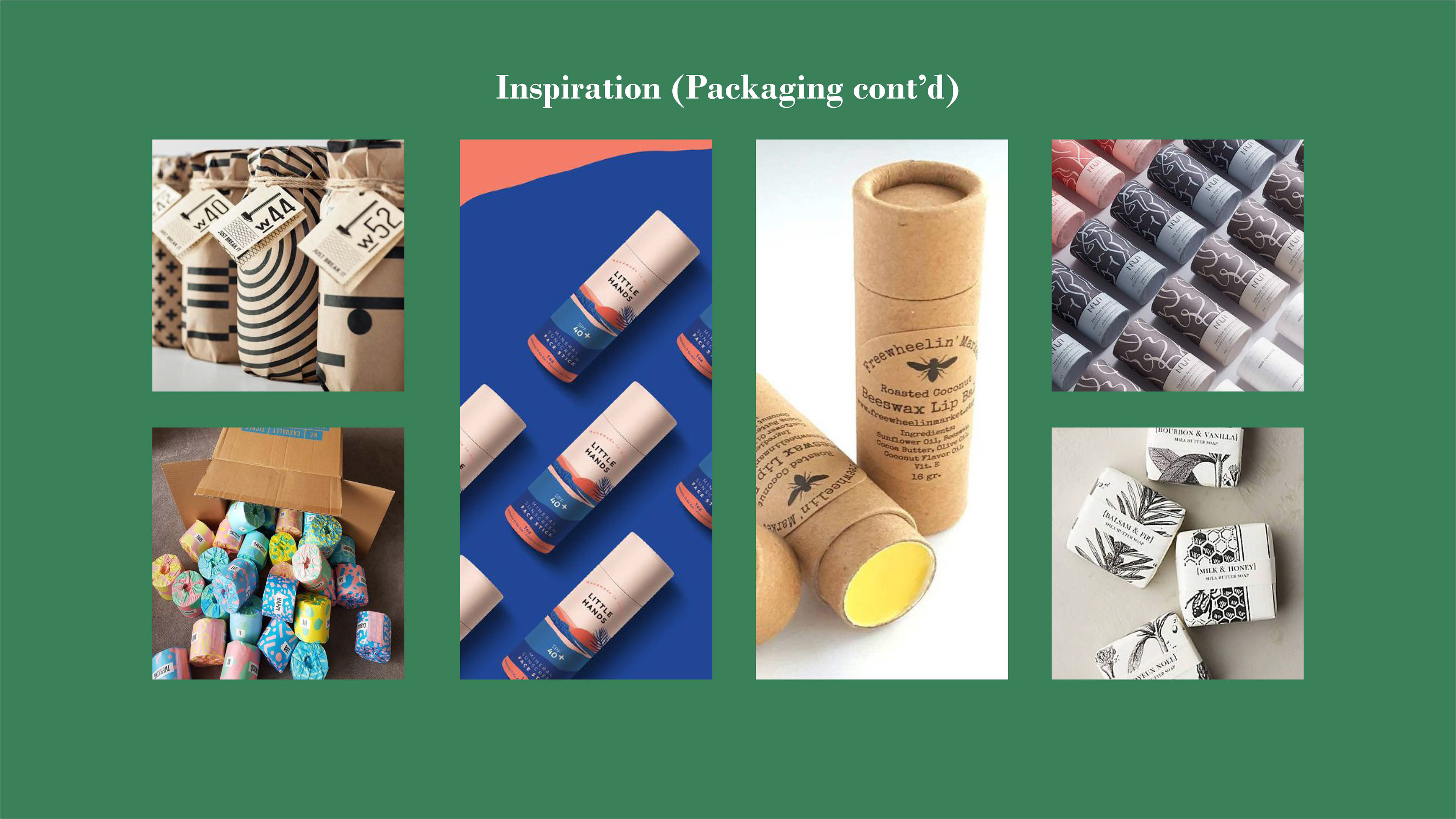
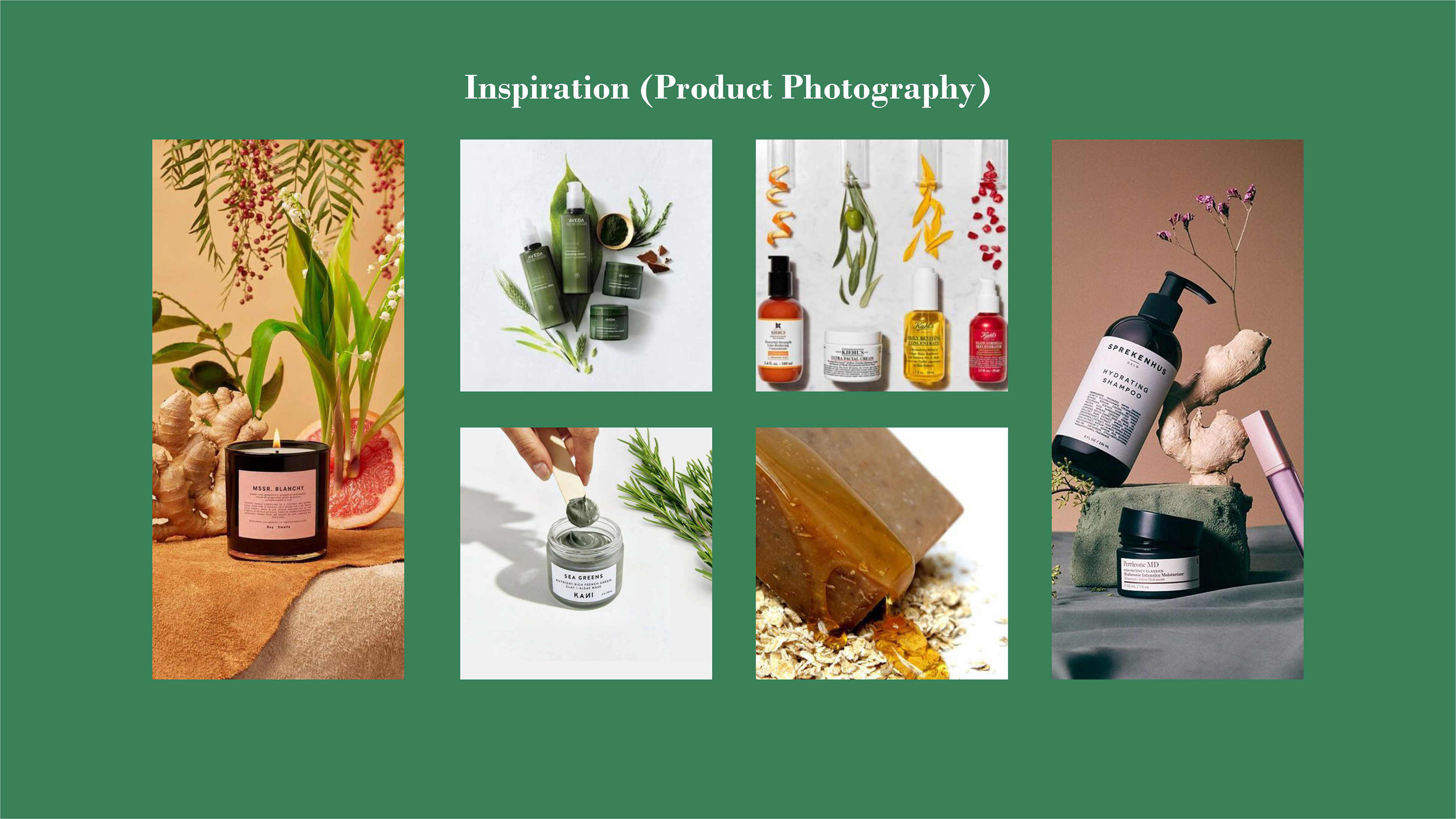
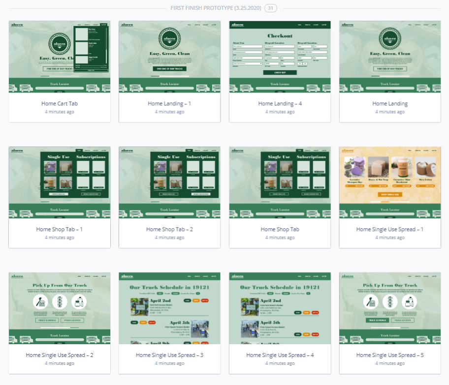
No personal care product brand would be complete without some lovingly hand-crafted bars of soap. That was plan, at least, before COVID-19 disrupted the course of this project. I was originally planning on building, photographing, and editing a set of real-life jars, bottles, and soaps to use as product photography. Then, the week I was supposed to get the photos taken, my university took measures to stop the spread of COVID-19 and shut down campus, immediately cancelling all extracurricular activities.
For some time, I was stumped on how to reframe this part of the project. I was faced with the fact that I had no comparable camera or photography skills; there was no realistic way to do things the way I had planned, at the quality I had expected. Once I made peace with that realization, I switched gears and represented my product line in a completely different way. With vector illustration, I was able to tailor more custom products than I could have with my original method. Everything from the shape that the soap is cut, to the style of the pump bottles or deodorant tubes, to the specific labels on the tooth tabs and sugar scrub, would not have been as extensively unique had I built and photographed from material I had purchased.

Research — Investigating Competitors
A brand like Aloeco would not have come to fruition without rigorous research. From the very outset, I was dedicated to studying my competitors to see what they do right, what they do wrong, and what they do differently. The beginning of my studies began with simply looking at the names, logos, and products of a smattering of different brands.
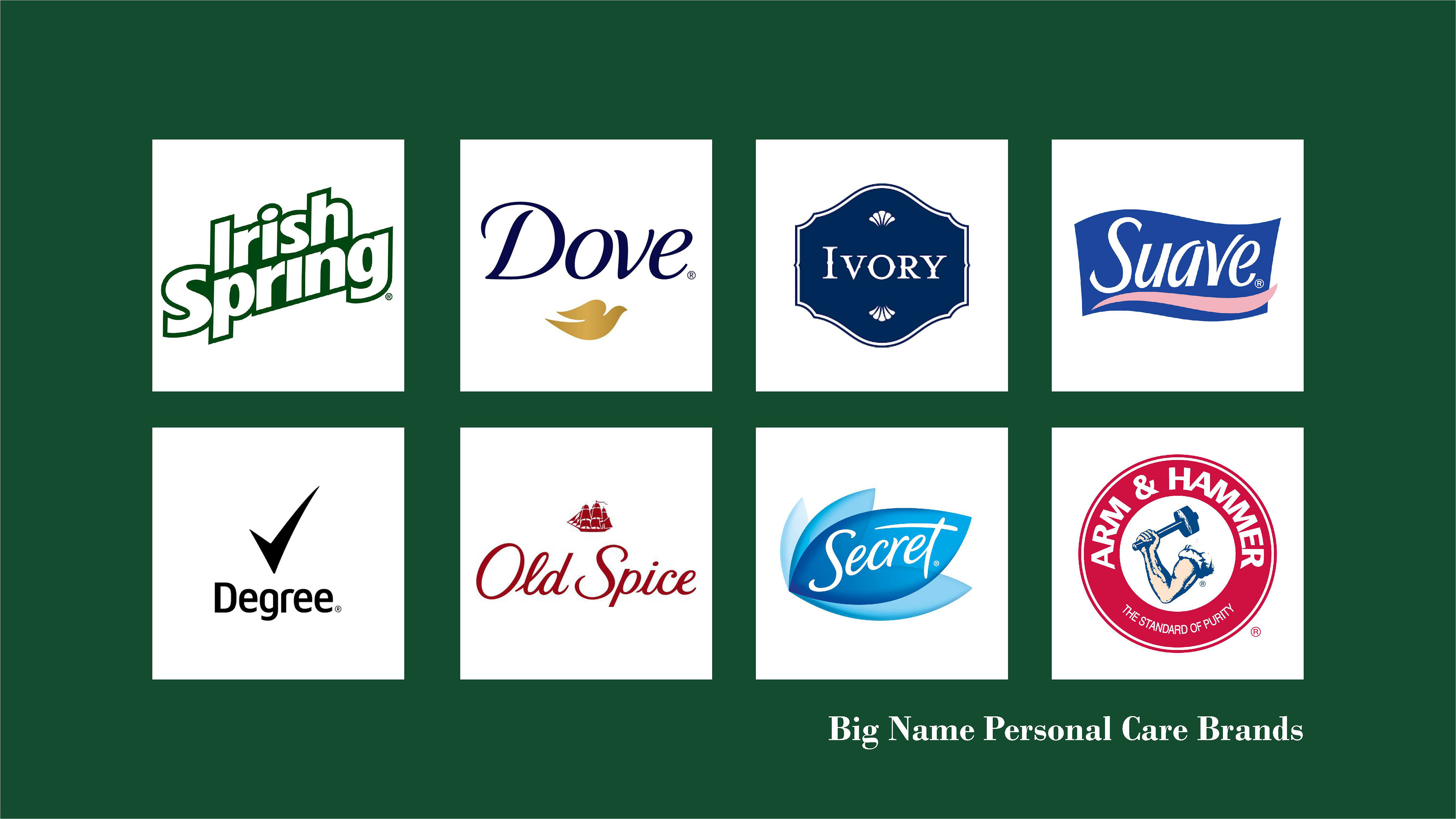
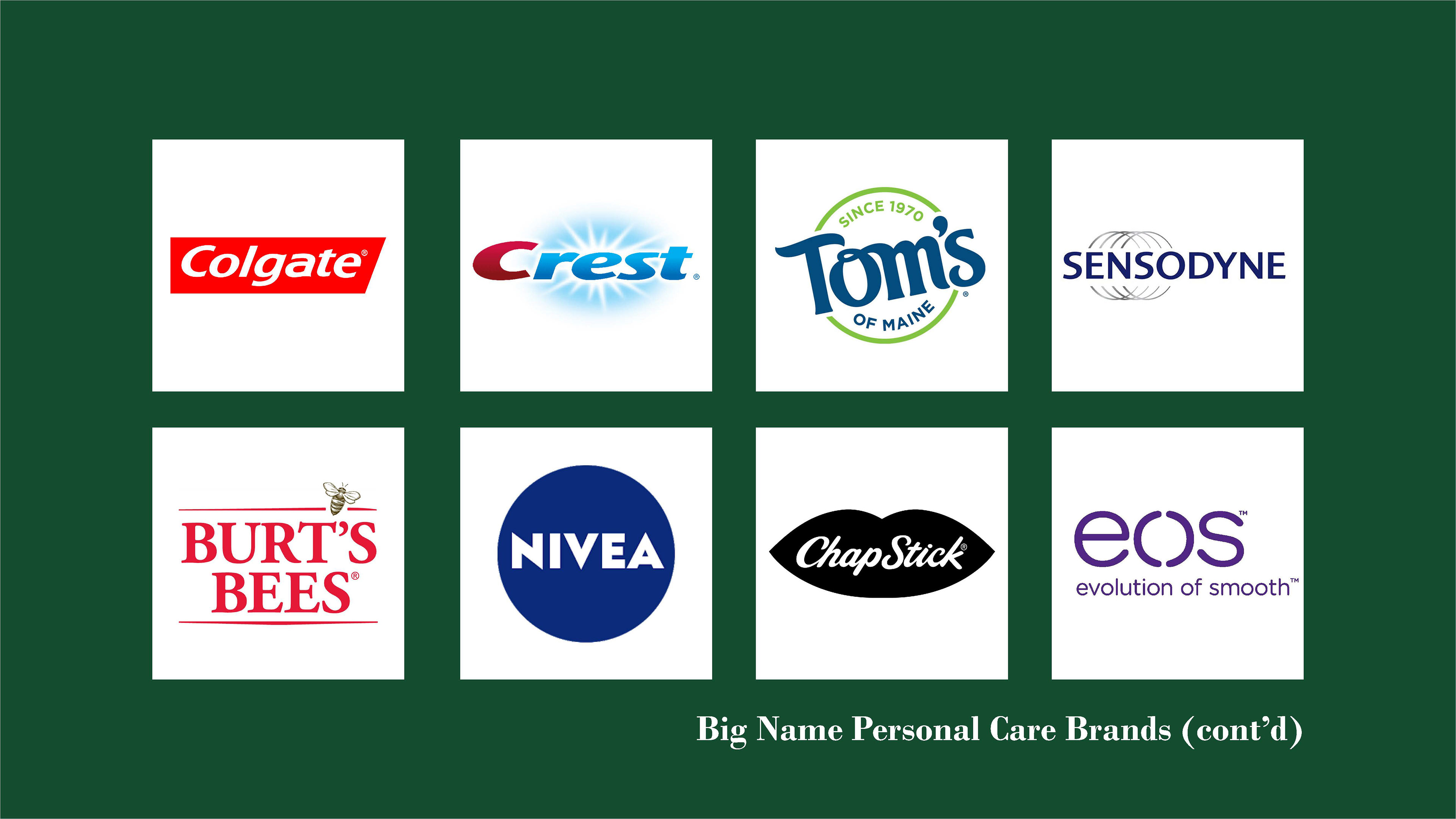
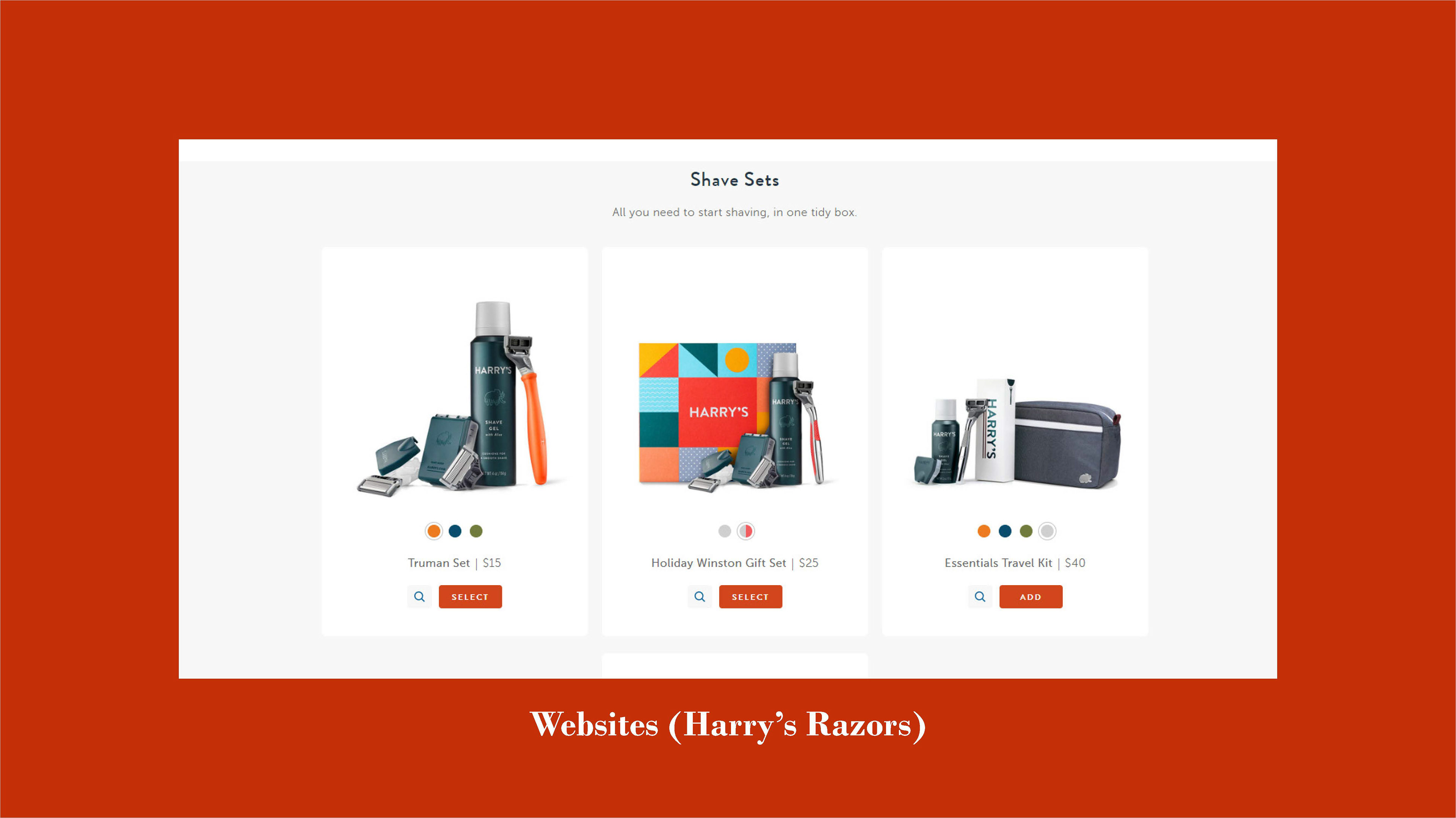
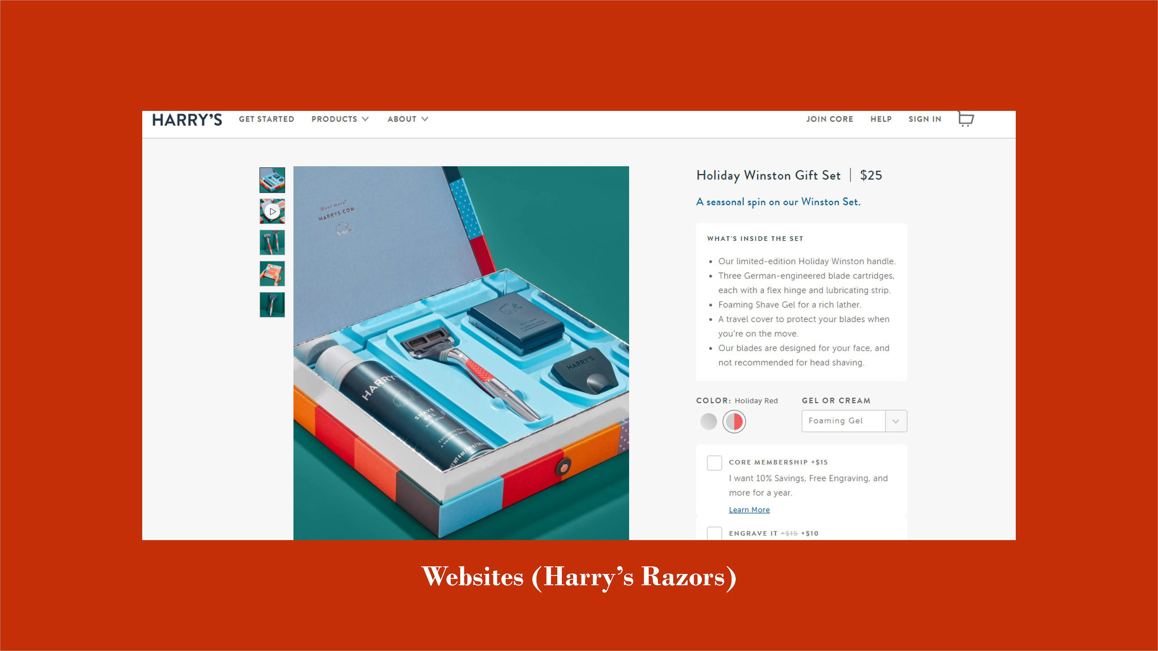
To start, I surveyed a number of big-name brands. Many of these brands over utilize plastic in their brands, which can sit in landfills for hundreds of years without decomposing. Furthermore, most of these brands tend to go overboard when it comes to design; misplaced flourishes, overuse of gradients, questionable typography choices, etc. Another thing that I realized is that products of a similar nature, especially when they are not aggressively gendered, tend to have similar characteristics. Toothpaste brands like Colgate and Crest utilize similar typography, color choices, and packaging, to the point that it can be hard to tell the difference between them. Tom’s of Maine, a natural toothpaste, breaks that mold with its retro script logo and dark blue/green color scheme. In comparison, other brands have a more rigid, gendered approach. Razor brands like Gillette and its subsidiary Venus are starkly different in their efforts to assert that the former is for men, where the latter is for women. Gillette has a strong navy blue in its logo, while Venus has a soft robin’s egg blue. The typography for Gillette’s logo is very stark and uniform, whereas Venus’ is comparatively curvaceous and loose. The same idea is true for deodorant brands like Old Spice and Secret; even when they both utilize script typography in their logos, the color, illustrations, and marks firmly separate the two brands by gender for little discernable reason.
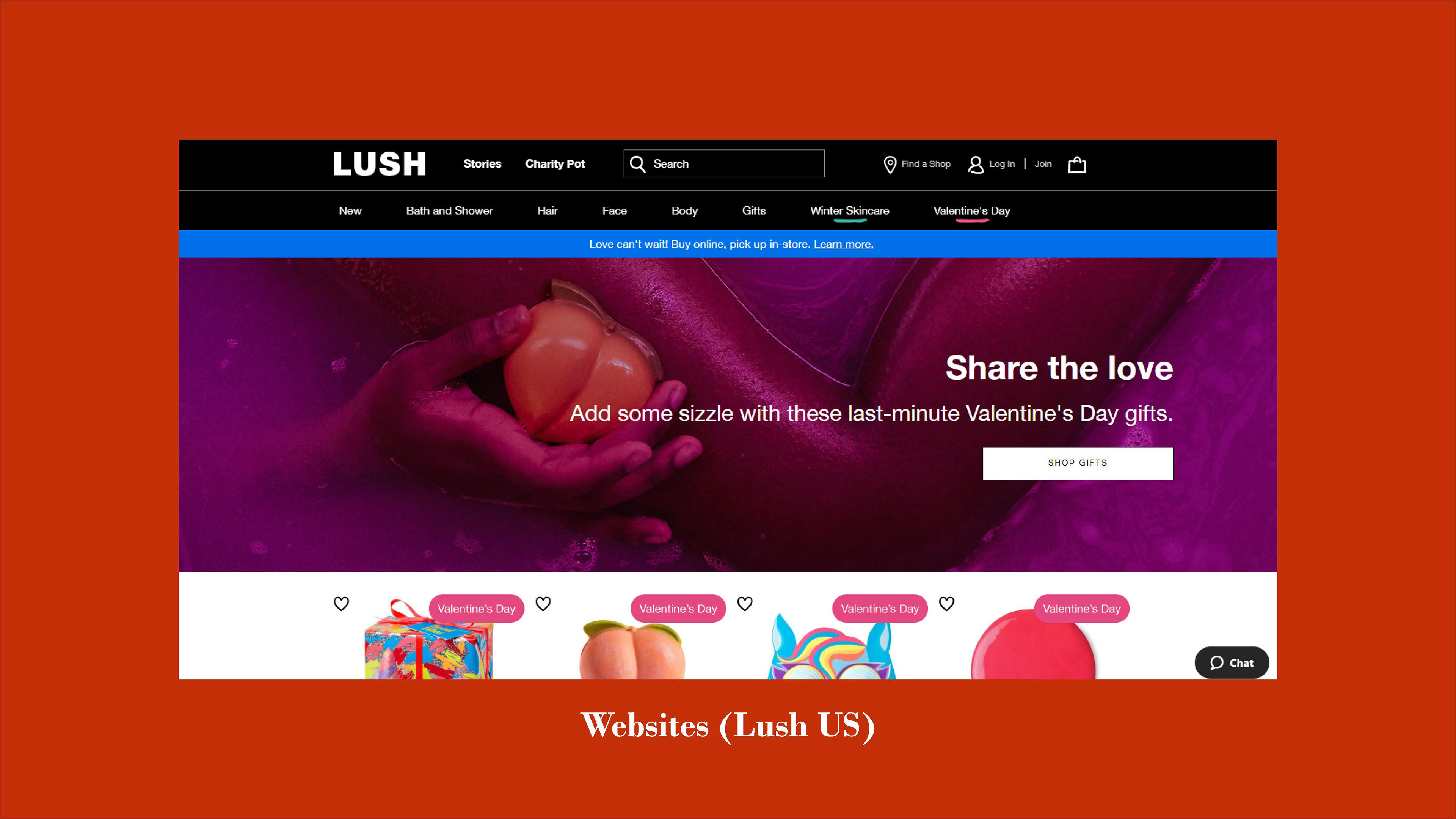
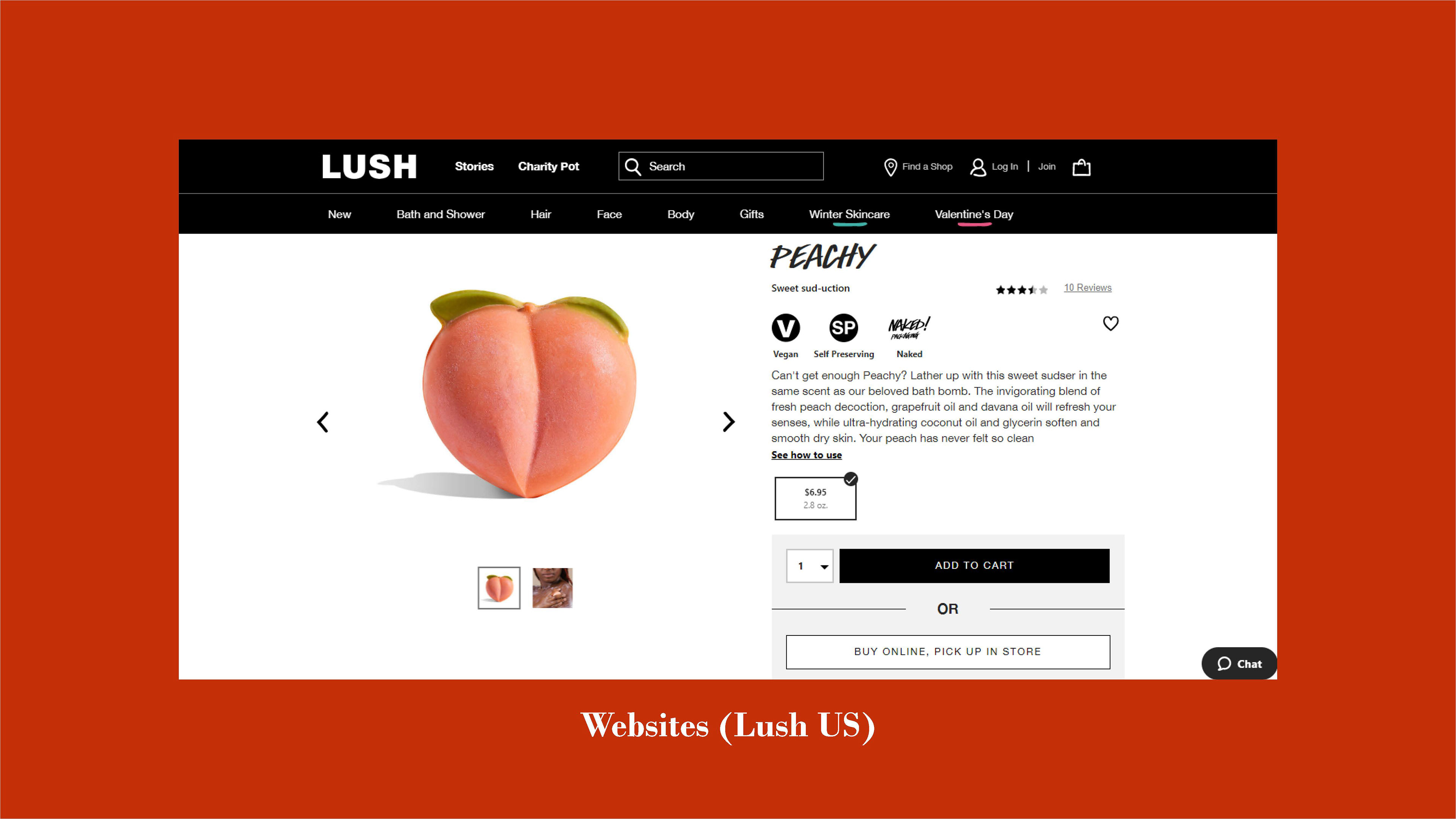
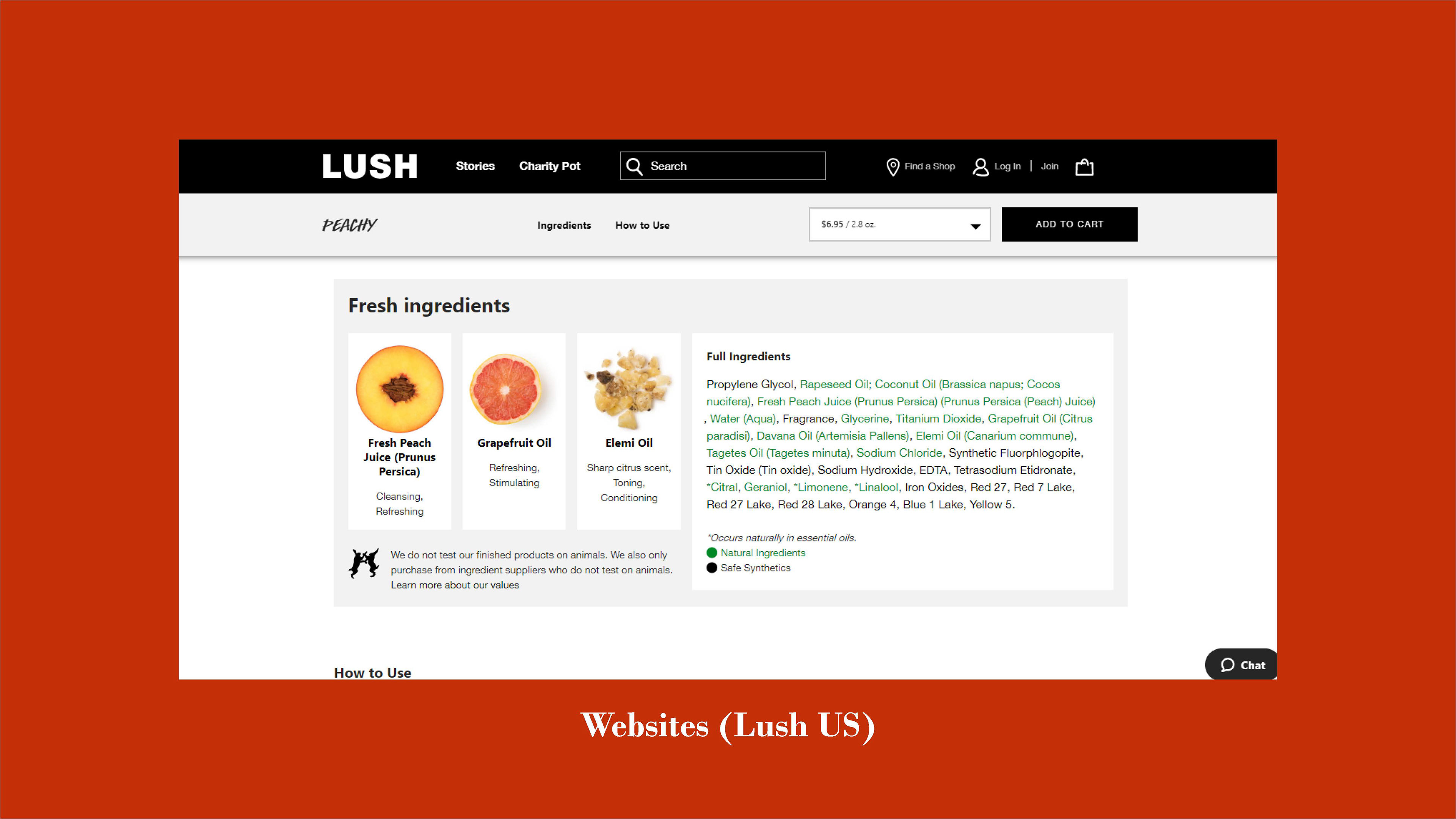
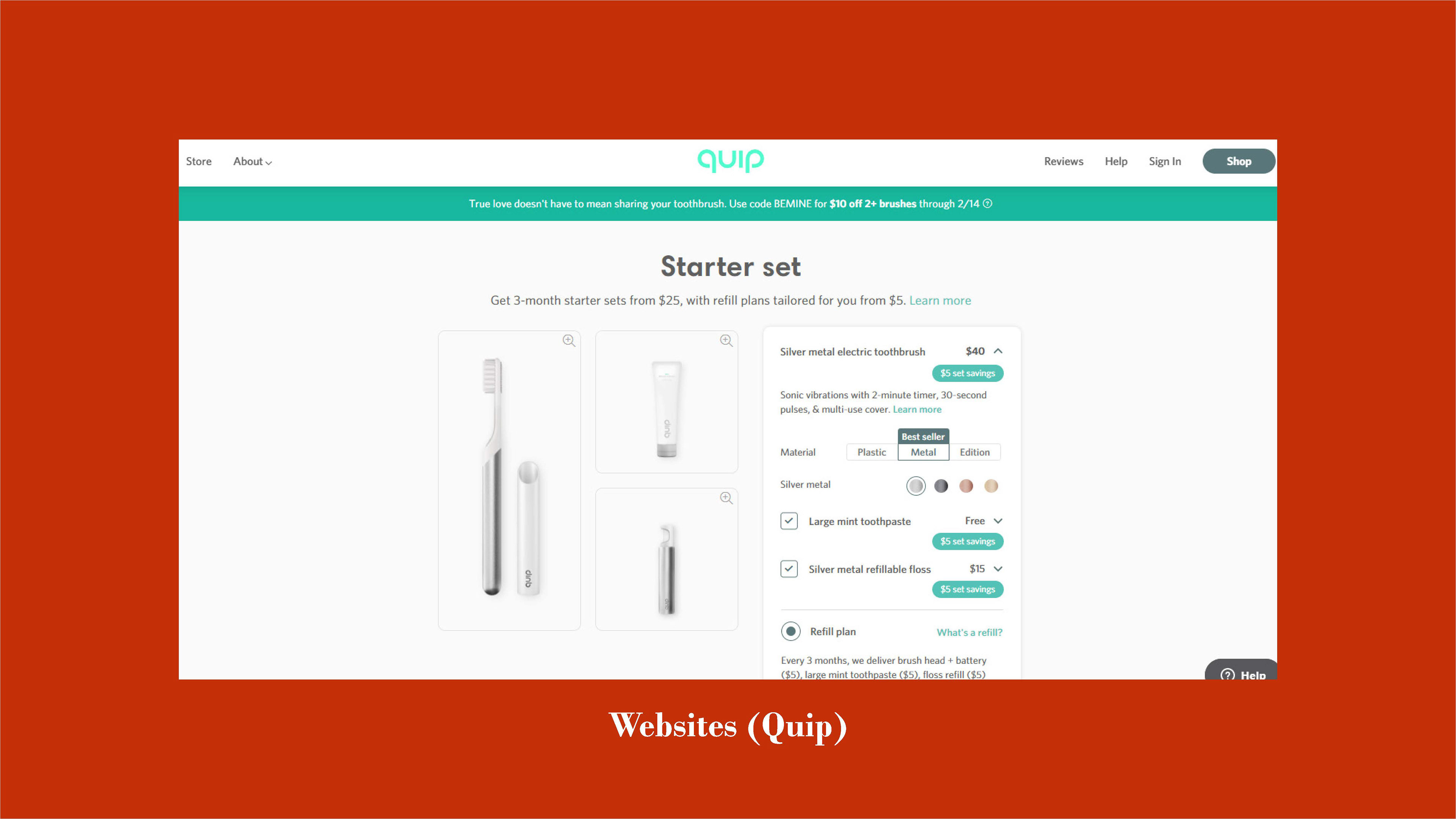
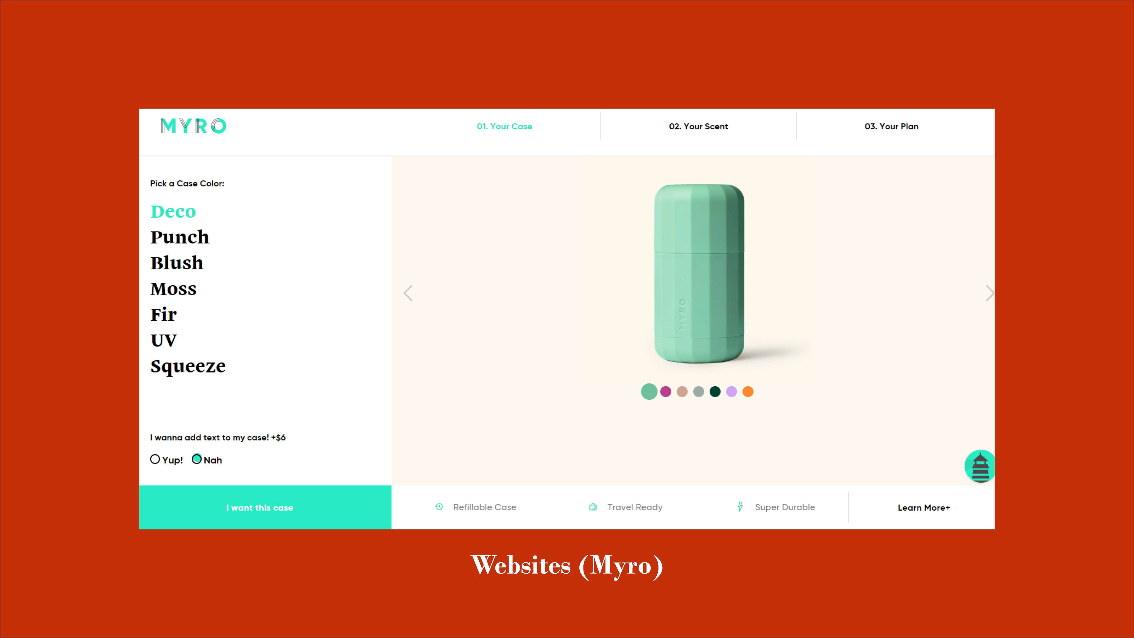
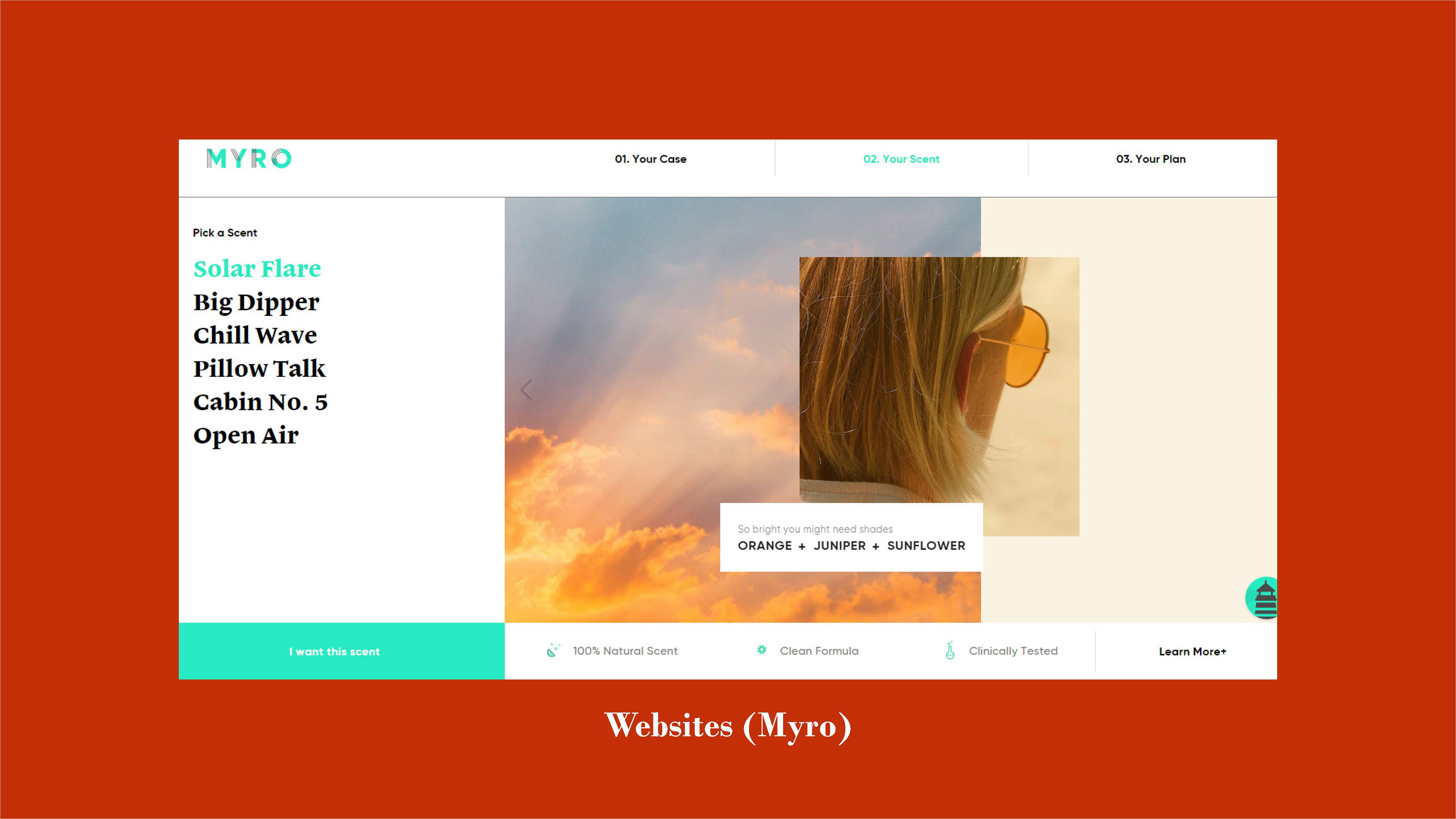
When I moved from investigating large brands to focus on small brands, I found less of a gender binary there. Even if there are certain gendered elements to them, brands like Myro, Quip, and Lush do not go out of their way to use their design or products to strictly enforce entry to one gender or another. I focused more on what worked and what did not with their design sense. The combination of bright, sans-serif type with linework in Myro’s logo, the simple black-and-white type of Lush and Package Free Shop, and the simplicity of Quip’s product photography all work marvelously. The only detriments to the three of them are their continued use of plastic. On the other hand, the questionable typographical choices and empty packaging of Zero Waste Cartel and Habitat Botanicals gave me food for thought. While the products they sell are amazing (I even personally use ZWC’s bamboo toothbrushes), for the most part, the branding falls short. If had to describe the feeling I get from either of those brands, I would call them “okay”. Mediocrity does not draw people in, even if they like the product.
From there, I investigated websites from personal care competitors to inform my UI/UX decisions. Admittedly, I had a bit of a difficult time at first. Most of the resources I had were either middle-of-the-road brands like Lush, or dozens of templated websites for little brands that were more or less the same. Things changed when I started looking at comparable brands on awwwards.com. From there alone, I was able to find previously mentioned sites like Bite, Helias and Malai, among several others. From the laundry list of websites I visited, I noted aforementioned visions of motion, ways to lead the user between pages, account information, and cart items, layout, and visual design.
Surveying Potential Customers
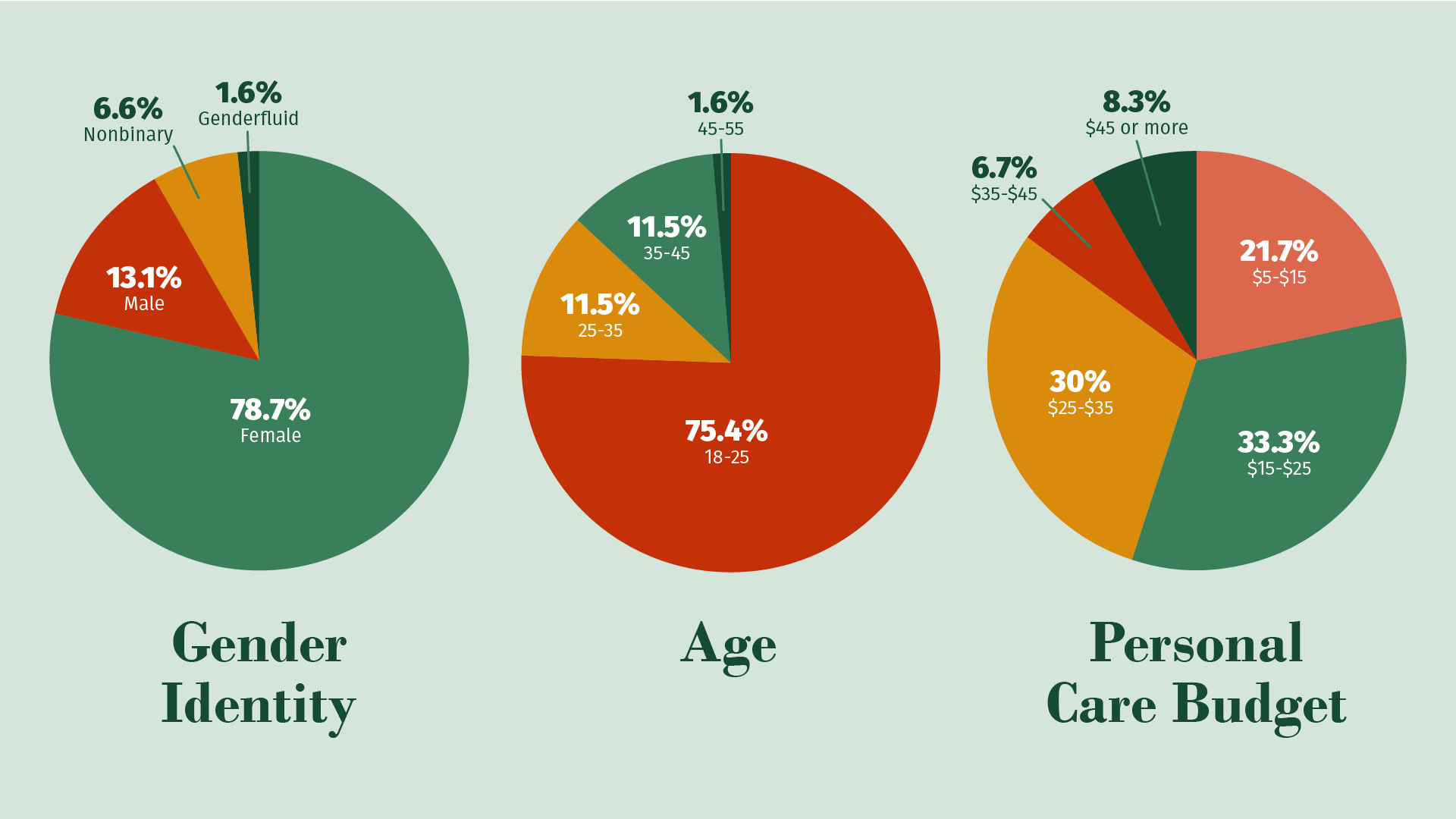
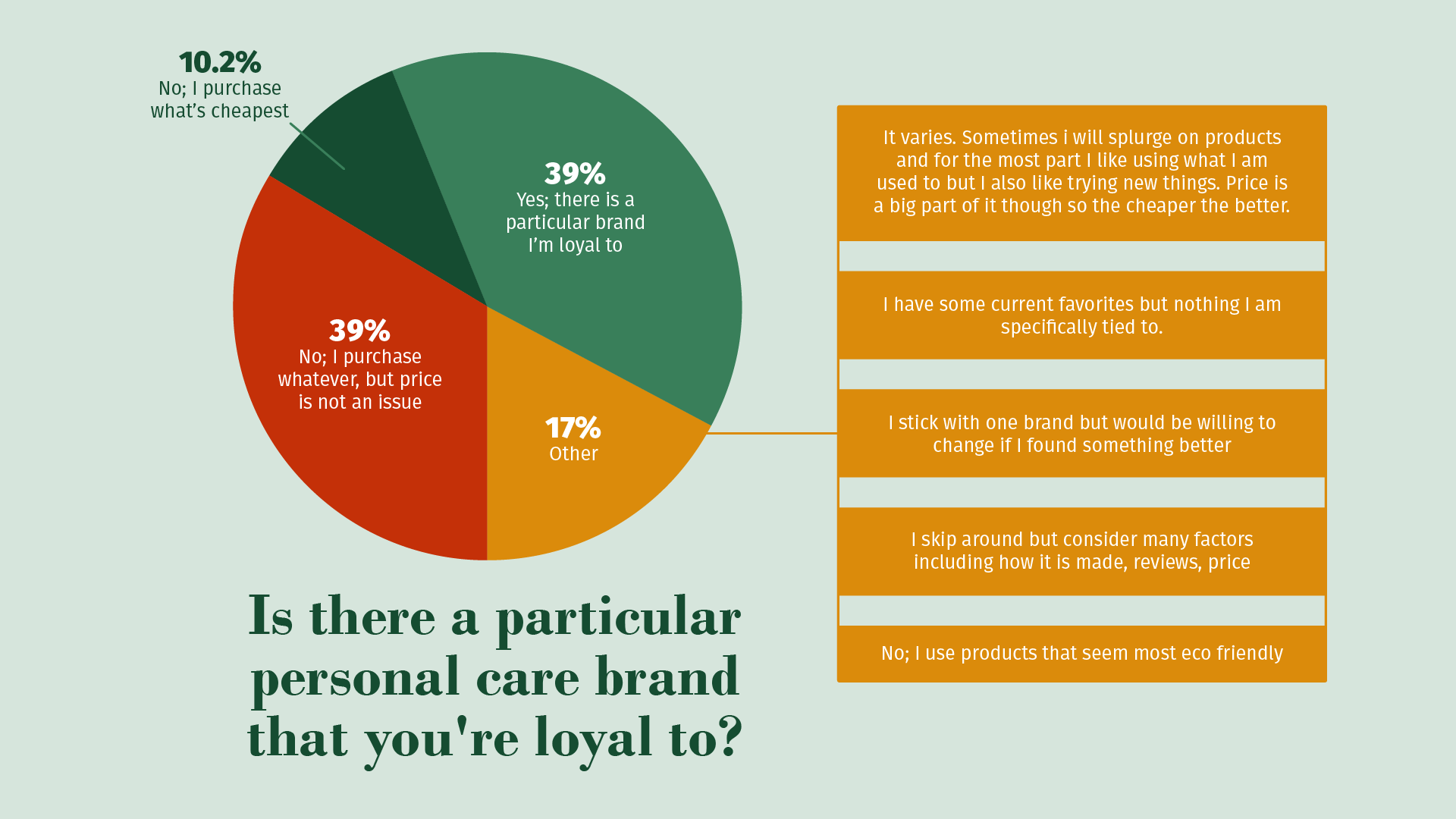
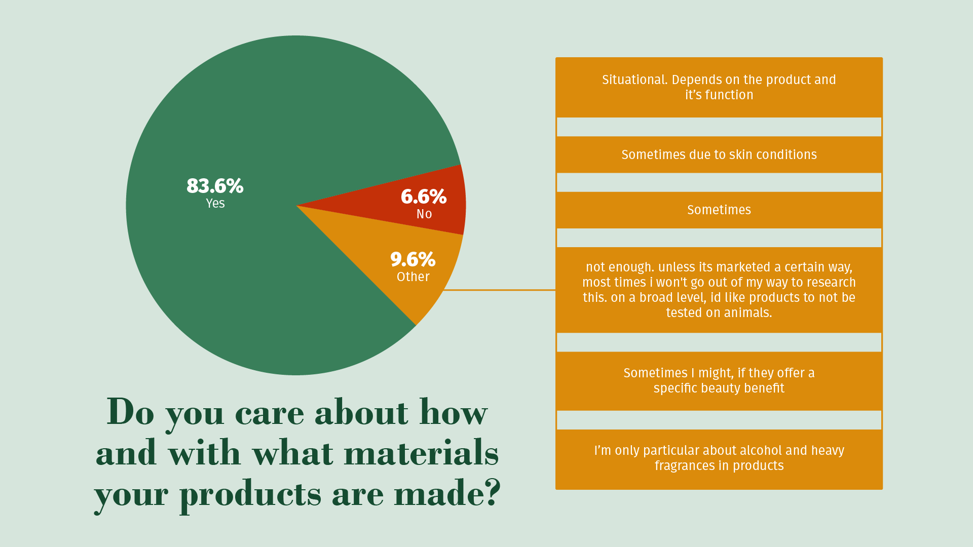
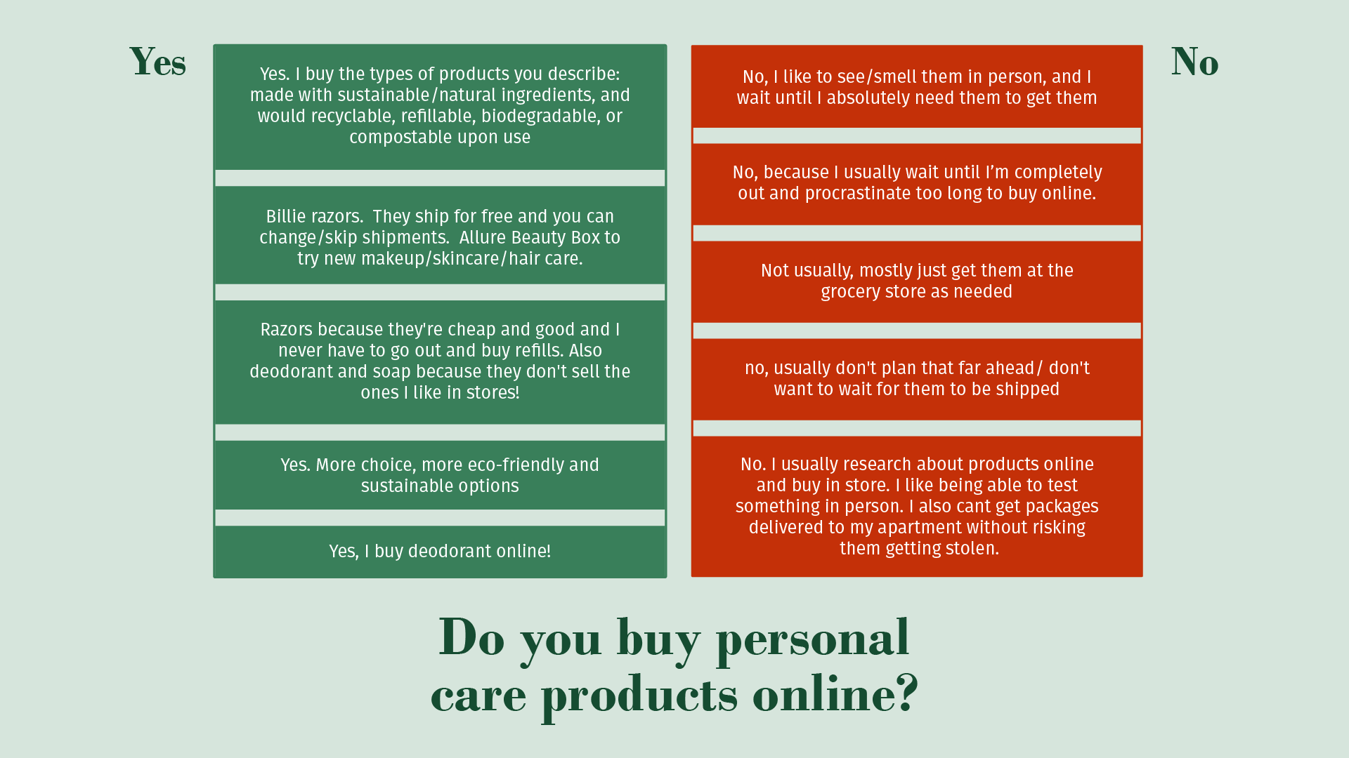
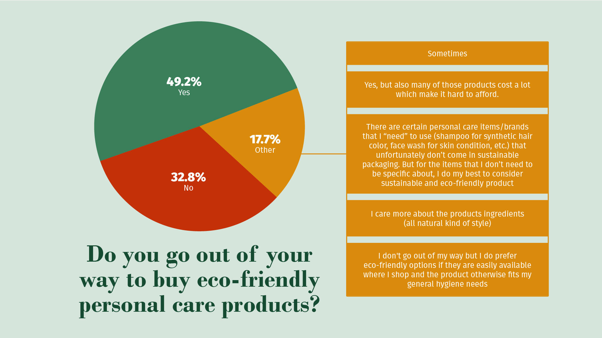
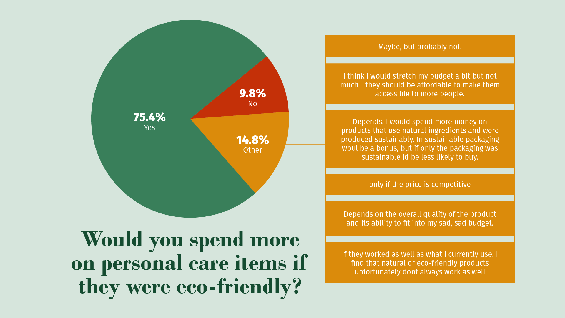
Simply studying competitors was not enough; I wanted to go through the design process with quantitative data. I made a quick survey of ten questions to ascertain the demographic of those interested in personal care products, and the possibility of switching to eco-friendly alternatives. By reaching out to family, friends, acquaintances, and strangers on Facebook, Instagram, and Reddit, I received sixty-one responses. The data was certainly interesting, to say the least: the vast majority of respondents identified as female, from the ages of 18-25. Monthly budgets for personal care varied a bit more, but generally settled in the range of $15 to $35. Largely, it seemed that my hunch that people avoided eco-friendly products because of price or potency had some basis in reality. What interested me the most was what people wrote when there was an option to fill in their own answer; having them explain their reasoning was vital to making sure that the brand I was building reached a wide audience. These respondents want to believe in this kind of brand.
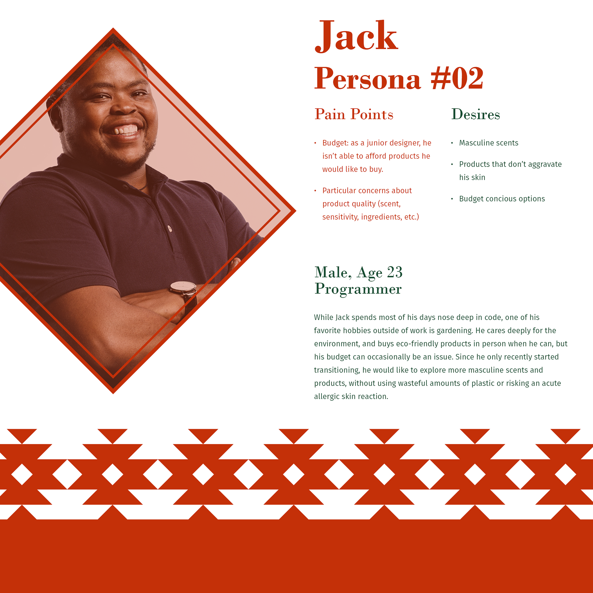
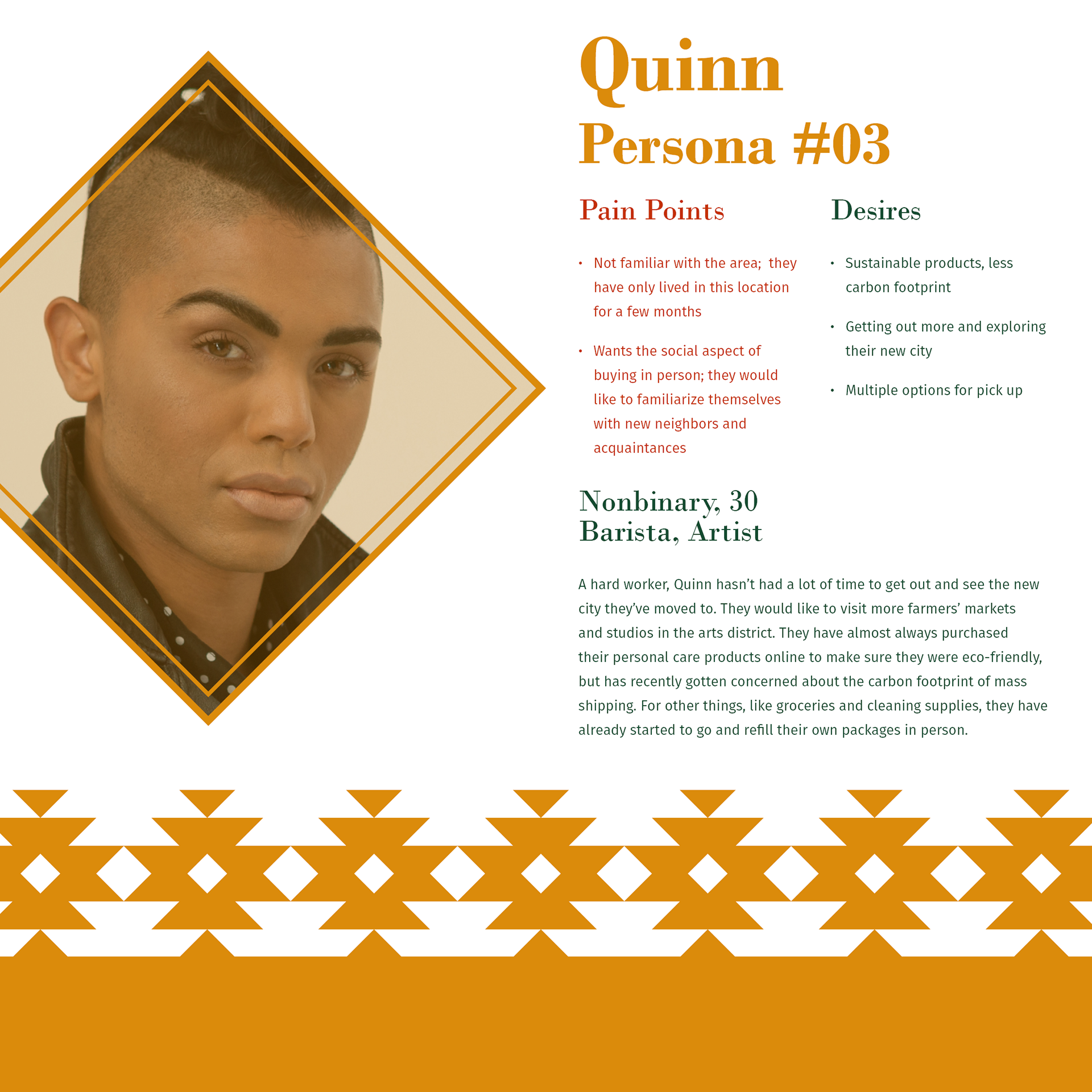
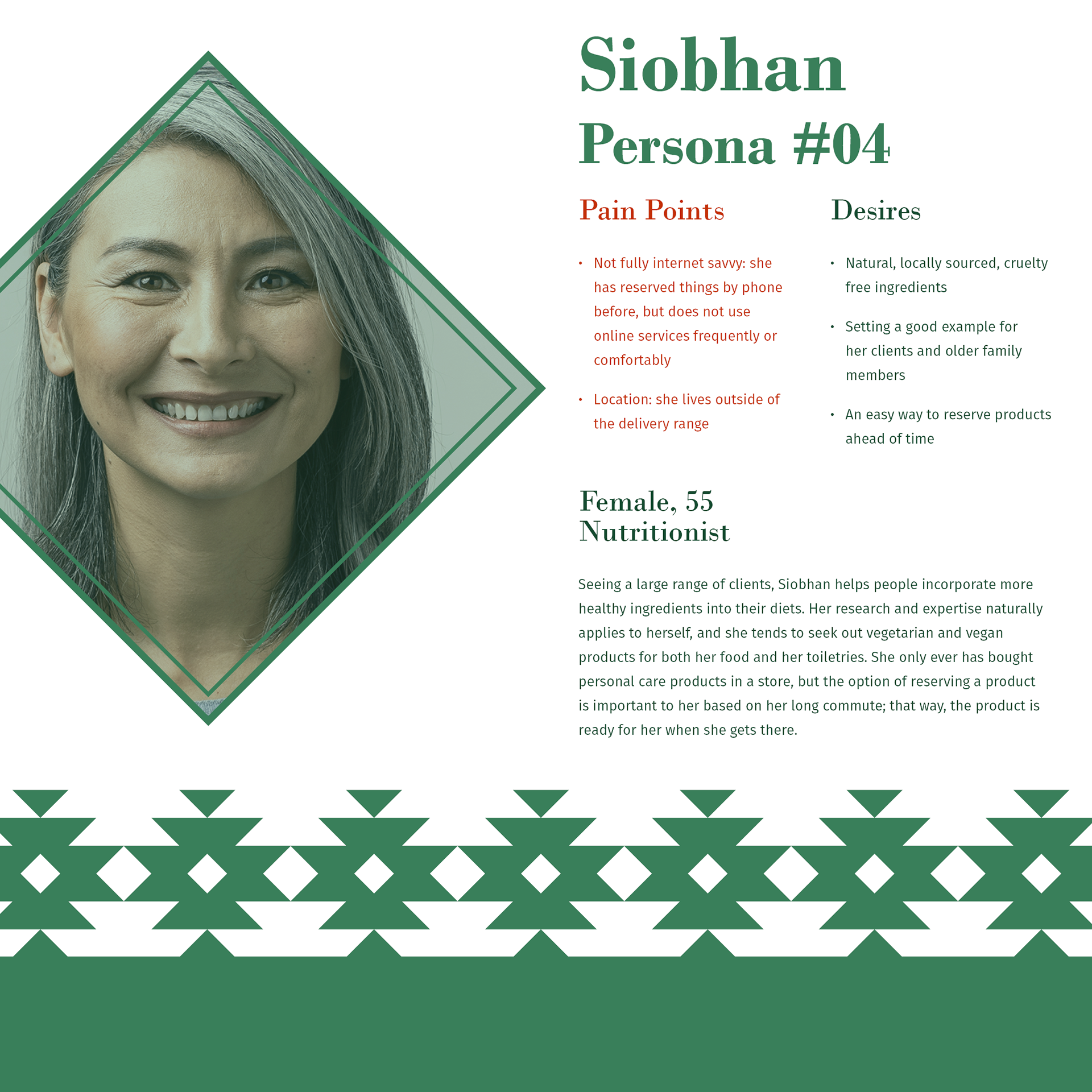
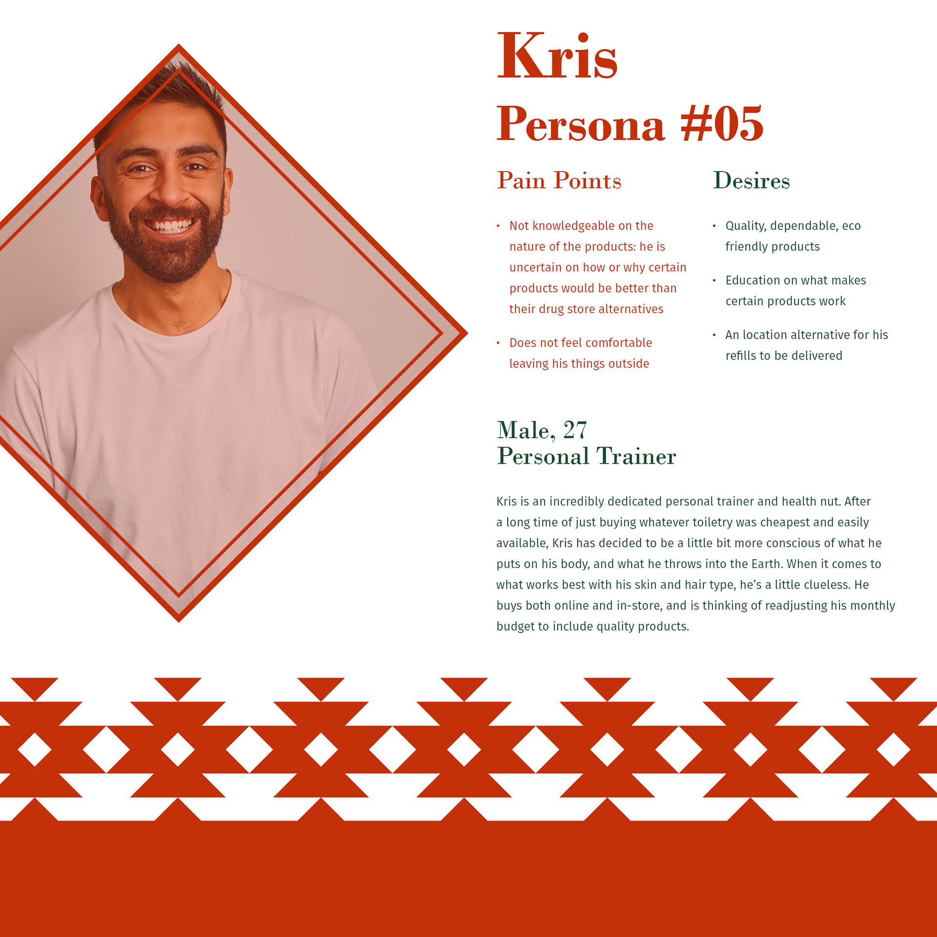
User Personas
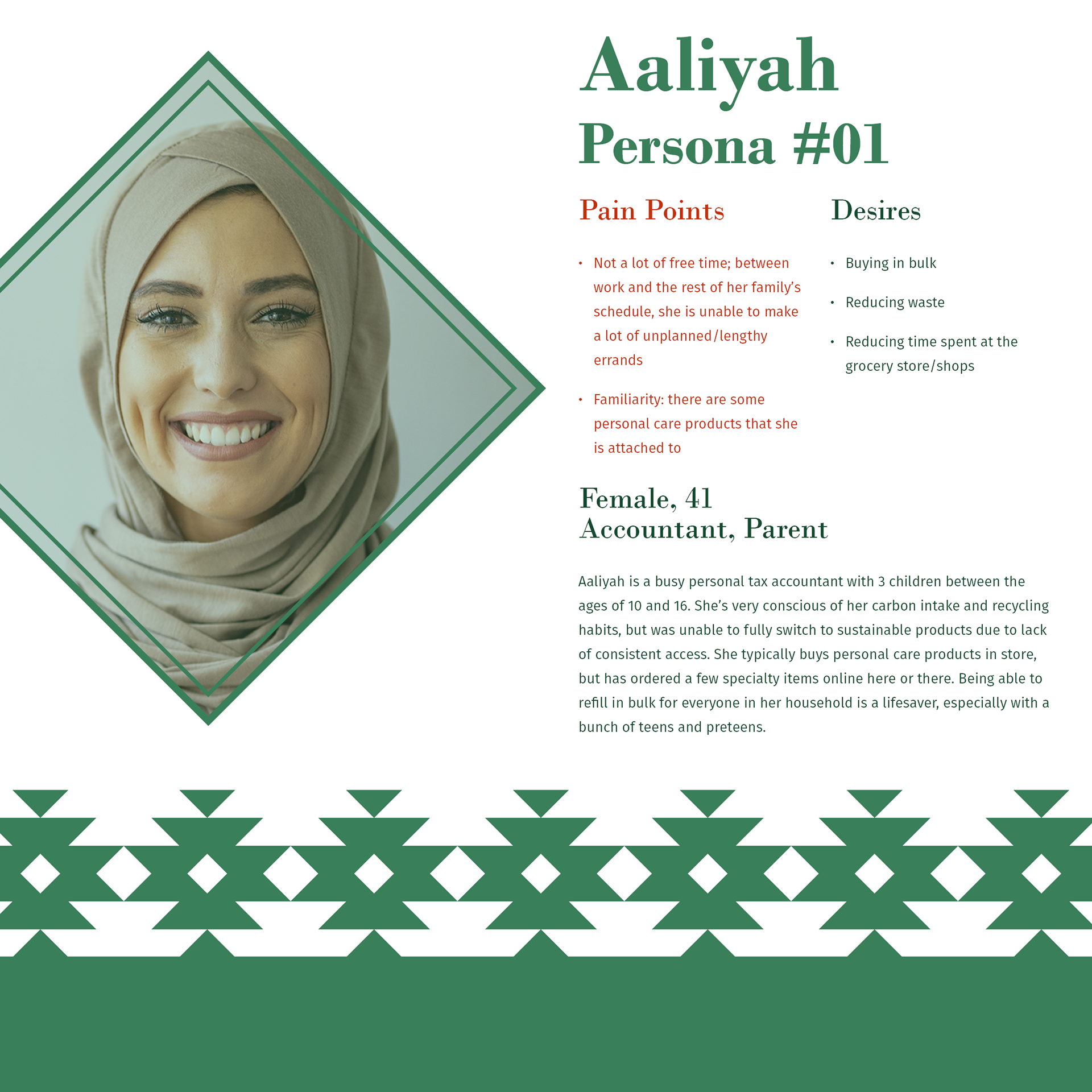
Utilizing the brand research and the survey data I collected, I created a series of five user personas to iron out exactly what people may need from Aloeco. The survey in particular raised a lot of excellent pain points and desires that deserved to be explored. Concerns over price, quality, potency, access, and availability were important points for each of these consumer explorations.
Another important point for me is to explore the needs of male and/or LGBTQ+ customers. Be it a limitation of the data or not, my survey showed me that men did not respond to this kind of brand in the way that I had hoped. I included two specifically male personas to try and work through what may be putting male customers off. For similar reasons, I also purposefully included two clear examples of transgender and/or nonbinary users in Persona #02 and #03 to express the concerns of someone who may choose certain products to alleviate gender dysphoria or increase gender euphoria.
Two final aspects of diversity I focused on in the user personas was to show people from a number of different races, and to show people of many different ages. While it would not have been appropriate for me to focus on branding products that I would not use based on my hair and skin type, I thought it imperative to create a brand that everyone could enjoy and afford. Furthermore, there is no age limit on utilizing personal care products; an honest representation of people was necessary.
Visual Design Research
Once the necessary research was out of the way, I dedicated my time to visual design research. While the project has changed courses a few times due to struggles with design choices and the onset of COVID-19, this section of the process by and large went by the fastest. A comprehensive look at my visual design research can be seen over on my InVision page detailing what I discovered.
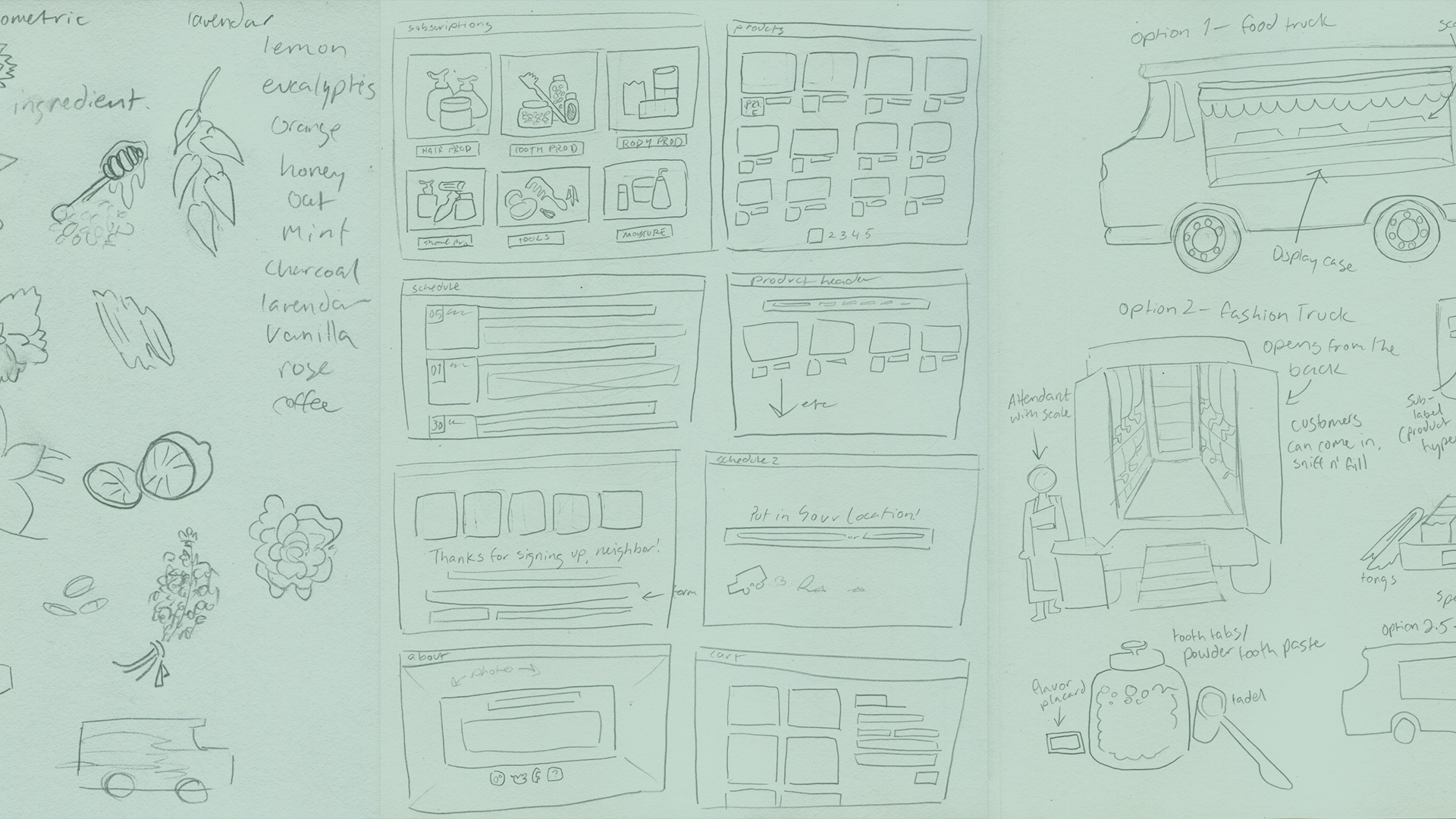
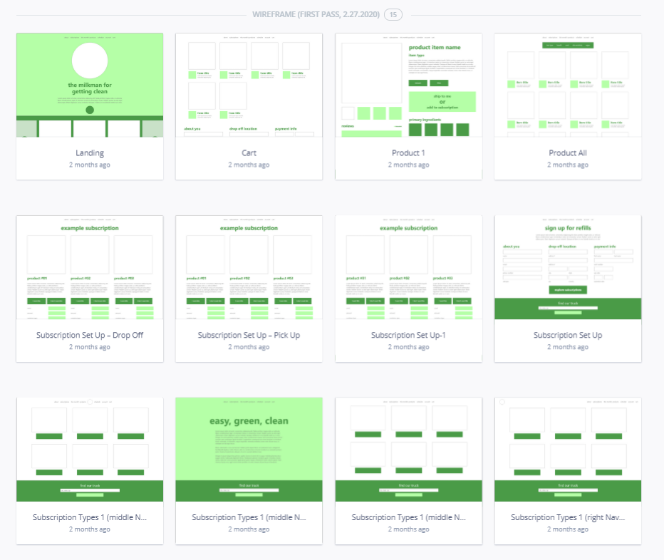
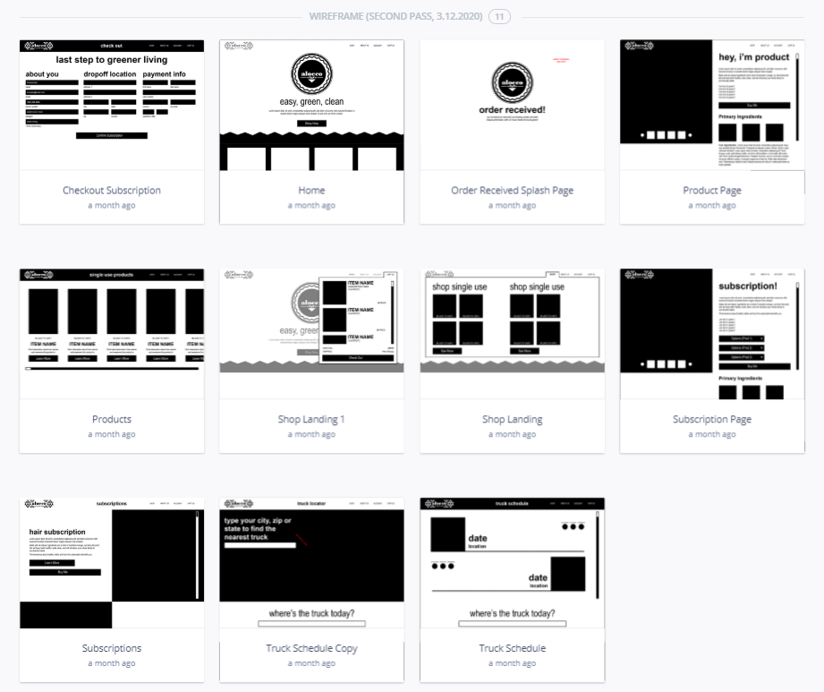
Wireframing Process
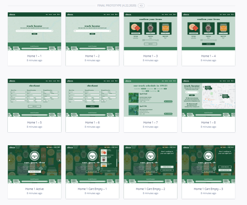
After my visuals were squared away and I had made good progress on the branding, I went through the iterative process of wireframing the website. At first, I fell into the trap I described above of cookie-cutter commerce websites. It was after reviewing my first wireframe with my art director that I revisited my web design research through awwwards.com. From there, I temporarily pivoted to black and white to figure out the format of the pages with non-traditional movement. The first finish phase started right around the time my university closed due to COVID-19, and as such, I got stuck on providing realistic imagery when I no longer could be reasonably expected to do so. The final product, as seen above, put a neat bow on two-and-a-half months of work. If you are so inclined, take a look through all of these screens on InVision.
Moving Forward
Now that my time working on Aloeco has come to an end, I can take solace in all that I have learned because of it. Multiple times through the course of this project, I have had to think on my feet and complete pivot to another way of thinking. When I hit walls with the intricacies of my branding, the construction of my website, or the occasionally misleading nature of my research, I picked myself back up and started sprinting in another direction to get going again. That instinct, which has developed alongside Aloeco, had me illustrate my packaging, start my research afresh, and completely revitalize my entire brand. It sharpened my skills in research and allowed me the opportunity to do quantitative studies of my own. Above all, it made me extra passionate about self-care, which is becoming overwhelmingly more relevant by the minute. I am proud to have rolled with the punches, and proud to have seen this project to its fullest extent.