Art Direction - Bryan Satalino | Categories - Design, Research
Creative Timeframe - August to December, 2019
Team Members - Becca Hawkins, Lucy Kukulski, Claire Qualls
Purpose - Educational Project
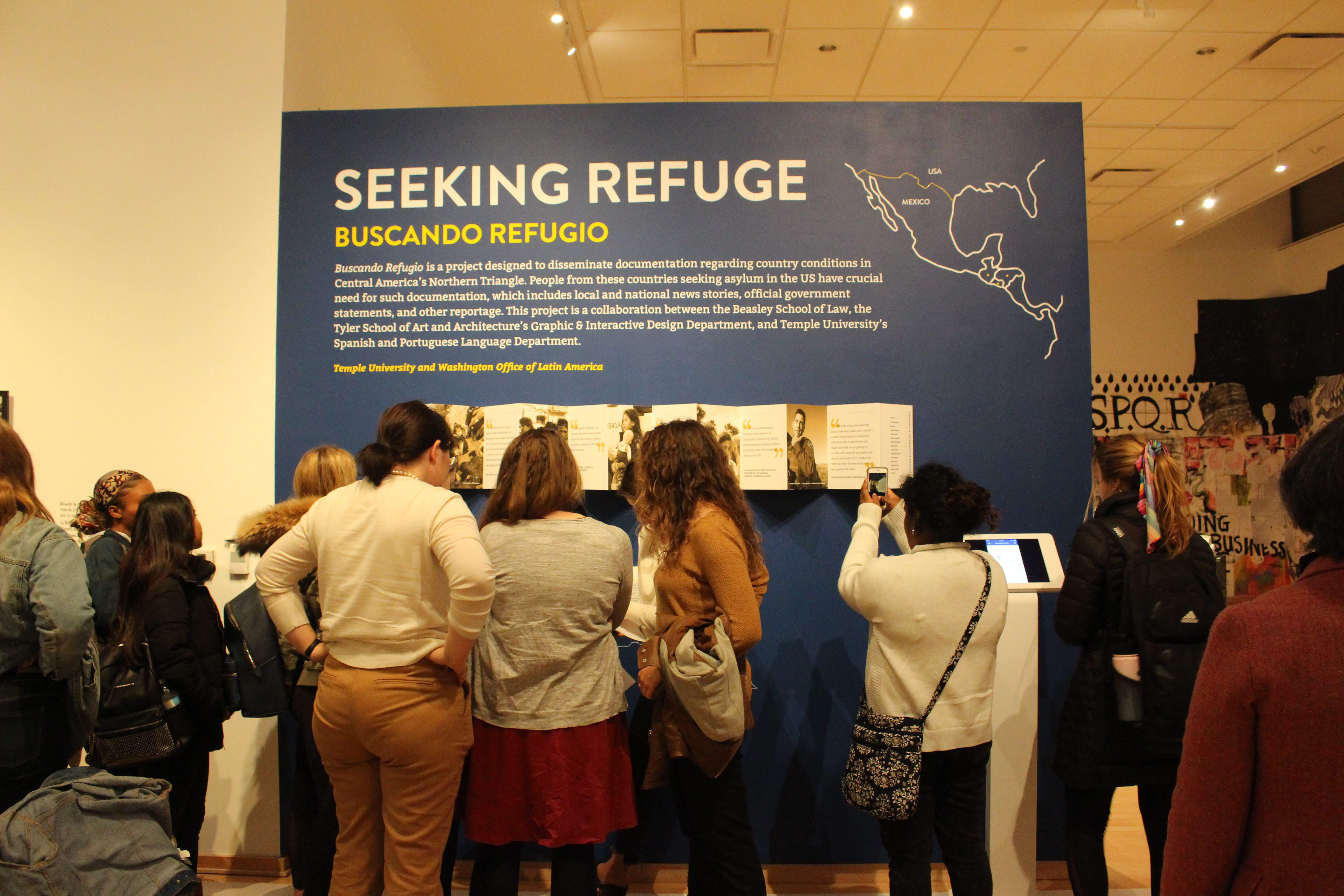
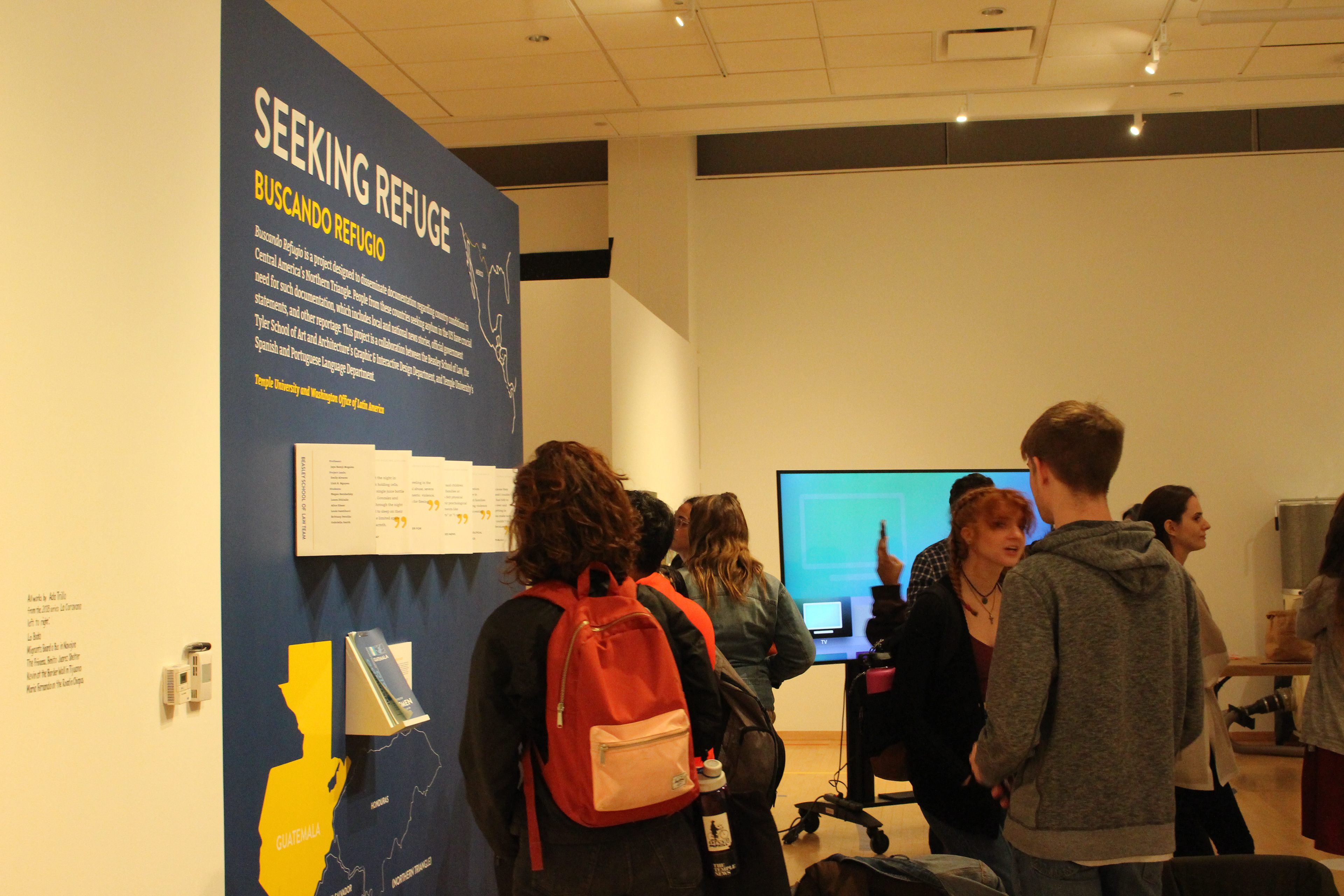
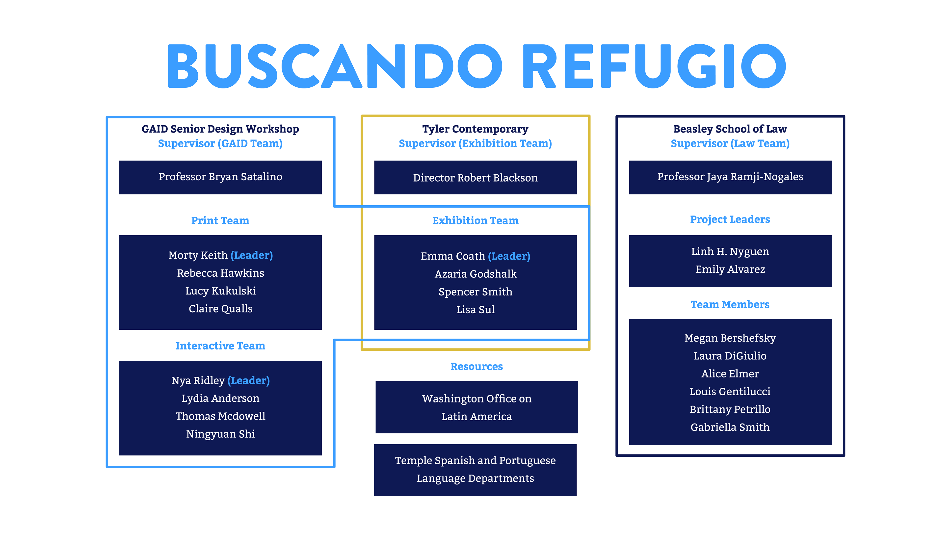
In the fall of 2019, I had the privilege of working alongside the Temple University’s Beasley School of Law, Tyler School of Art and Architecture’s Senior Design Workshop, Spanish and Portuguese Language departments, and the Washington Office on Latin America (WOLA) to realize Buscando Refugio, a large scale effort to connect refugees seeking asylum in the United States’ southern border to documents that would help their effort to make a safer life in America. The goal of the project was to prepare and deliver pro se (self-representative/without legal counsel) materials to asylum seekers so that they could represent themselves efficiently in their asylum hearings.
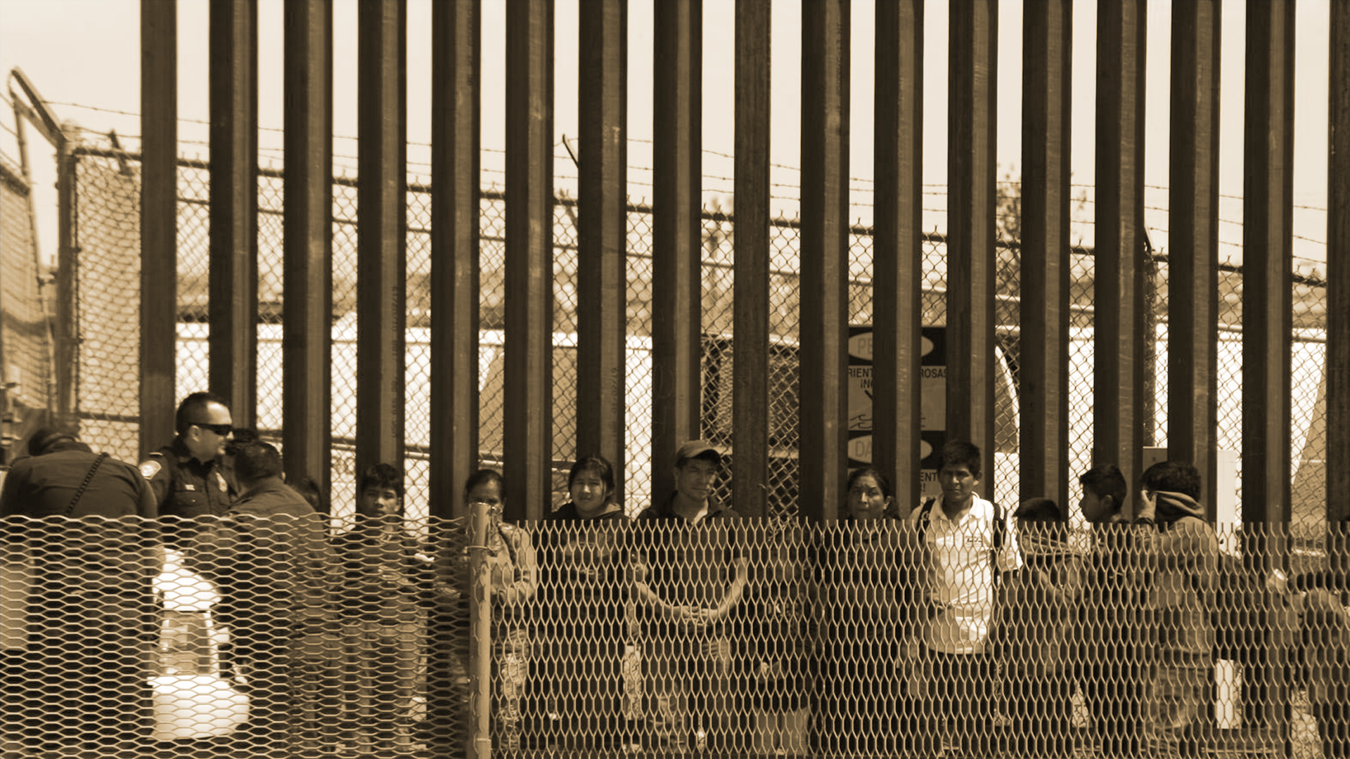
David Peinado/NurPhoto via Getty Images | Original Source from Vox
Large groups, like this group of 100, have become increasingly common at the US/Mexico border — contributing to
the rapid spike in apprehensions of migrants.
the rapid spike in apprehensions of migrants.
How to Help Asylum Seekers
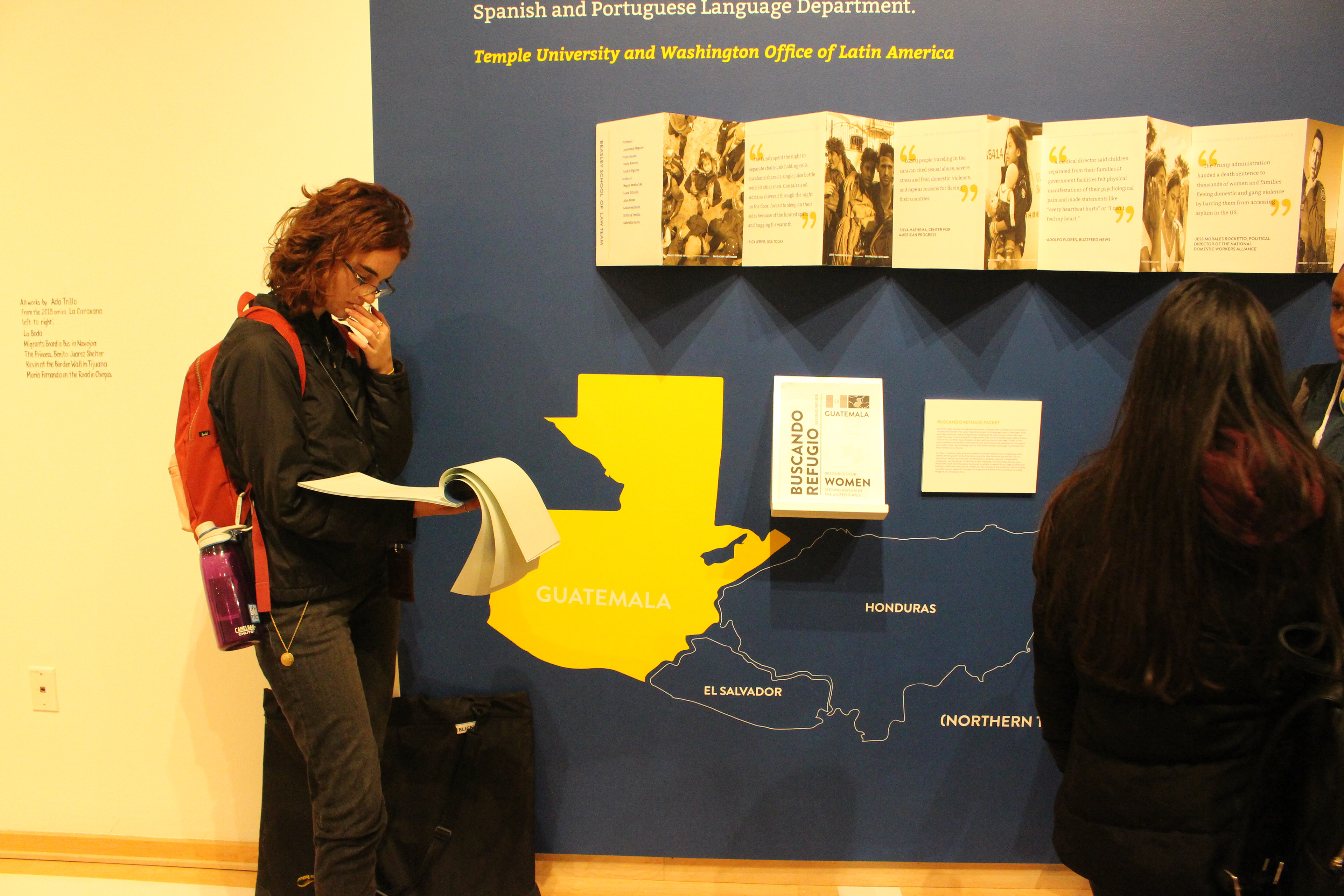
Our group focused specifically on the Northern Triangle region of Central America, comprising the countries of Guatemala, El Salvador, and Honduras. These countries have experienced violence from gangs and the police, often placing women, children, and LGBT+ people in grave danger. People fleeing from this violence make up a majority of people seeking asylum at the America’s Southern Border. There they face more violence, detention, or removal under the policies of the Donald Trump administration. When these asylum seekers finally have the chance to defend themselves in an hearing, they usually go without counsel, do not receive materials in a language they can speak or read, or have to testify in a large group of other asylum seekers. Our work seeks to lessen that burden on the asylum seeker, so they can more easily seek safety.
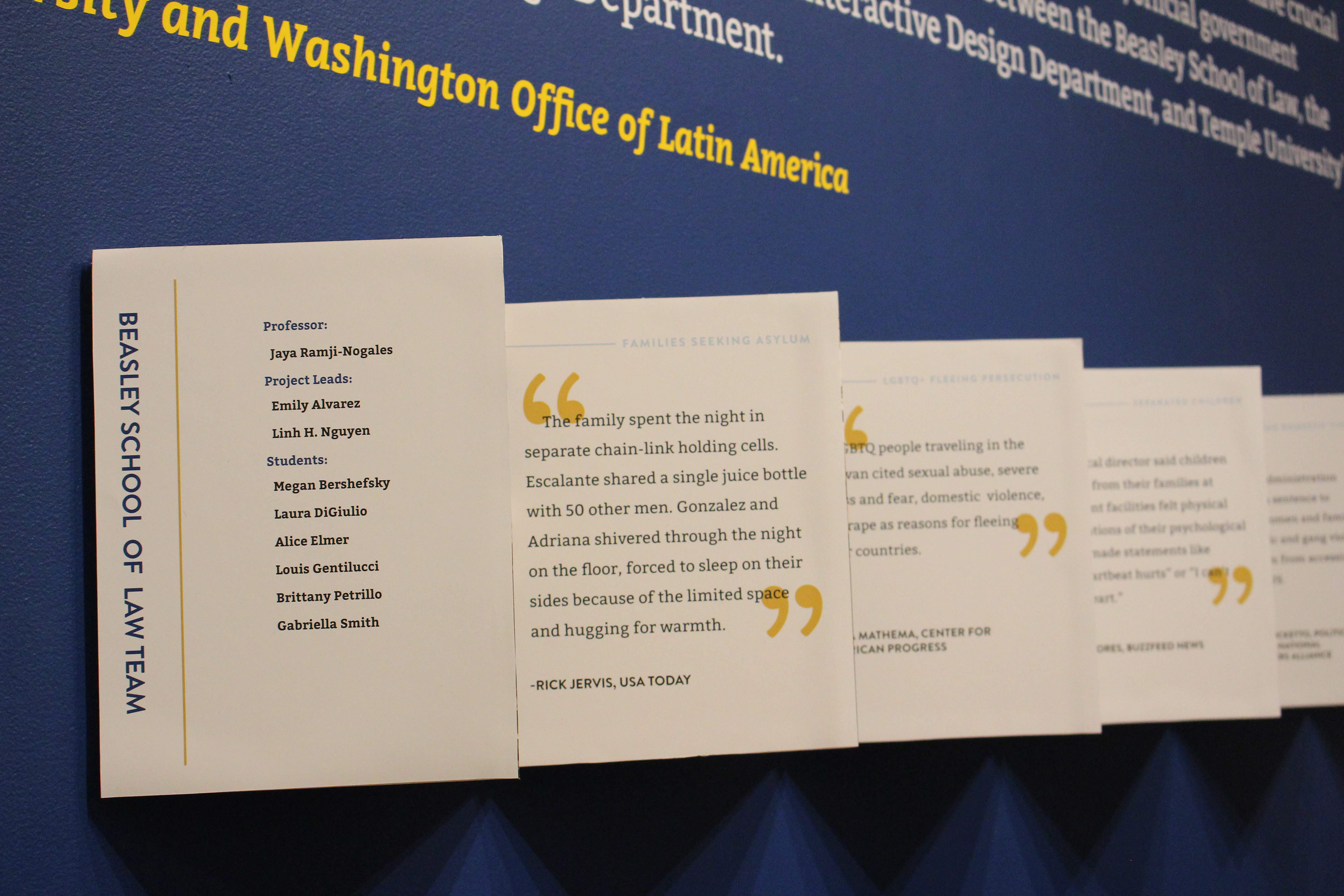
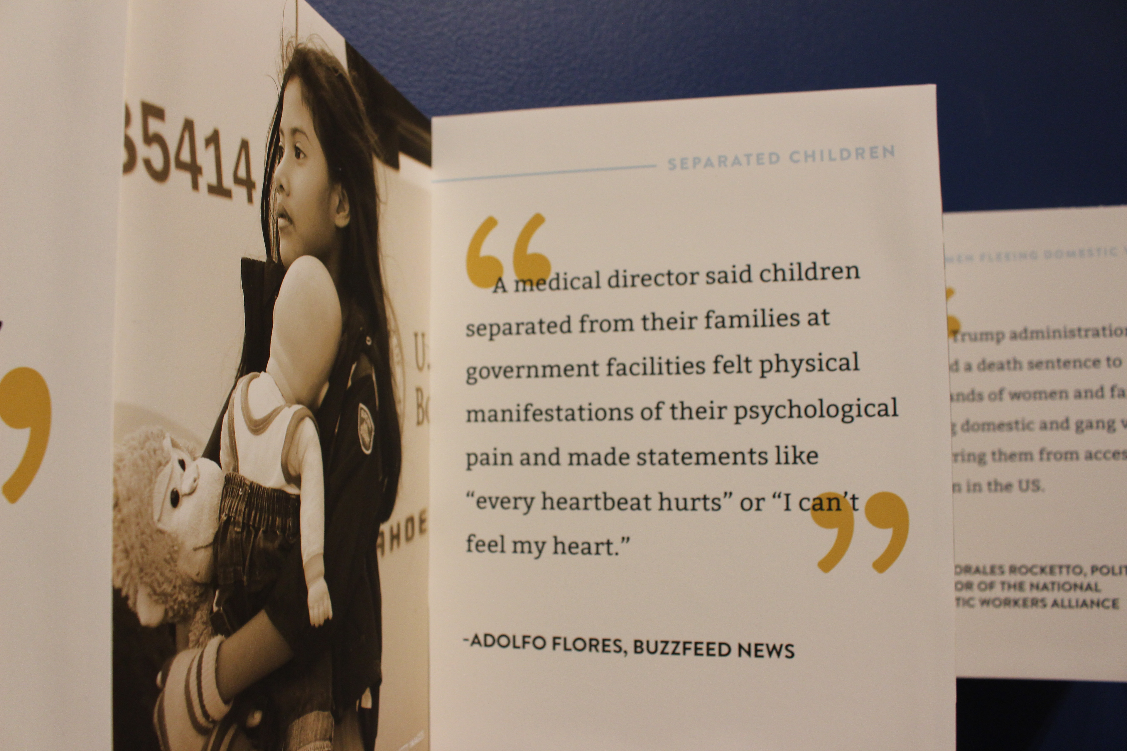
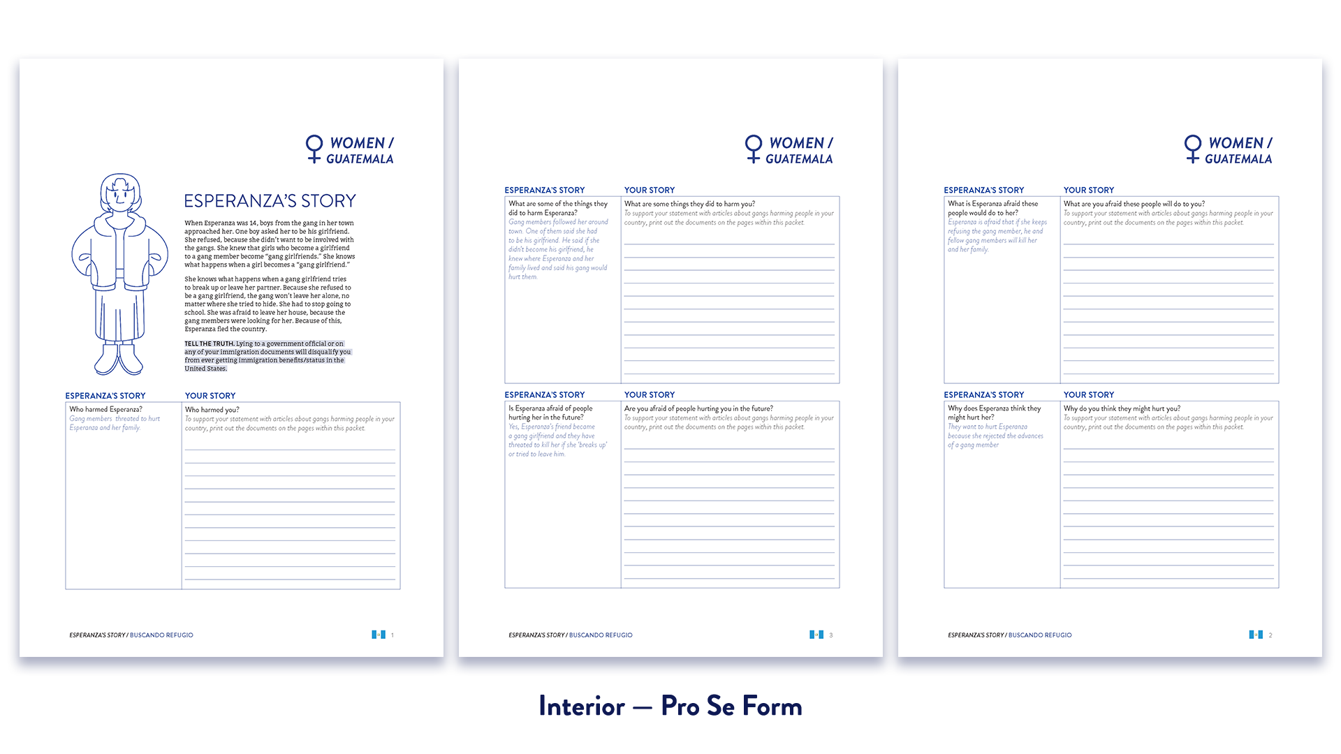
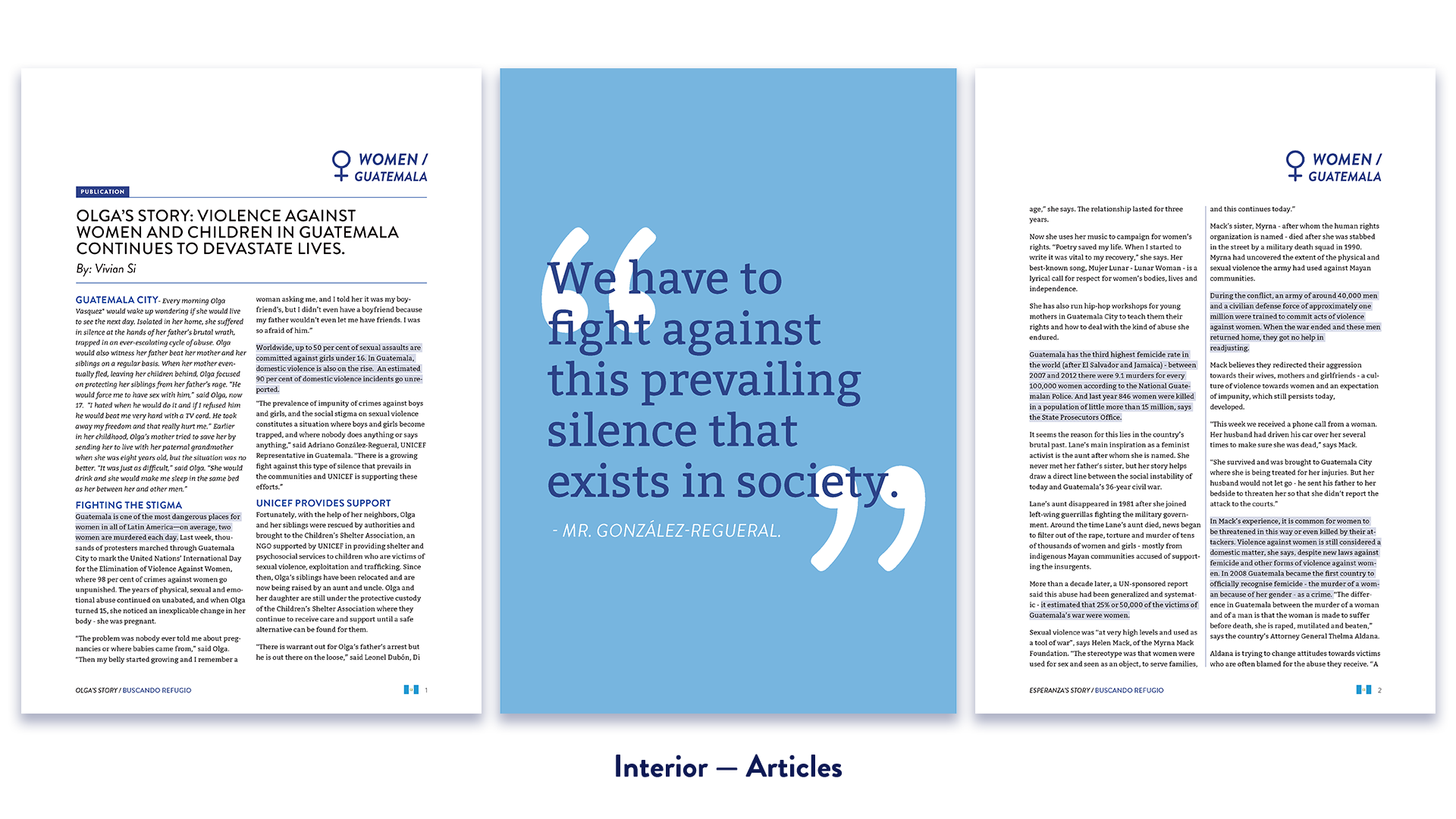
Each team in this project had equally demanding and important tasks to complete. The Beasley Law team, representing WOLA and led by Professor Jaya Ramji-Nogales, performed the majority of the Pro Se research. They collected materials for the Tyler teams to utilize in their designs. These included articles detailing violence and strife, statistics, or general user stories of mistreatment in each respective country that the end user could compare to their own situation. Temple’s Spanish and Portuguese language departments did the vital work of translating all the Pro Se materials to their respective languages. This allowed our group of end users to use them best. Finally, the Senior Design Workshop, led by Professor Bryan Satalino of Tyler School of Art and Architecture’s Graphic and Interactive Design program, prepared and designed the Pro Se materials for use in a paper packet, a mobile app, and a walk-in exhibition at Temple Contemporary.
Packet Making — The Print Team
As the team leader for the printed portion, my team and I were directly responsible for the look of the design and production of the paper packet for Buscando Refugio. My teammates Becca Hawkins, Lucy Kukulski, and Claire Qualls worked diligently to make sure that the packet was organized and had all the information needed for the end user to navigate clearly.
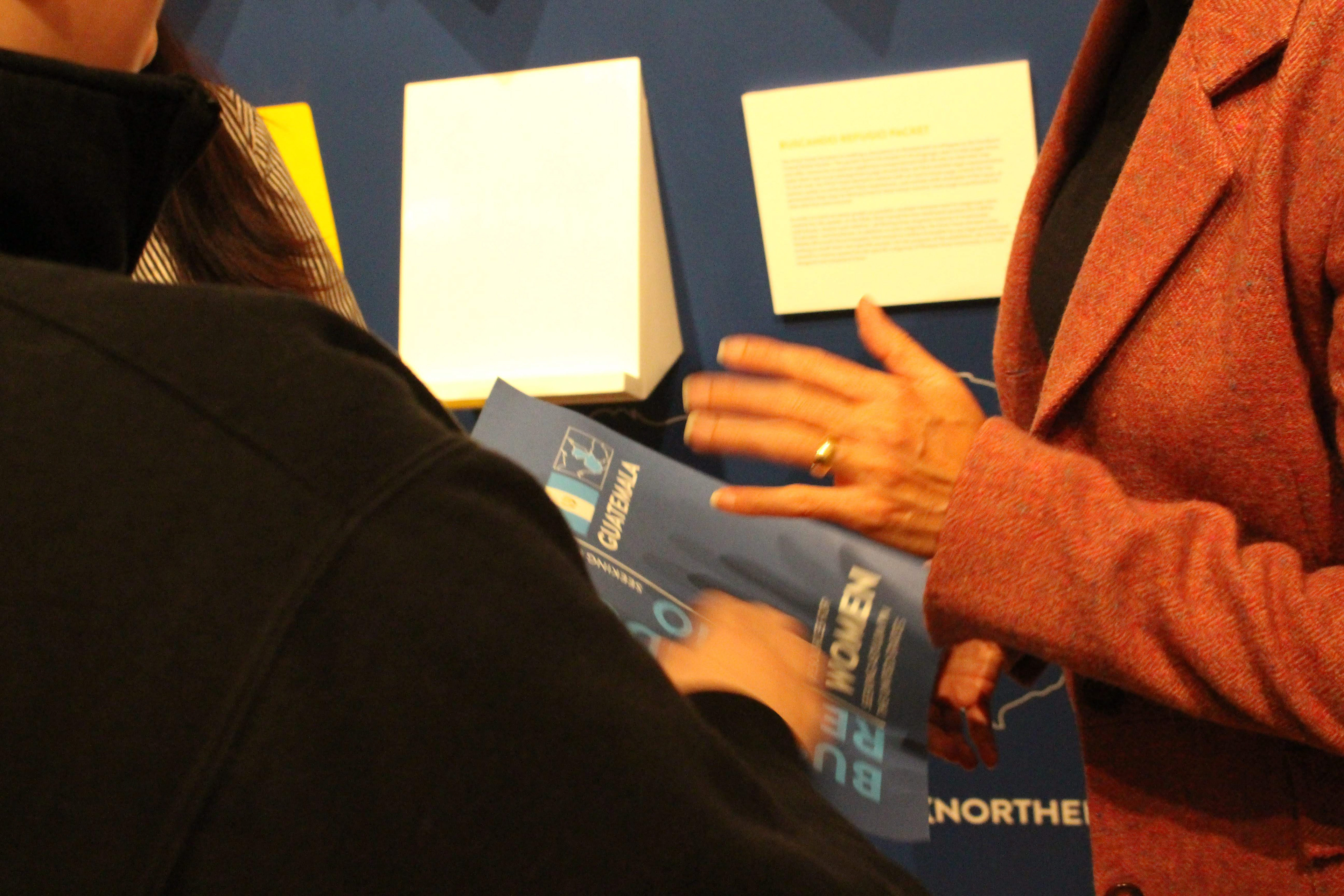
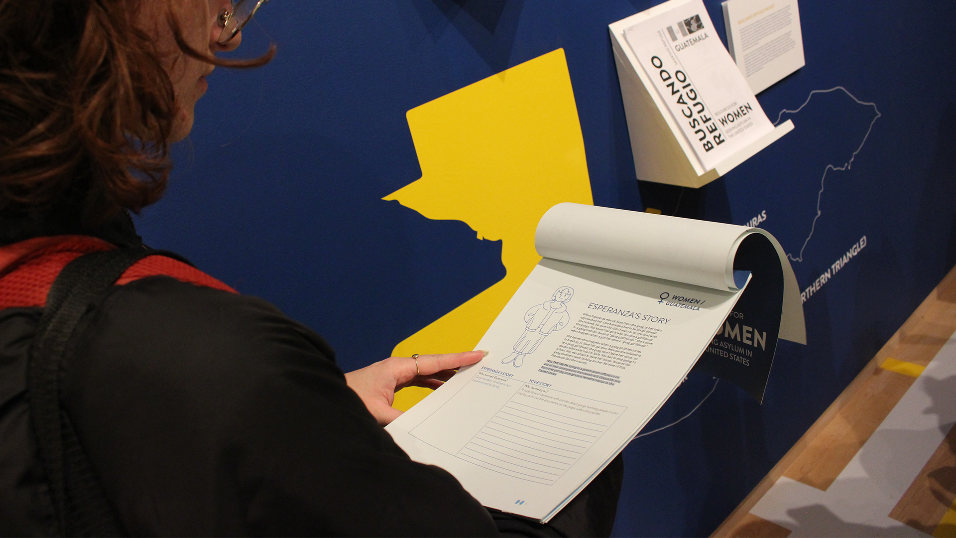
Our work began by understanding our audience. To supplement our research, we had many meetings with Linh Nguyen, Brittany Petrillo, and Megan Bershefsky to get to know our users. Most of the asylum seekers that would be using these packets would be escaping violence from the Northern Triangle, and the Central American region of Guatemala, El Salvador, and Honduras. When narrowing down to specifics, our counter-team on the Beasley Law Side suggested that we create several packets with different subgroups. Following their direction, we clarified and settled on three subgroups: Women, Children, and LGBT+ People. Each of these subgroups would additionally have their own packet for each country, bringing the total number of packets to nine.
With our subgroups decided on, our team had to learn how to format the Pro Se materials. As a starting example, Linh, Brittany, and Megan sent the Stanford Packet, which is a comparable Pro Se packet. While functional and easy to read for its intended office, my team and I agreed that the Stanford Packet did not have a consistent illustration style, typography, and design. We strove to make something uniform and clean across all of its pages from every detail, down to the finest line and color.
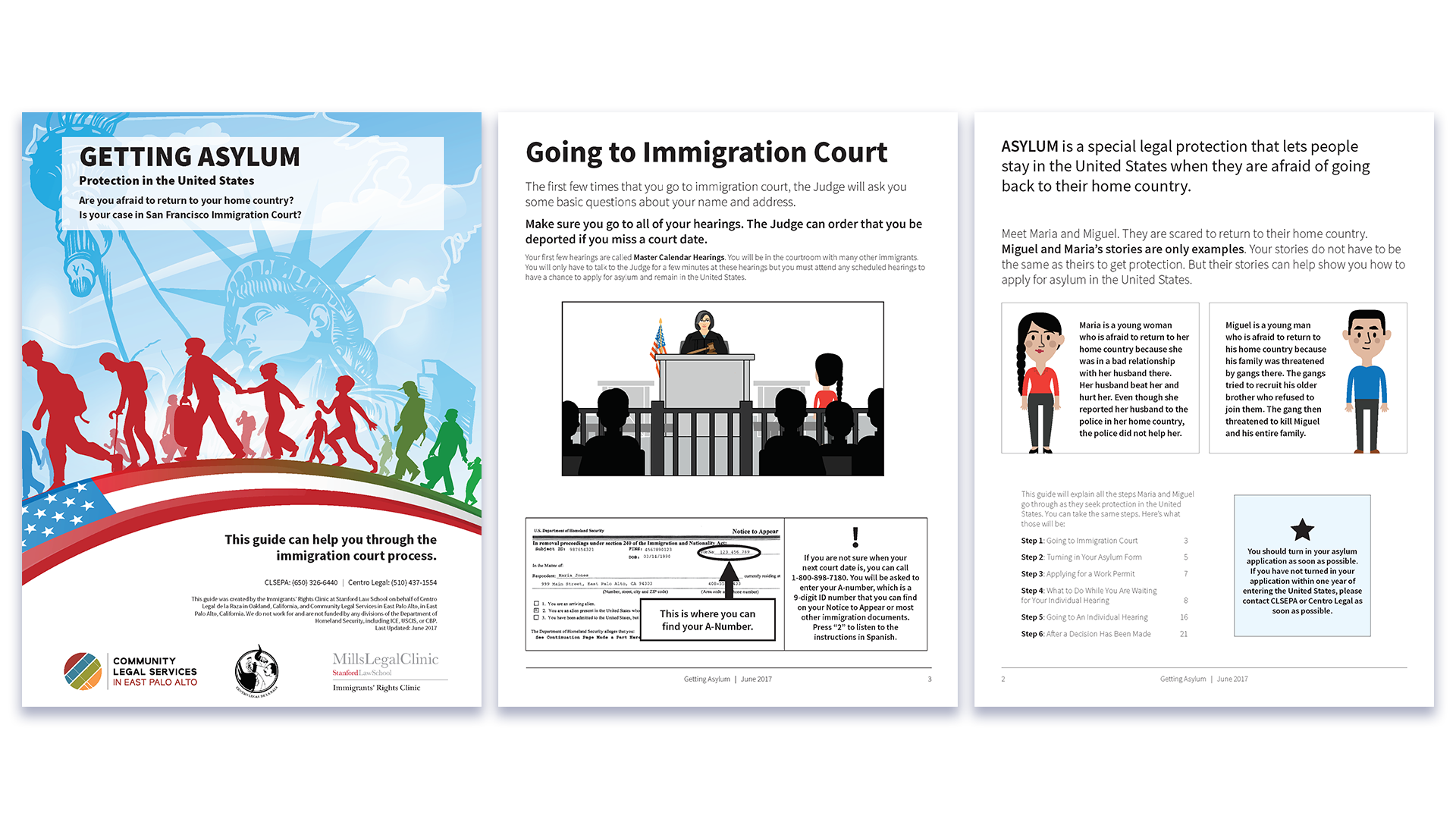
Our original starting point, the Stanford Packet — not the most consistently designed document in the world
Making a Universal Design
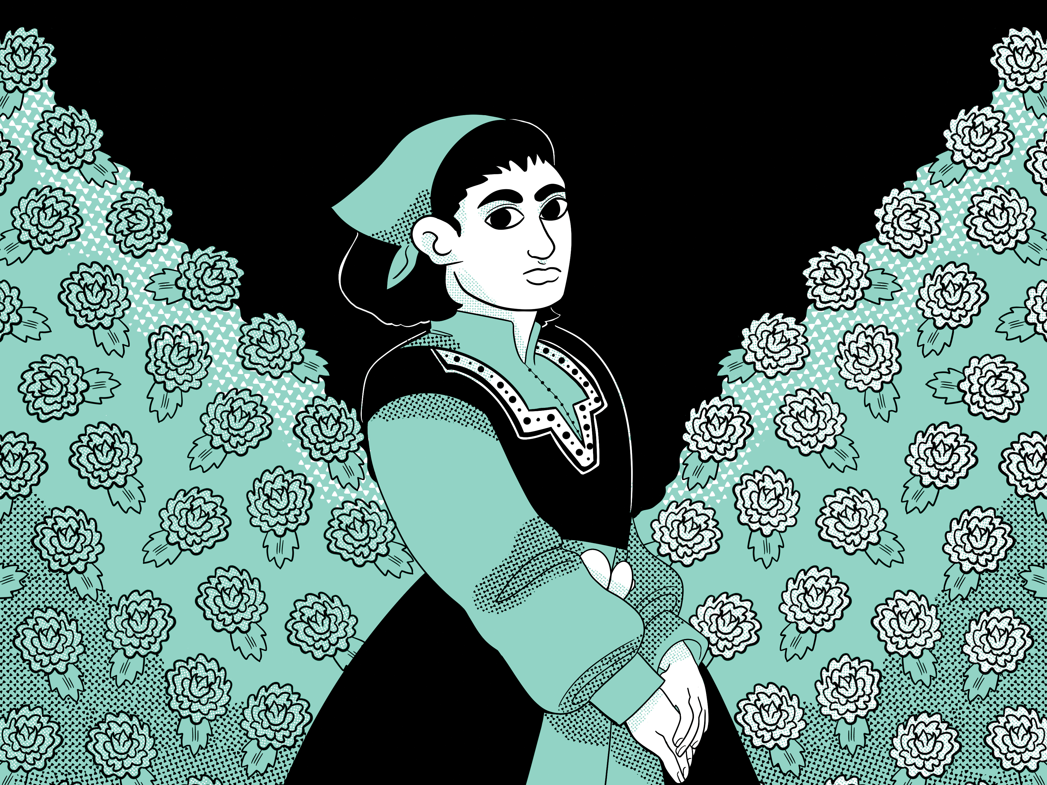
As a class, we all created prospective design guides for the project: style tiles. After a process of review and refinement, we settled on the styles above curated by Mobile Design team lead Nya Ridley. Additionally, we selected an illustration style by Lisa Sul, an Exhibition Design team member. With our design methods chosen, we had to decide how our materials were going to be printed and distributed. Most lawyers and volunteers do not have access to the same printers, binding techniques, and high-quality papers as we do, and we wanted to accommodate those needs.
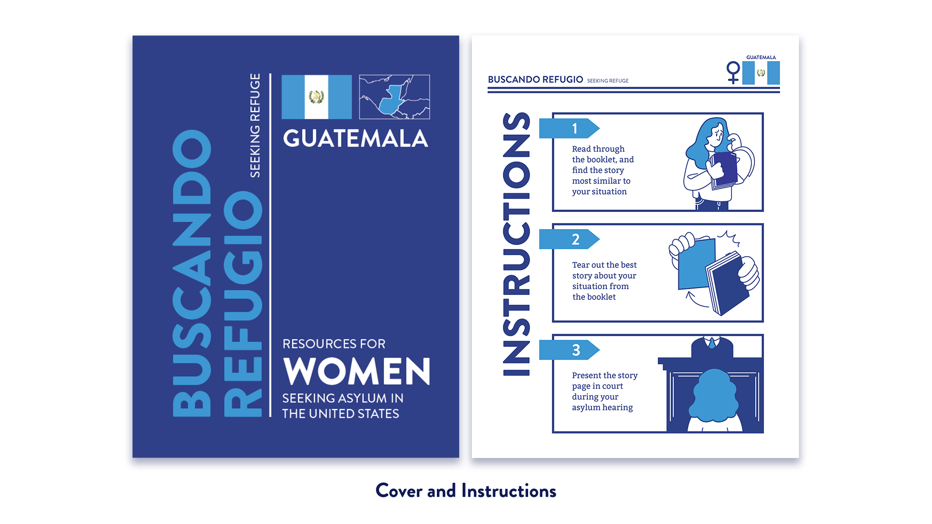
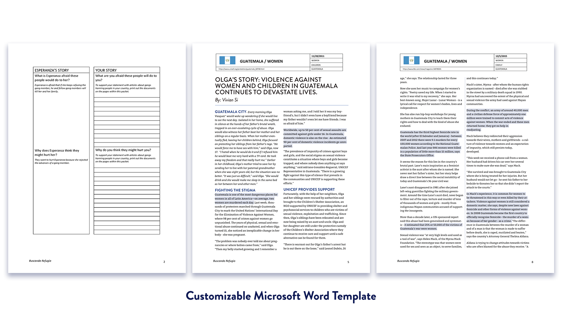
The interface, subgroups and design needs that faced us presented our team with a unique set of challenges. For this draft exhibition copy, we decided to focus on the Women from Guatemala Subgroup. We decided that for the purposes of the upcoming exhibition, we would create two versions of the packet; a high fidelity version printed on high quality paper stock, prong bound with perforated pages, and a low fidelity Microsoft Word template to be printed on copy paper.
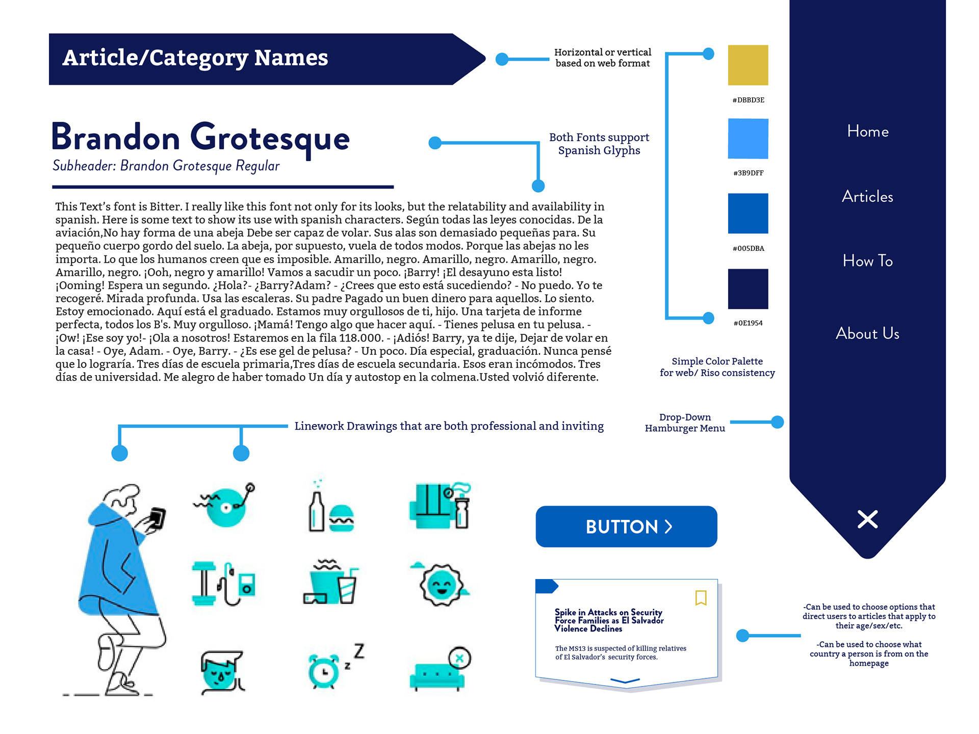
The Buscando Refugio complete style tile, created by Mobile Design team leader Nya Ridley
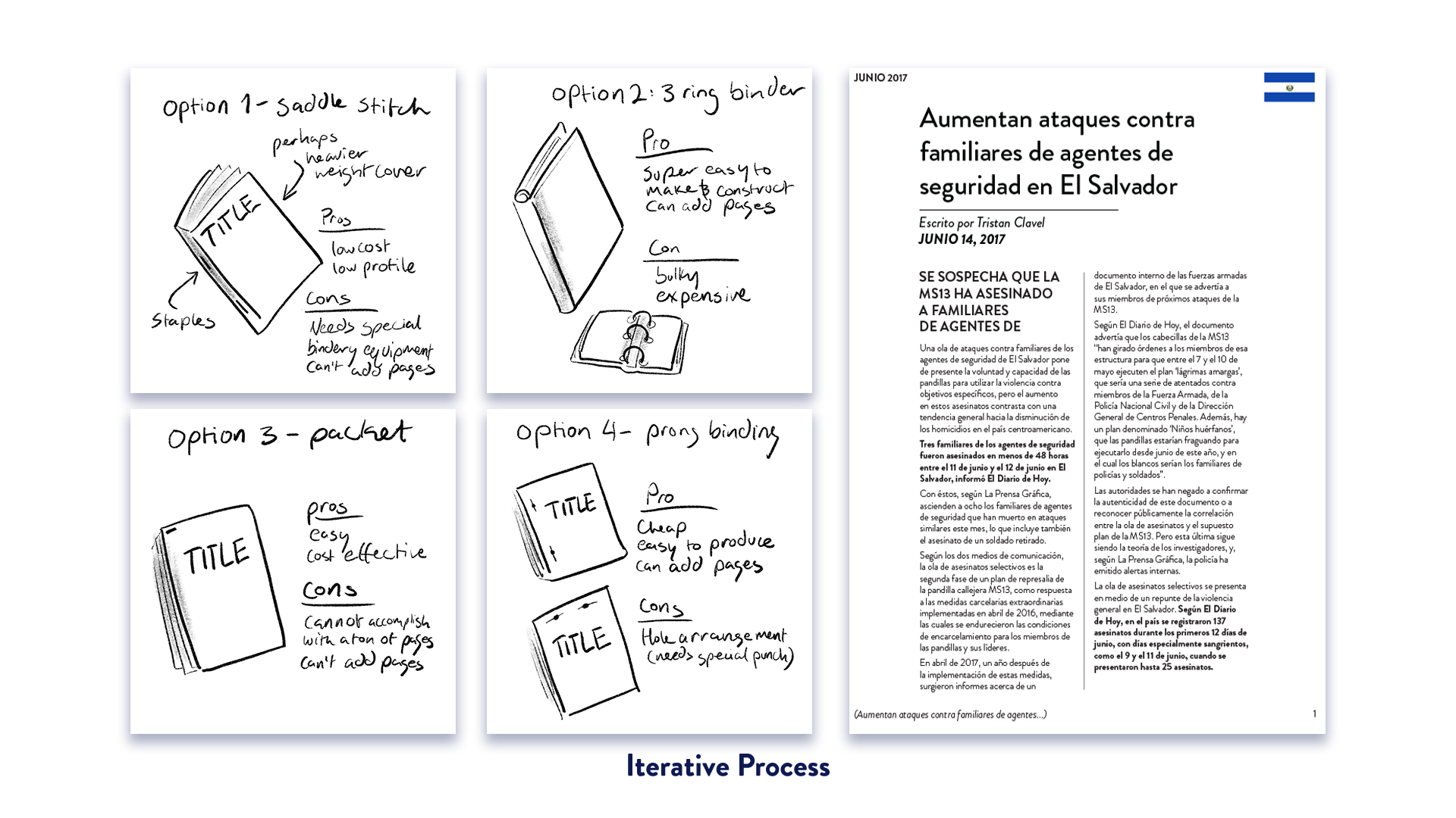
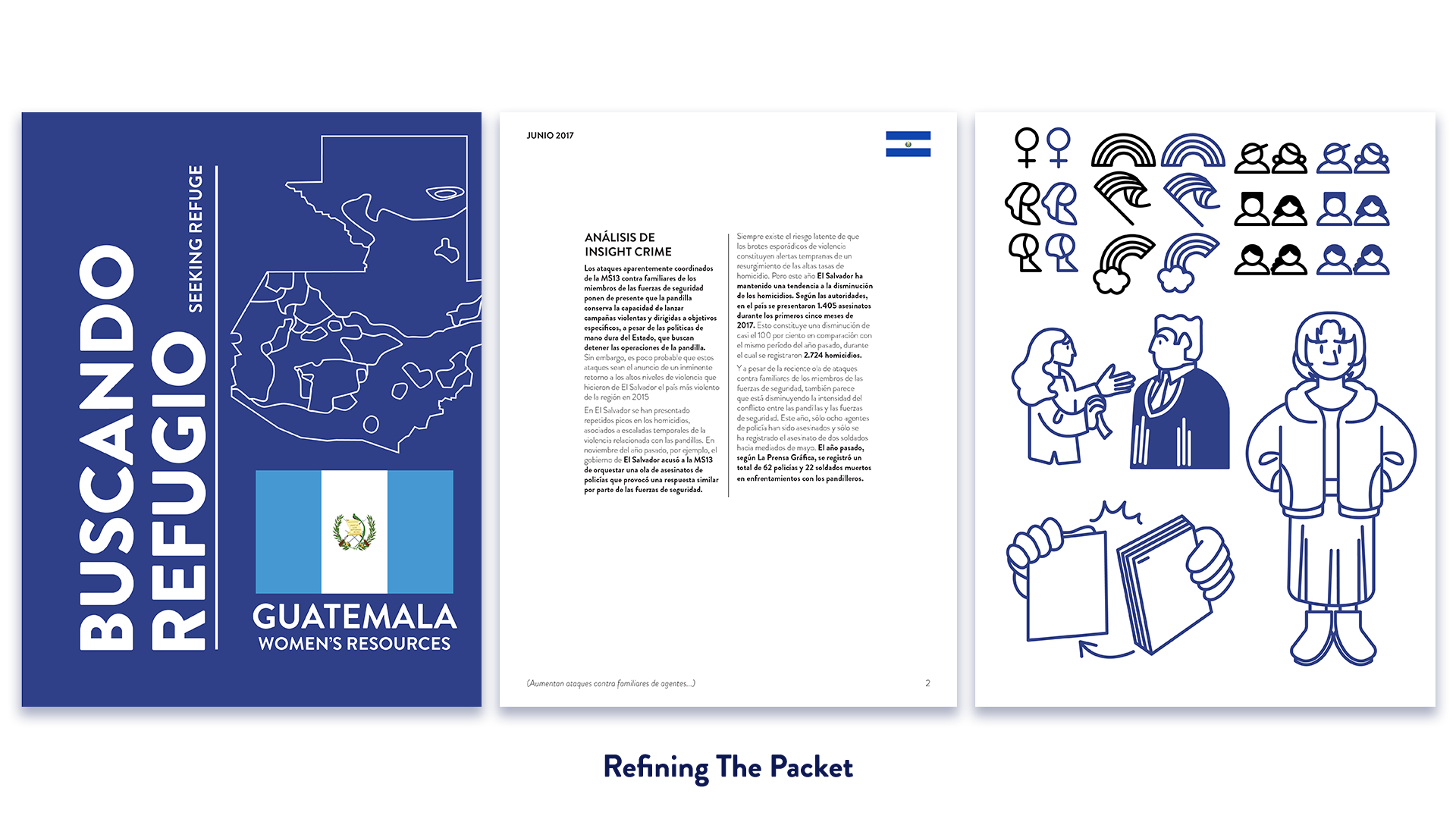
While we focused on this specific subgroup, we also developed icons, hierarchy, covers, and instruction pages that would be relevant to all the packets. Early in development, we also wanted to clarify how our project would be presented in both of its forms. The vision for the low fidelity packet came easily: we would print single side on regular, white, 8.5”x11” copy paper, and staple it diagonally on the left-hand corner. The high-fidelity version was a little more difficult because the world was our oyster. Going back to our color palette, we decided on a blue, speckle-toned paper that was just blue enough to highlight the design, but not enough to overpower it. After some deliberation, we decided to bind the high-fidelity packet with a prong at the top; it was practical, relatively inexpensive, and had a nice flair that made a text-heavy document more friendly.
From there, we hit the bricks and refined all of our designs to make sure that our document worked like a well-oiled machine. With critique from Professors Ramji-Nogales and Satalino, Linh, Brittany and Megan, we were able to fully flesh out the packet in nearly no time at all.
The Finalized Packet
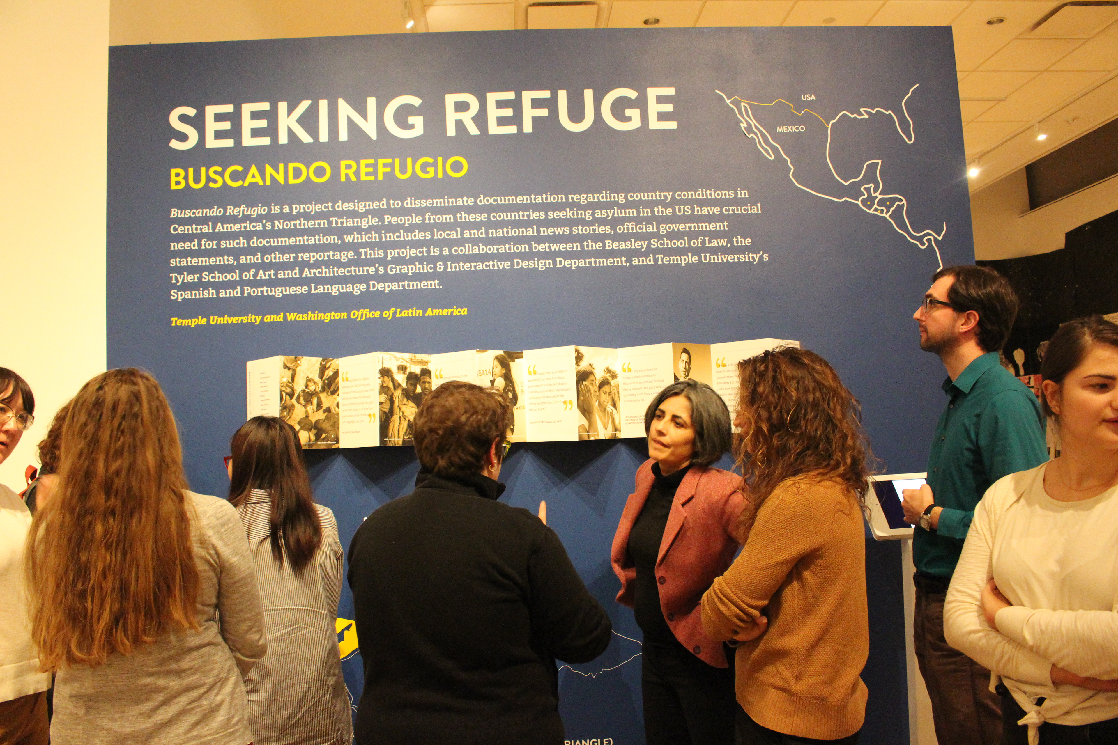
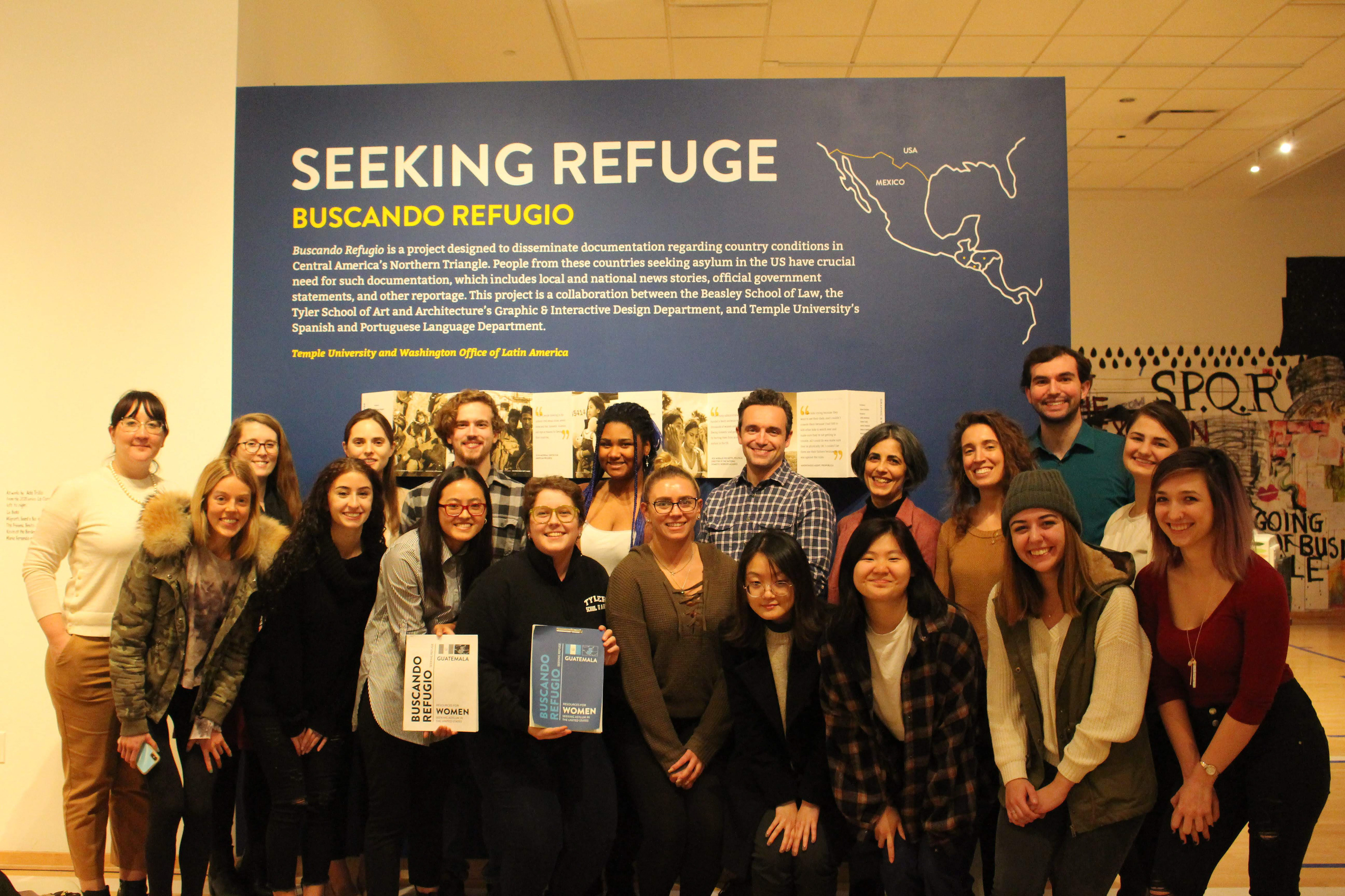
The Exhibition
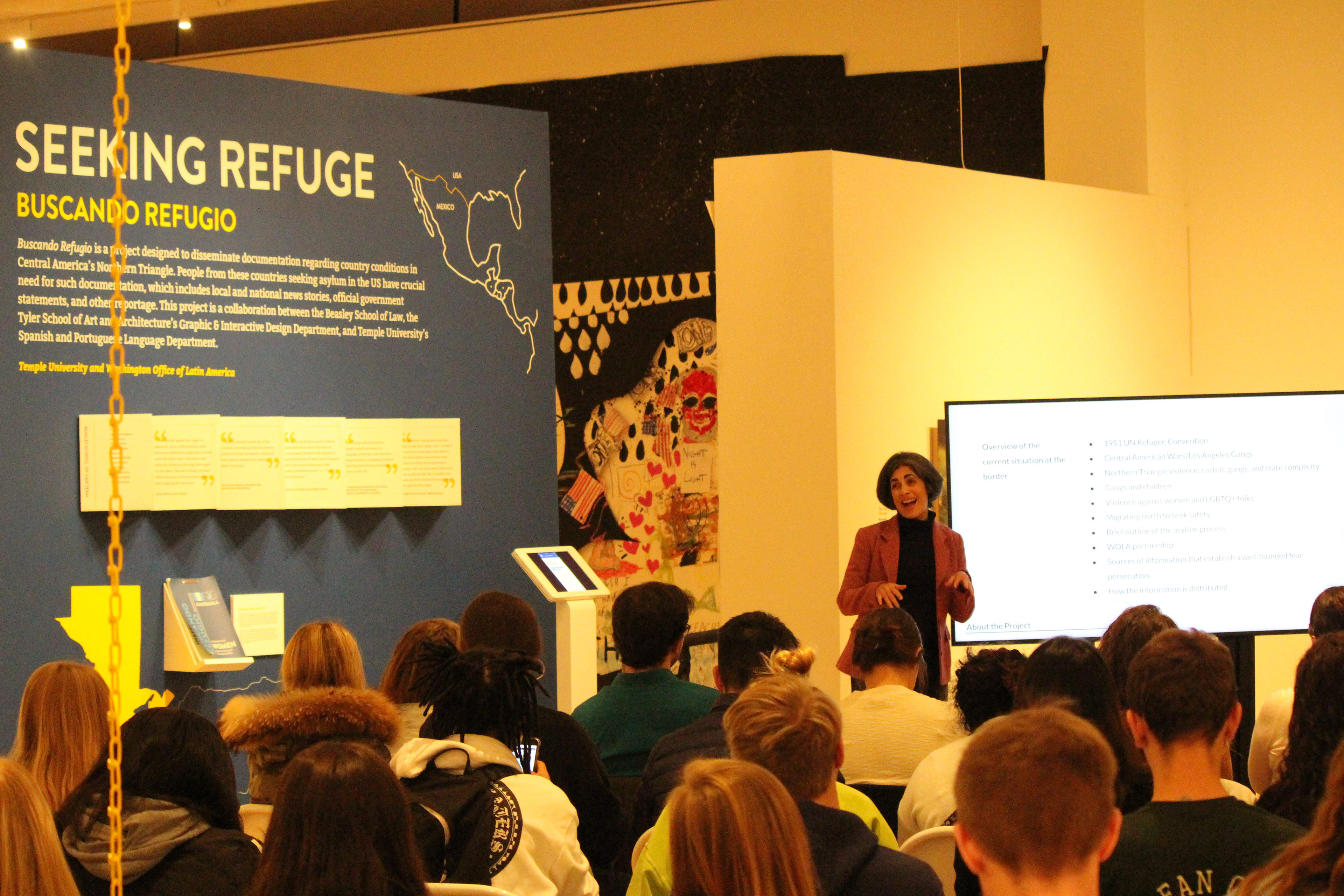
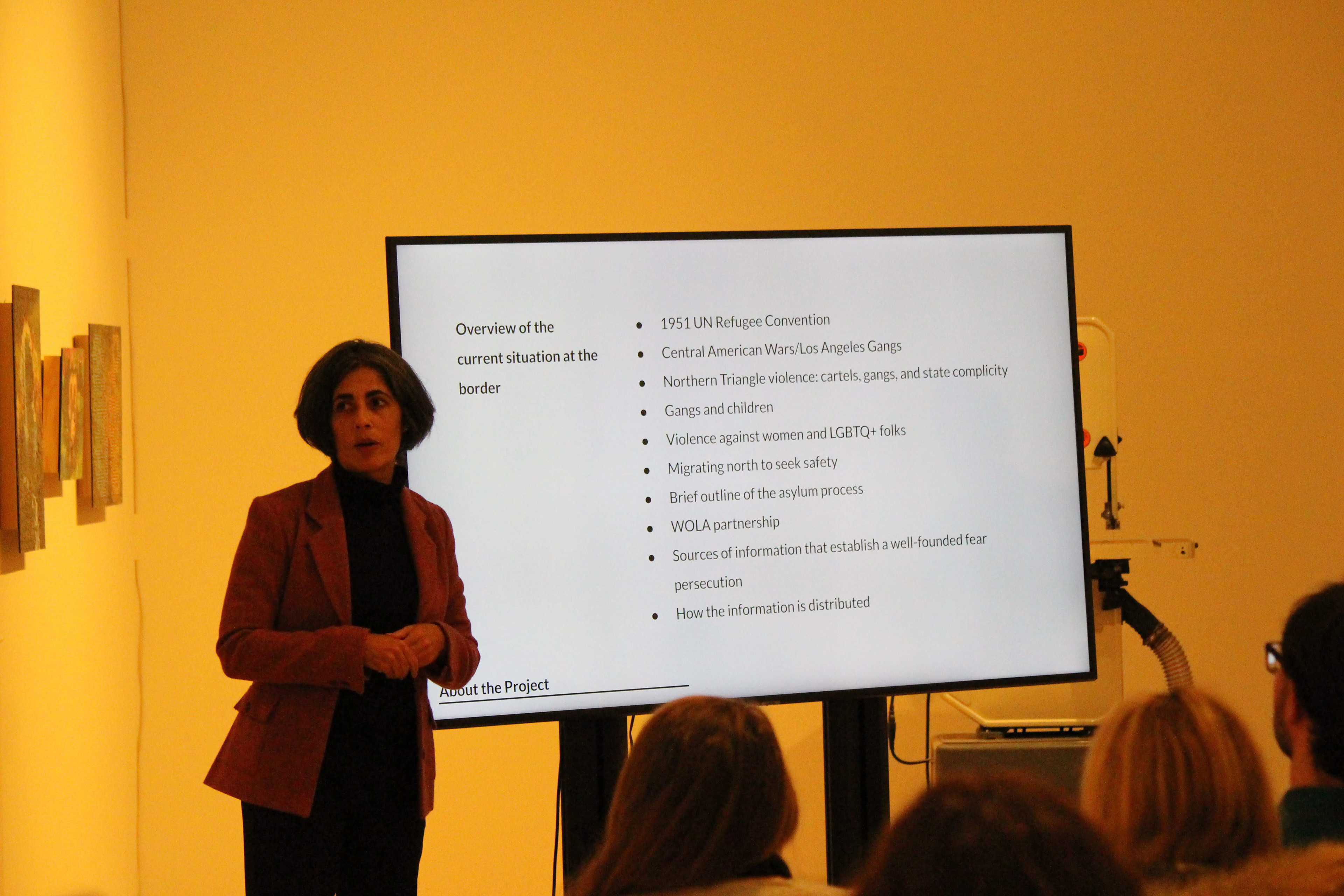
Finally, with all the hard work done on the packets, the teams convened at an opening event for the exhibition on November 11th, 2019. All the students from Professors Ramji-Nogales and Satalino’s classes attended, as well as a number of Tyler students, faculty, and staff. Professor Ramji-Nogales opened up the event by describing the events that led to the foundation of the project, followed by Professor Satalino describing the bricks and mortar of the design portion. After, all the team leaders had a chance to present their teams’ work.
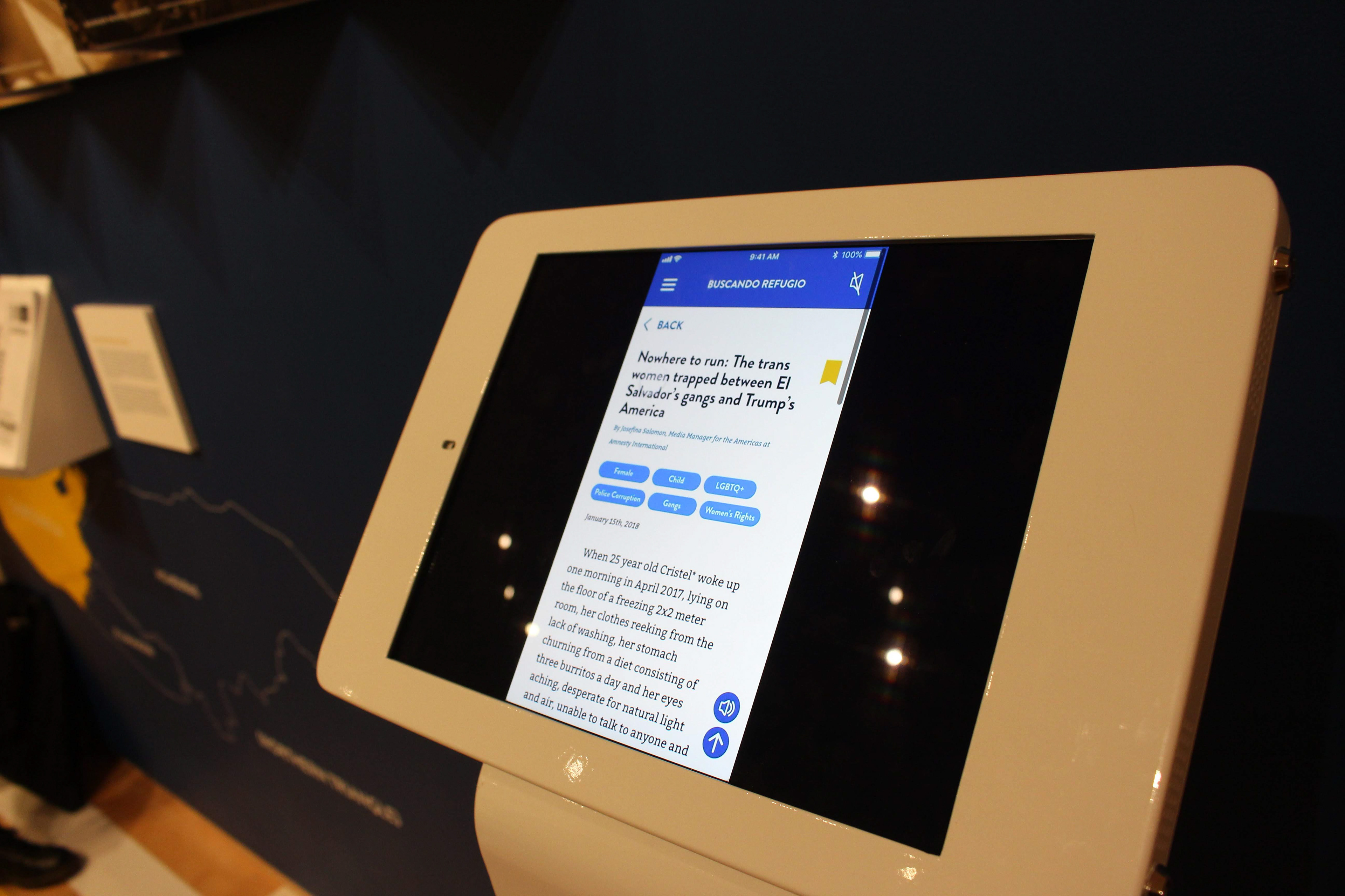
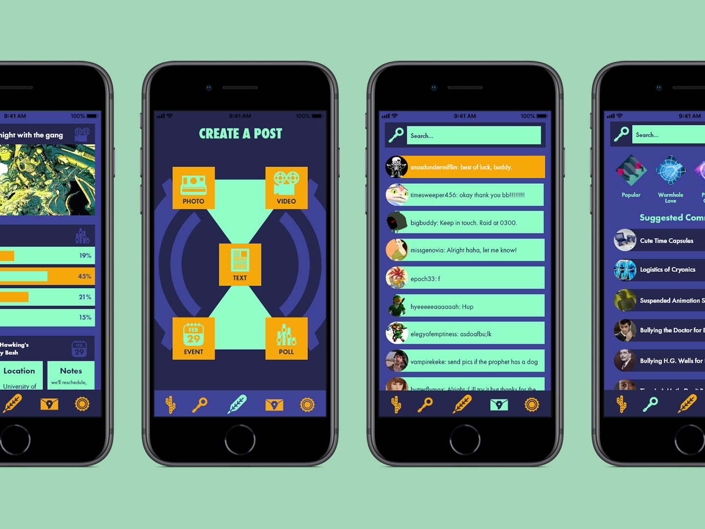
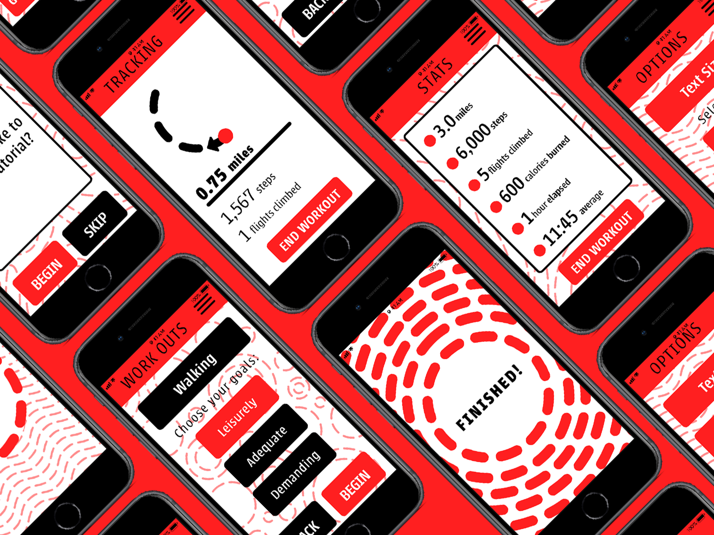
I went first, detailing the research and design process from start to finish. Following me was Mobile Design team leader Nya Ridley, who described the unique user experience her team crafted. The app prototype takes users through a set of questions to present specific articles tailored to the user’s Pro Se needs, with instant translation and audio reading on each page. Following her was Exhibition Design team leader Emma Coath, who shared the long process of preparing for the event. She and her team went through multiple rounds of iteration, prototyping, cutting, and building to get the exhibition into tip-top shape.
Overall, I am incredibly fortunate to be a part of this experience, as well as proud of my team, my classmates, and my larger group of cohorts at Beasley and the departments of Spanish and Portuguese. This project is a large, dedicated, and vitally important undertaking that none of us could have done alone. As a Jewish man, I am doubly thankful for the opportunity to participate in this project. I would have wanted someone to do this for my ancestors if they had the knowledge and talent to do so. I plan on continuing to work with this group to further refine the packets and any other design needs that crops up, because it is incredibly important work. All in all, I admire everyone’s hard work and cannot wait to see where the project goes next.