
Art Direction - Bryan Satalino, Scott Laserow | Categories - Interactive, Research
Creative Timeframe - January to April, 2019 (Versions 1 and 2);January to February, 2020 (Version 3)
Team Members - Jess Atwell, Teejay Moore, Ivy Shi | Purpose - Educational Project
Promenade is a fitness app and band prototype built specifically for people with low vision and the visually impaired. The app is geared more towards people who are inexperienced with exercise to have a hands-off workout experience.
Problem
In partnership with Adobe, Teejay Moore, Ivy Shi, Jess Atwell and I were challenged to make a fitness application for the visually impaired. Their definition of visually included those who are fully blind, have some vision or have other impairments such as tunnel vision.
Justin Fraga of Adobe presented our brief, describing that as a group, visually impaired people tend to be less active, and are affected disproportionately “by obesity and other health issues related to sedentariness”. Usual visual aides such as a guide dog or human trainer are options but are often expensive and complicated.
Research
Our brief included a link to a post on Sandy’s View, a weekly editorial published by the Chicago Lighthouse, about the relationship between the visually impaired and exercise. The editorial, citing a CDC study, states that only about 50% of people with physical disabilities choose to exercise. 50% of that group reported chronic illnesses like diabetes, heart disease, and stroke. Some common anxieties of visually impaired people regarding exercise mirror those that were gone over in the brief, and also include ones such as lack of transportation, lack of motivation, lack of information, and fear of getting hurt.
Ending on a hopeful note, the editorial expresses confidence that most activities can be performed by people with visual impairments with slight changes based on the individual’s condition. There are also a wide array of sports made specifically for people with visual impairments, such as goal ball and beep baseball.
Next, we studied specific technology-based standards to apply to our project. Our main source for this was the Inside Design article on how to design mobile app experiences for the visually impaired. The primary points were making sure that there was a good contrast balance for app elements, not relying on color to convey a message, enabling a dark mode, and having support for dynamic type.
We moved on to learn experiences from the people we would be designing for. We first watched videos by Tommy Edison, a Youtube film and media critic who was born blind. He has a series of videos of what it’s like to be blind, the differences and similarities of his experiences compared to sighted people’s, and even comparisons with other people who have low vision or became blind later in life. We specifically studied his video about how the built-in screen reader works on an Apple cell phone to get a sense of how our users would interact with our app.
We moved on to learn experiences from the people we would be designing for. We first watched videos by Tommy Edison, a Youtube film and media critic who was born blind. He has a series of videos of what it’s like to be blind, the differences and similarities of his experiences compared to sighted people’s, and even comparisons with other people who have low vision or became blind later in life. We specifically studied his video about how the built-in screen reader works on an Apple cell phone to get a sense of how our users would interact with our app.
Finally, we had the opportunity to speak with Julie Ann Lieberman, the program director of Temple University’s Institute on Disabilities. She went into depth on the tech available to people with visual impairments not just in terms of exercise, but in day-to-day life.
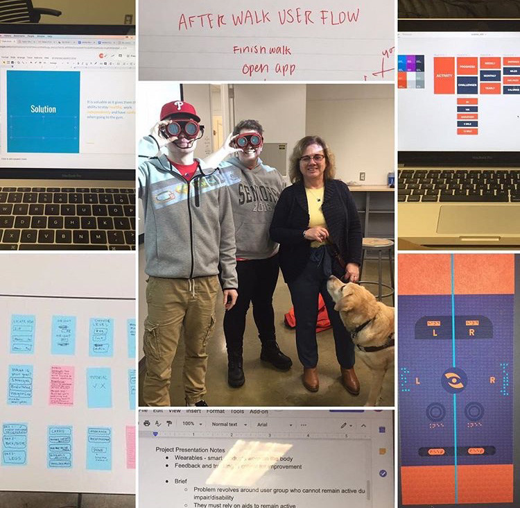
A picture of Brandon Rudolph (left), me (center), and Julie Ann (right)
She is familiar with a wide swath of technologies and is very enthusiastic about developing systems. In detail, she went over the disability support within current-generation Apple Products, and, told us about several resources outside of Apple. Related but not connected to the company is AppleVis, a community page for blind and low-vision people with Apple products to share information and help each other with their tech. For non-apple users, there is Inclusive Android, a similar sight for that user base. She went over several more that were interesting, but ultimately unrelated to how my team interpreted the brief. The programs, services and organizations that we ended up not researching were AIRA, JAWS, TechOWL, and the Philadelphia Blind Sports Association.
Speaking specifically on apps, Julie Ann gave us some extremely helpful tips and tricks to make our prototypes work the best for our target audience. Above all, she urged us to keep it simple and not over complicate things needlessly. She stressed the importance of high contrast again and told us explicitly that gradients, patterns and anything that could clutter the screen make it difficult to navigate. It is important, she said, to either have the app be compatible completely with the device’s built in screen reader, or read the information on the screen to the user. On that note, she also stressed the importance of tight back end labeling, making sure every button, image and important portion of the app is labeled in a way that is as detailed and specific as possible. Keeping the layout logical, such as having the menu at the top right, is a must, as well as making sure that everything stays in the same place from update to update. Tutorials are a good tool, but need to be optional to facilitate self-discovery. Finally, vibration and sound are excellent user feedback because they require no screen reader.
Planning
The first step in planning the app is choosing a suitable audience. In our research, we noticed that most commercially available fitness tech is not very first-timer friendly. Most of the tech we studied did not explain exercises, or even track metrics specific to the exercise being performed. Additionally, the tech was incredibly reliant on the user’s own tech literacy. We decided to limit our audience to people inexperienced with exercise, and people who are not tech literate, which tend to skew towards audiences of children and people older than 45.

Image courtesy of Wareable, on their article comparing the Apple Watch Series 2 and the Fitbit Charge 2
When looking at our competitors, our team focused mainly on the Apple Watch and FitBit. We did not want to make a carbon copy of one, so we weighed the two industry leaders for their pros and cons. In the latest generation, both bands have similarity to each other in functionality. They can track heart rate and sleep, support ECG, detect exercise seamlessly, and are waterproof. The Apple Watch additionally has cellular connectivity, workout plan sharing, and SOS functionality. Based on our conversation with Julie Ann, screen reading services work well with the Apple Watch, and on the Fitbit App.
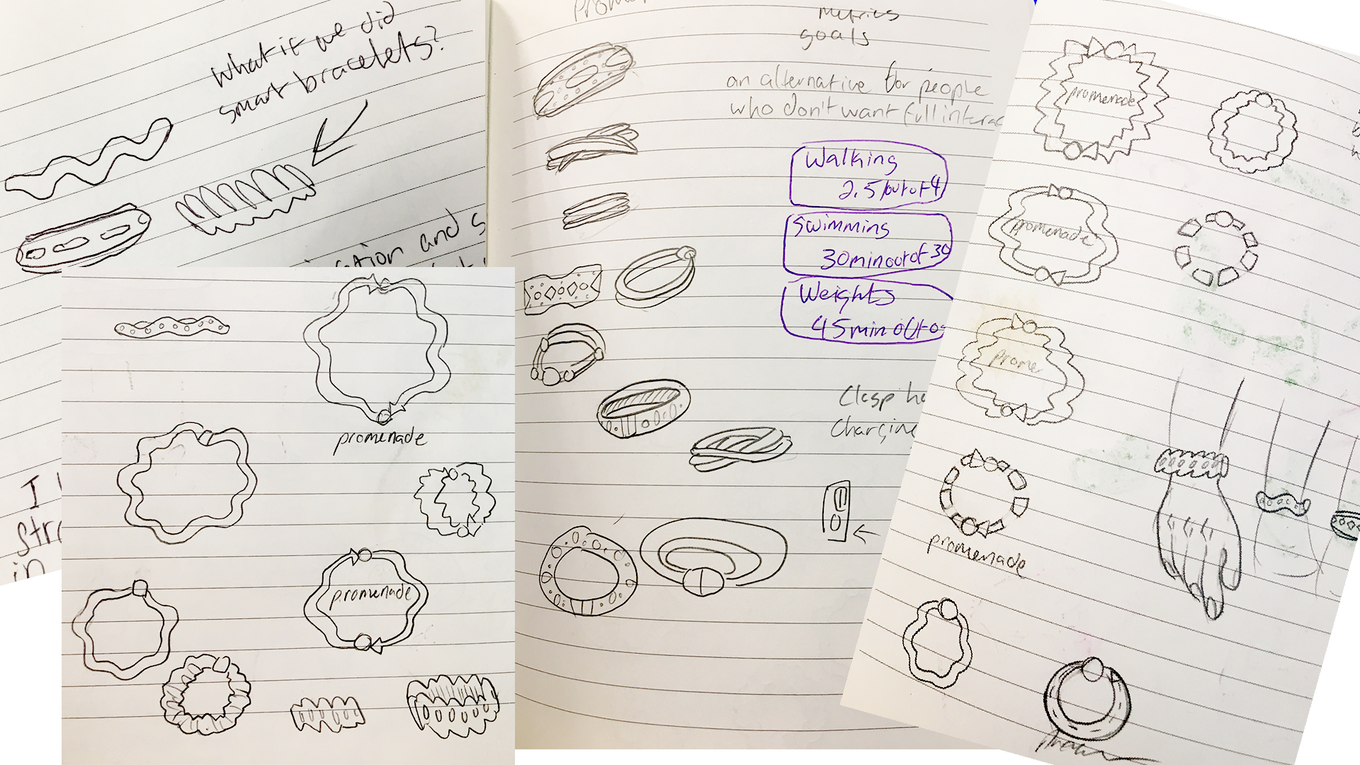
Initial band and logo sketches.
That being said, the drawbacks to both bands is that their layout is not user friendly for the visually impaired. The Fitbit app in particular can have low contrast on certain screens, and a fair amount of visual clutter. While better than Fitbit, the Apple Watch’s built in fitness tracker has a fair number of screens with gradients and clutter that make it hard to focus. Probably the biggest concern we saw as a team is that both of these services do not cater to a less experienced demographic. Neither explain the exercise that the goal sets expect, or really has separate space for exercises that are not walking and running; they primarily track miles, steps, and calories.
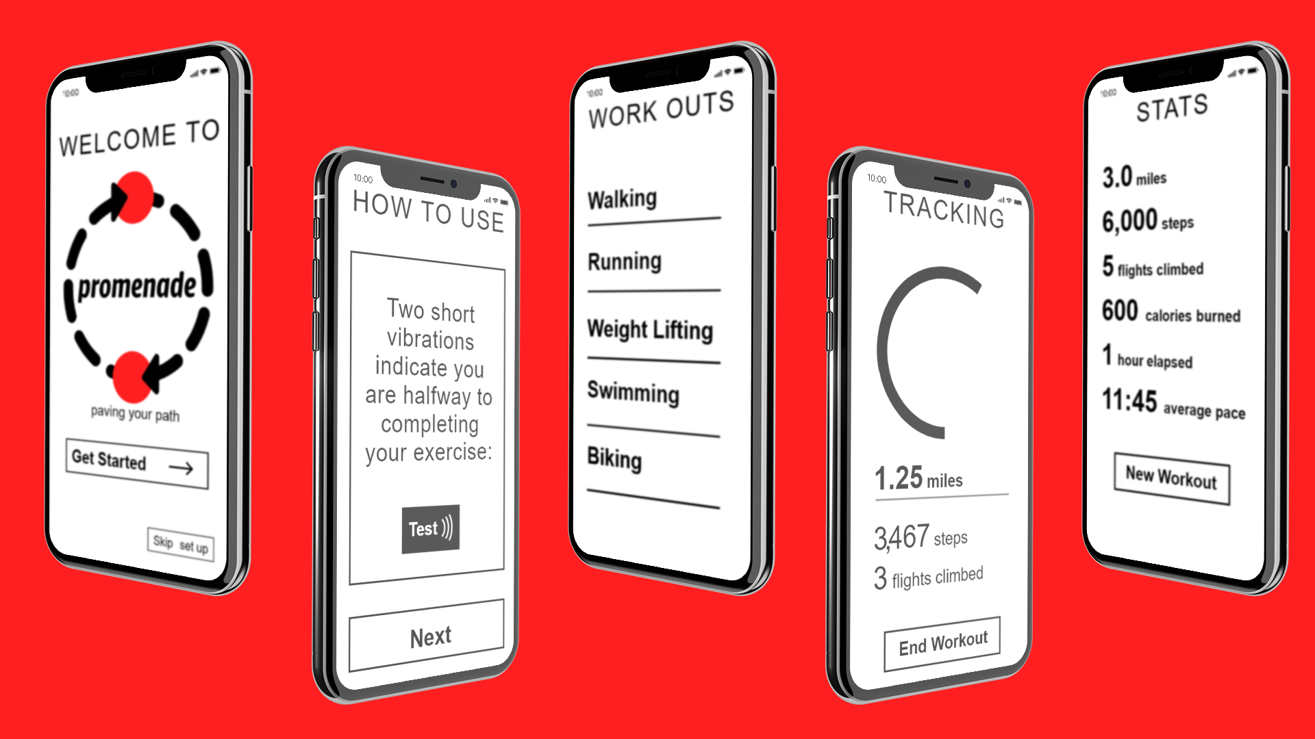
With that information under our belts, we strove to make something that would be beginner friendly, would be simple to pick up and learn, and had the opportunity to get more complex as the user learned. We decided to make the app simple, readable for screen readers and people with low vision, but sleekly designed so it could also be used by people with full vision.
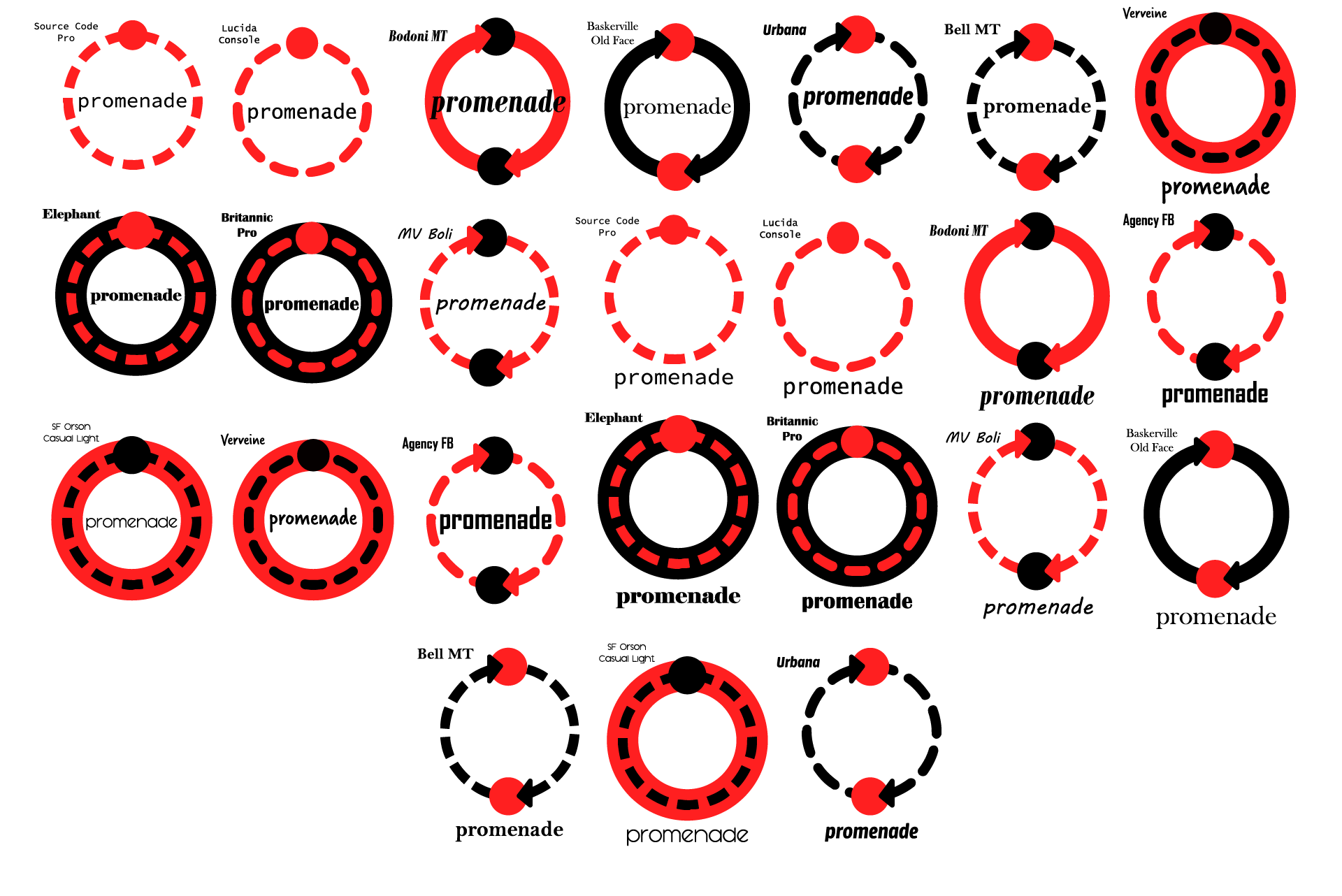
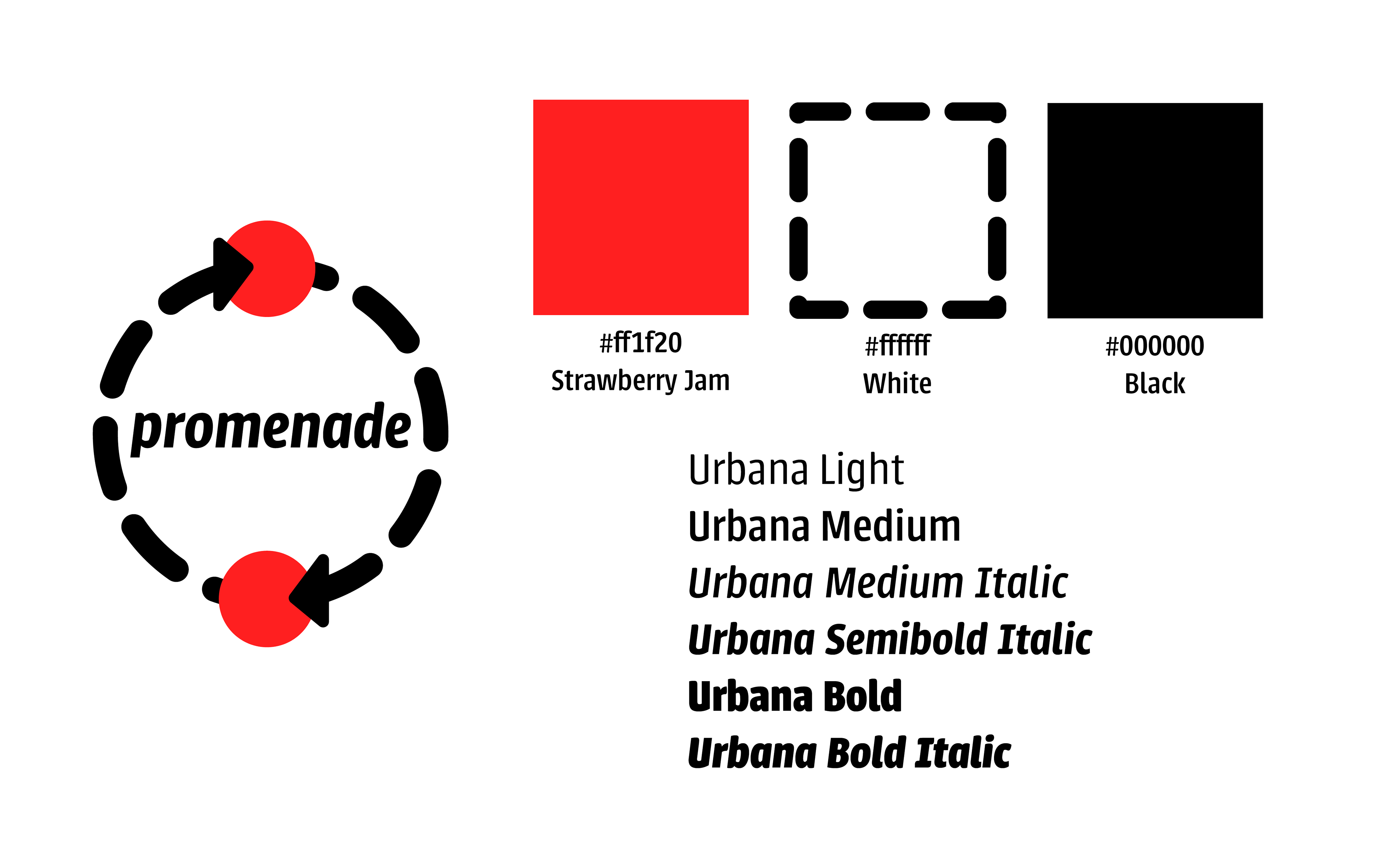
For that reason, we stuck with a simple color palette of black, white and red. We chose the name “Promenade” due to its grandeur and old-timey sensibilities to resonate with our older audience. The app begins with by pairing the band, and leads directly into a tutorial that describes the exact vibration and sound combinations the band would make at different stages of the exercise period. The fonts used in the initial prototype, Helvetica and Urbana, are distinct but easy to read. The buttons are large, and each option only has a few sub-options to choose from. The app also has a built in screen reader, where it describes each difficulty level and what specific exercises it entails.
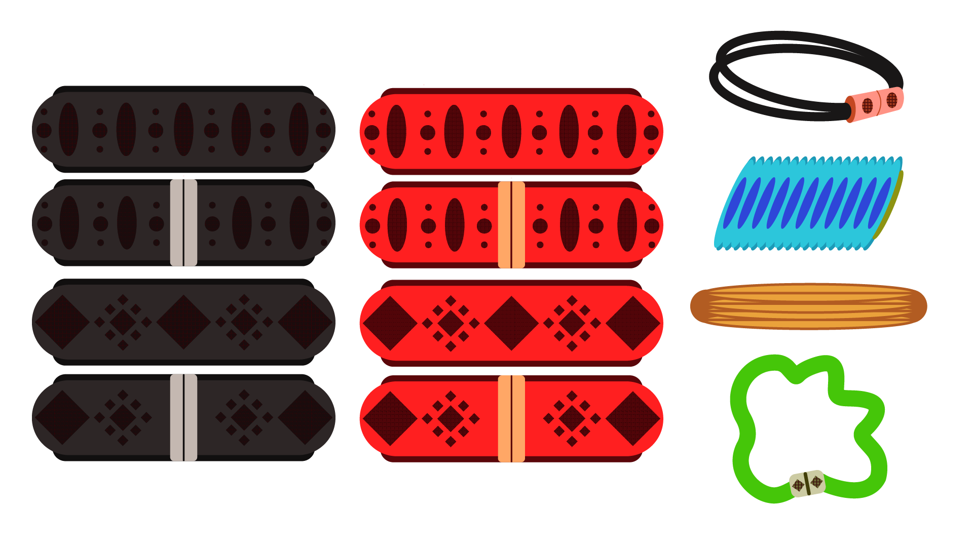
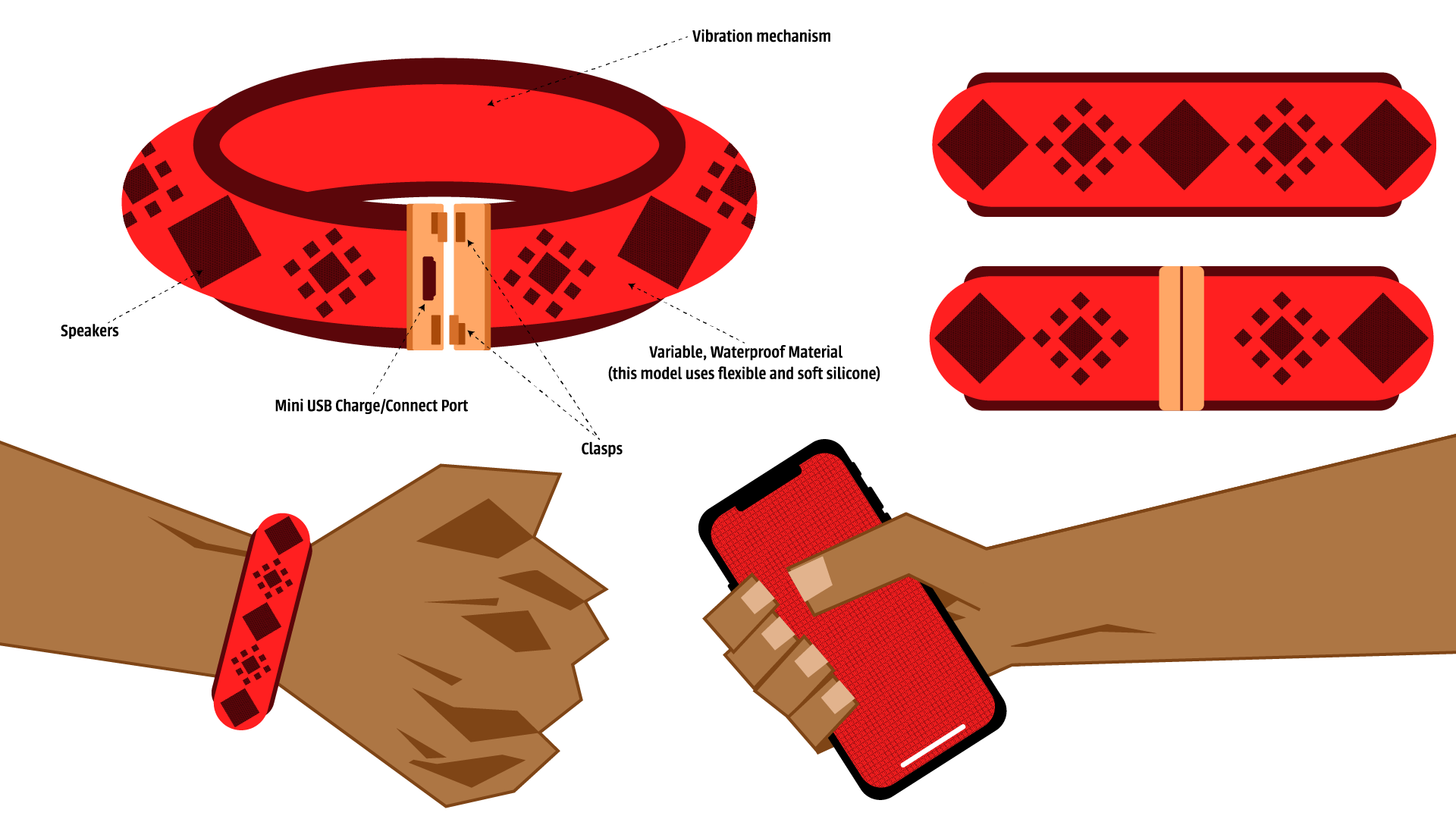
First pass at fully realized band designs.
The left and middle were the most solid conceptions, with the ones on the right being a diversion to see if they would work.
We originally designed the band to be more of a bracelet. It would be thin and made out of a waterproof flexible rubber with a metal clasp. Within the clasp would be either a mini-USB or USB-C charge port. The band would pair with your smartphone but does not need to be near it to be effective. If the user wanted to go on a walk without technology, the band would still be perfectly functional. Small speakers and a vibration system within the device would use a combination of specific alerts and buzzes to update the user on their progress.
Medium Fidelity Wireframe and Feedback
The time came to put our hard work to the test. We presented our work to get the necessary feedback to continue.
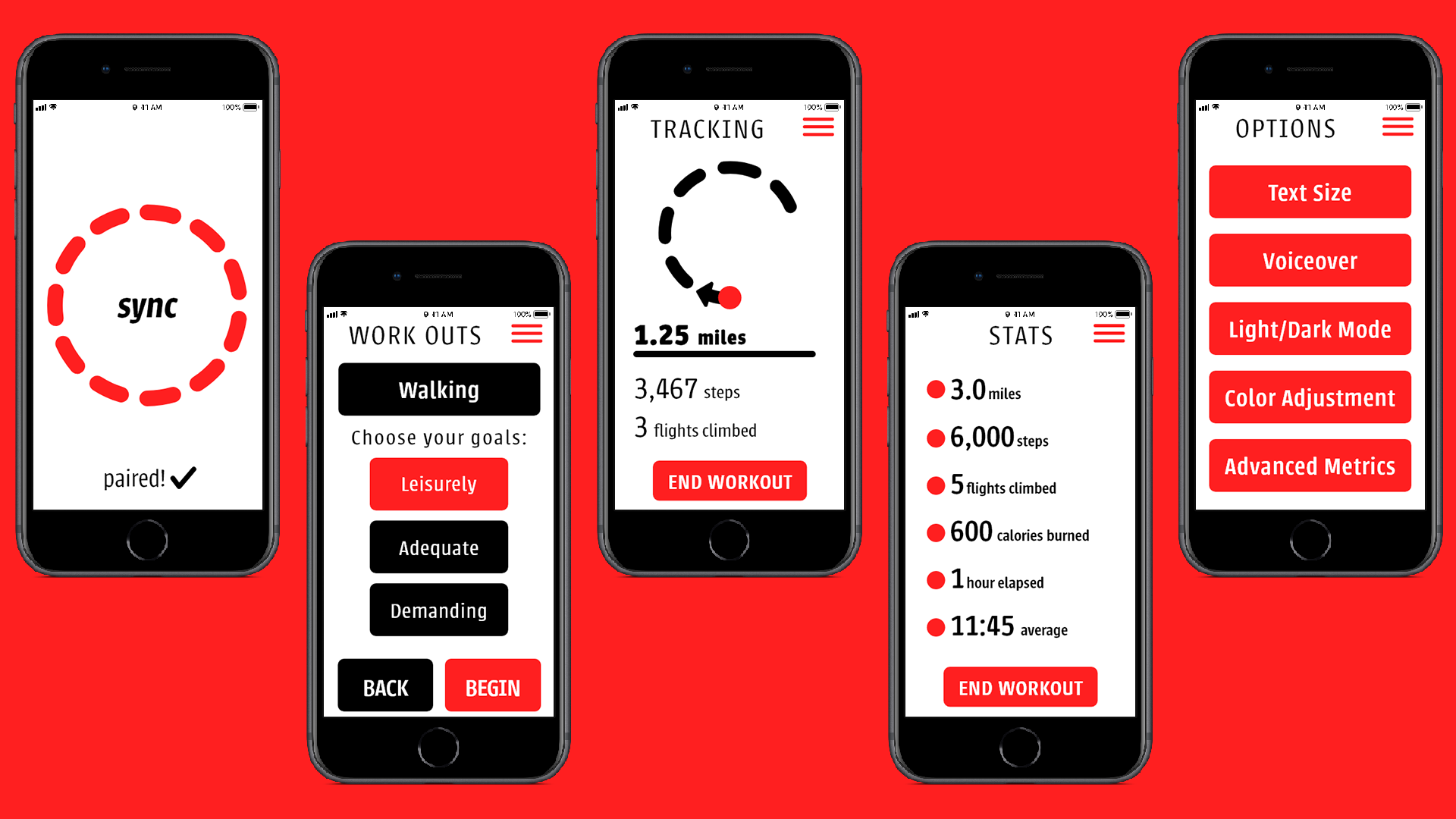
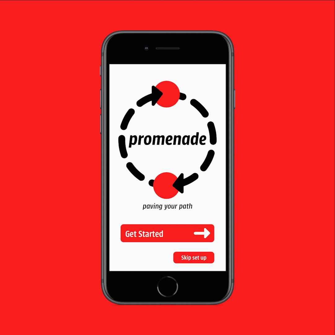
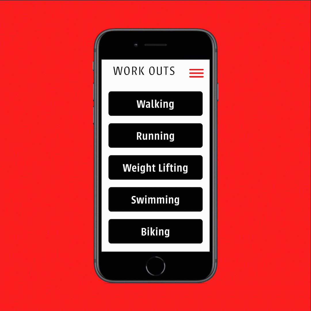
Our video walk through of the medium fidelity app
Our research and initial prototype were judged by a pair of professionals selected by Adobe. While they were impressed with our initial draft, they expressed concern over the lack of time telling on the band, the extreme simplicity of our prototype, the accordion system for our options, and the alert system for the band being solely vibration and sound base.
They suggested building in more ownership in the exercise experience, and examining the outcomes as opposed to the features: how easy is it to wear, and how does it function? How does the app adapt to the environment? How and when does the user get involved?
Our first pass prototype.
The refined bands as they appeared in the video.
They suggested building in more ownership in the exercise experience, and examining the outcomes as opposed to the features: how easy is it to wear, and how does it function? How does the app constrain to the environment? How and when does the user get involved?
My first individual reworking of the app.
UI Design Refinement, Round 1
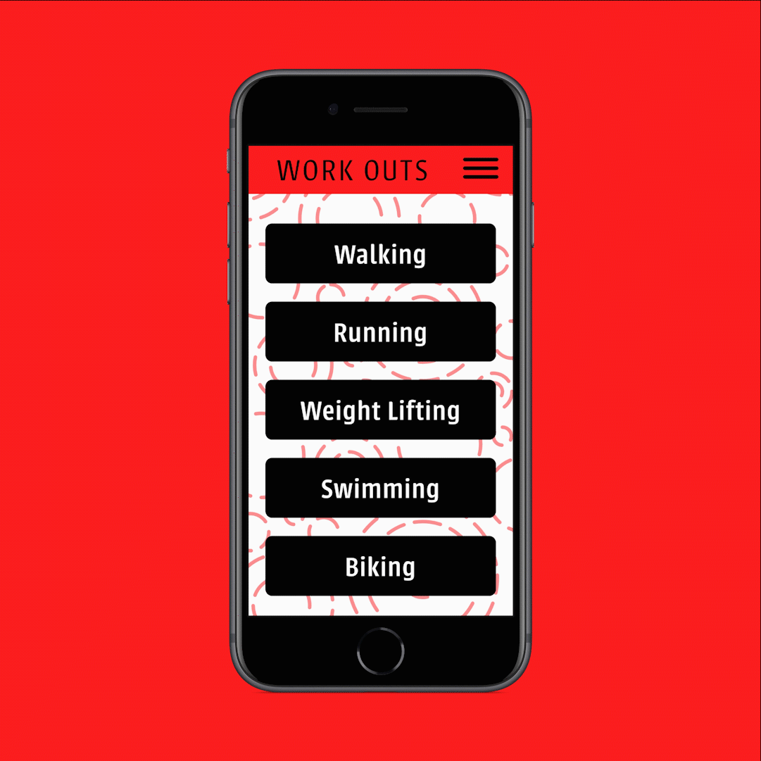
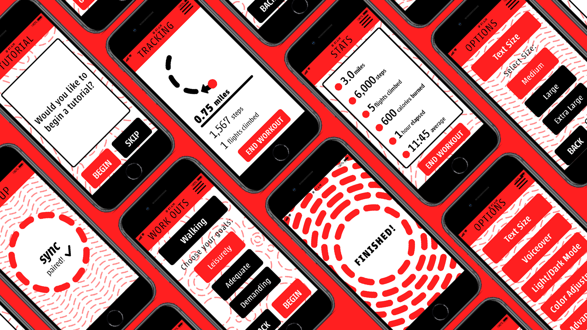
Feedback in hand, our group split to individually come up with refinements based on our feedback. In my first iteration of the prototype, I focused on giving Promenade a distinct identity. I moved all of the text to be set in Urbana, added more elements of red, and introduced more hand-done touches akin to the dotted-line circle in the logo. For the exercise screen, I changed each specific exercise to have its own submenu, ensuring that the exercise and their difficulty levels would exist as their own pages. Each exercise has a fully interactable “Leisurely” setting, all of the exercises have voice-to-text explanations of their difficulties, and a custom progress animation. Additionally, I hammered out an in-depth options menu with text customization, color options for different visual impairments, and a dark mode.
The new bands are redesigned in a setting that looks more realistic. They have a simple watch that only tells the date and time and can read the status of the user’s exercise when tapped. The original functionality of vibration and sound to announce stages in the exercise is still intact.
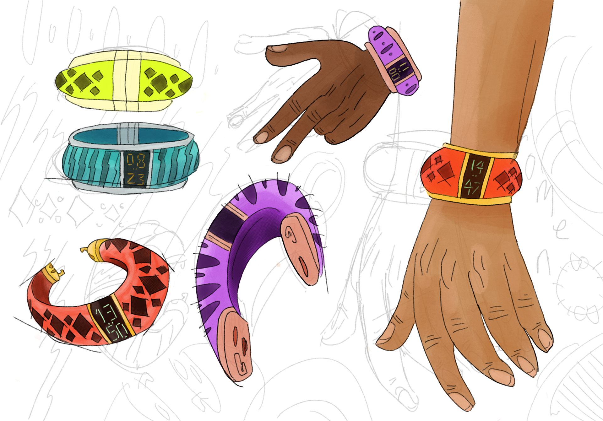
Further refined bands made in Procreate.
UI Design Refinement, Round 2
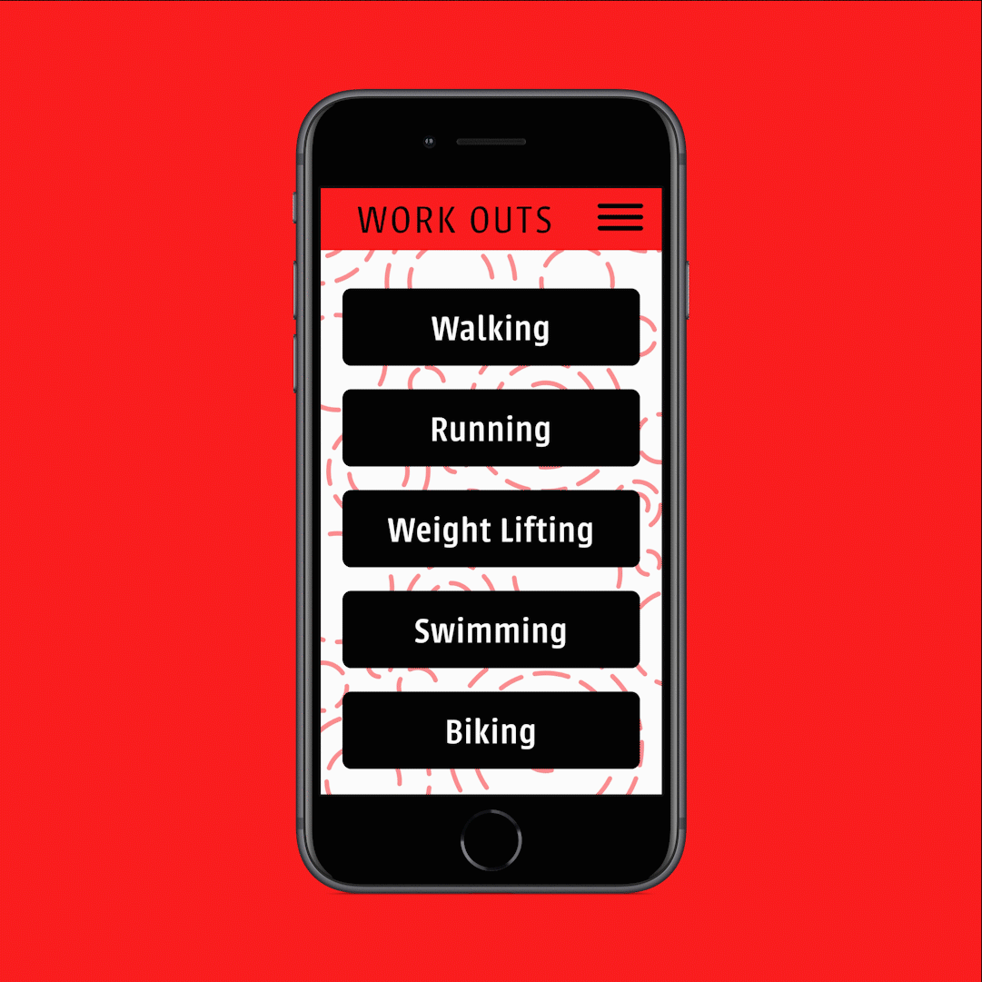
A year later, I returned to this project with a fresh eye to push its originality and polish. While Round 1’s design was functional, it had no definitive personality, rhythm, or emotion. The brand could be simple in its color palette, certainly, but that doesn’t mean that it can’t also be fun. Throughout, I changed little things like making the header red, refining the typography, and completely fleshing out dark mode. From there, I moved onto bigger changes like fully fleshed out walk-throughs of all the exercises, and illustrations to give the brand a funkier feeling.
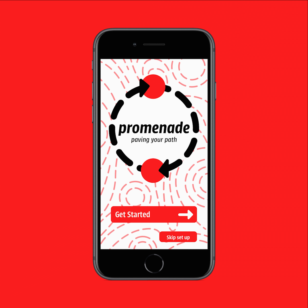
My second update of the prototype, in light mode.
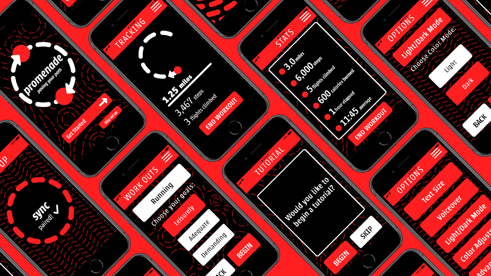
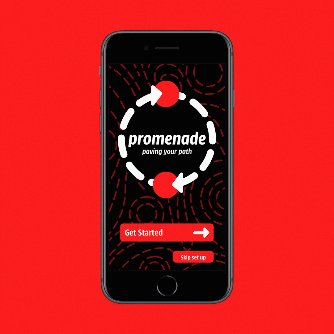
My second update of the prototype, in dark mode.
Conclusion
Taking in all I have learned over the time I have spent with Promenade, this project has taught me the importance of designing for people of all ability levels in interactive experiences. The resources I have compiled will serve me well as I continue to design apps and websites and are excellent jumping off points for further research. It has also helped strengthened my performance in a group work setting, forcing me to communicate often and openly, be concise, and be gracious. Overall, I am proud of the whole experience working with this design and look forward to tackling more complicated team cases in the future.